Budapest
Visual identity refreshing concept, 2020
"From now on, we will not live in Buda nor in Pest;
from now on, we will live in Budapest."
How can a city communicate about itself with visuality? How can you make the identity of a metropolis exciting, while providing its inhabitants with a sense of belonging? These were the questions we strived to answer when we decided to dream up a new city identity for Budapest.
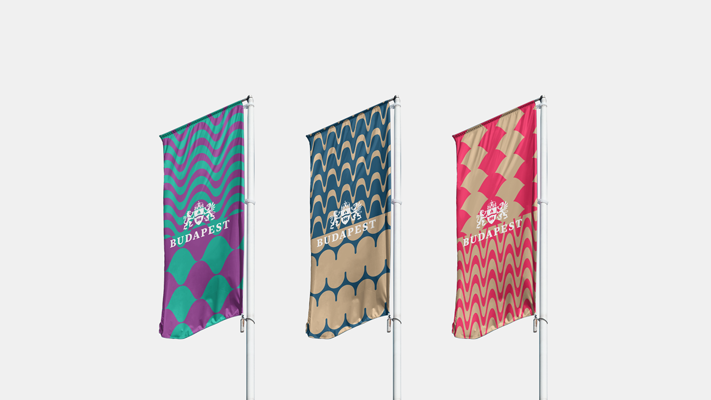
Keeping in line with predefined elements (three main and six secondary colors, the fonts Tabac G3 and FF Mark Pro, and the official logo of Budapest), we tried to capture the diversity of the city. We were looking for characteristic features to compile a universal yet specific set of patterns. This is how the essential elements of the city—the Buda Hills, the Gellért Hill, the dome of the Parliament and the churches, the piers of the Danube bridges, and the river's flow—were transformed into abstract shapes.
The parts and counterparts of Budapest (Buda and Pest, flat areas and hills, built environment and nature) engage in an exciting visual dialogue: a pattern of semicircles and waves appears on various surfaces (billboards, flags, citylights, websites) in bold colors and dynamic shapes. Using the two fonts together, we shed new light on Adolf Ágai's famous sentence (quote above) and thus on the city of Budapest.
The vibrant graphics of the identity conjure up the pulse of the big city—this energetic set of colors and patterns also allows various public service companies to integrate into the umbrella brand of Budapest's municipality.