


Vaccine Observatory
— GCE Brazil (2020)
Background
Funded by the Bill & Melinda Gates Foundation, the Vaccine Observatory allows quick public health decision-making and identification of vulnerable areas of herd immunity at risk in Brazil. Our goal with this project was to assist the research team to communicate their work and generate deliverables for different stakeholders, such as public health managers, journalists, researchers and other funders, depending on the different type of format the information would be presented at.

Collaboration
Our method simple < complex < Simple+ aims to answer a problem by transforming it into what we call the ultimate particular essence. For us, this is a co-design between the Odd team and the knowledge that already exists in projects or organizations - in this case, the team from the Catholic University of Santos, composed by medical experts, statisticians, epidemiologists and geographers. As supporters from the Foundation to research teams, we were able to participate since the data planning stages, allowing us to have depth in understanding and creative freedom in different areas.


Iconography
To represent the 11 vaccines that were the focus of the project, we decided that each one should have its own icon. The inspiration for this scheme came from the characteristics of the vaccines themselves, such as the type of virus or symptoms of the diseases they fight, and even general information on how it is applied.
For instance, Chickenpox is known to manifest itself through spots on the body, so we developed its icon as a set of dots referring to this characteristic symptom. Poliovirus, on the other hand, is famous for being the droplet vaccine in Brazil, so it made perfect sense to choose a drop to represent it.


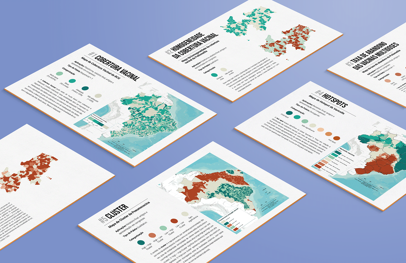
Data Visualization for Maps
The problem may start simple, but we know there are layers that we won’t be able to anticipate before exploring them. A big part of our work with these data visualizations was to find the most adequate and interesting color palettes without compromising the technical and the academic rigors. In this journey we had to categorize the maps and the colors they required so we could test it (a lot!) and balance it out with the Visual Identity of the Observatory.


Visual Identity
The main goal for us with this identity was adaptability, so that regardless of the context, it could communicate the project well to its audience. As you can see, the logo itself is dynamic, which means that every vaccine icon is also part of it. So at the end, we developed over 200 versions of the logo: Vaccine icons personalization, black and white, one color, badges, horizontal and vertical uses, grayscale... Plus the other complementary resources as well.


