JKN Design | Identity | James Kyle Nordsiek
The following is a logo I created during my sophomore year of college to serve as my identity.
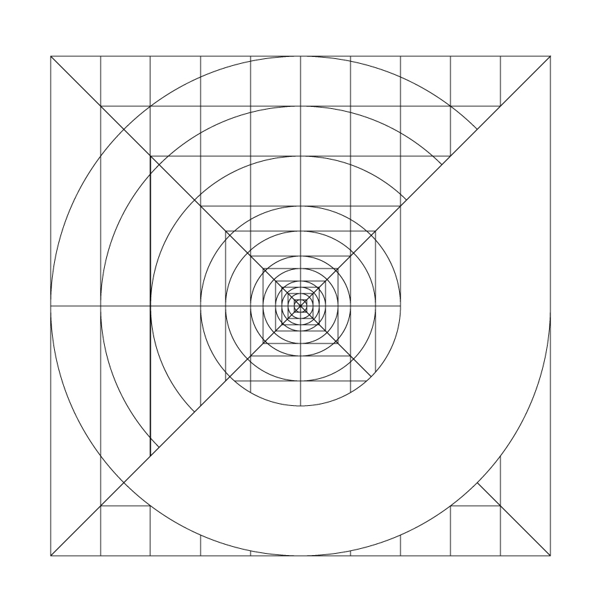
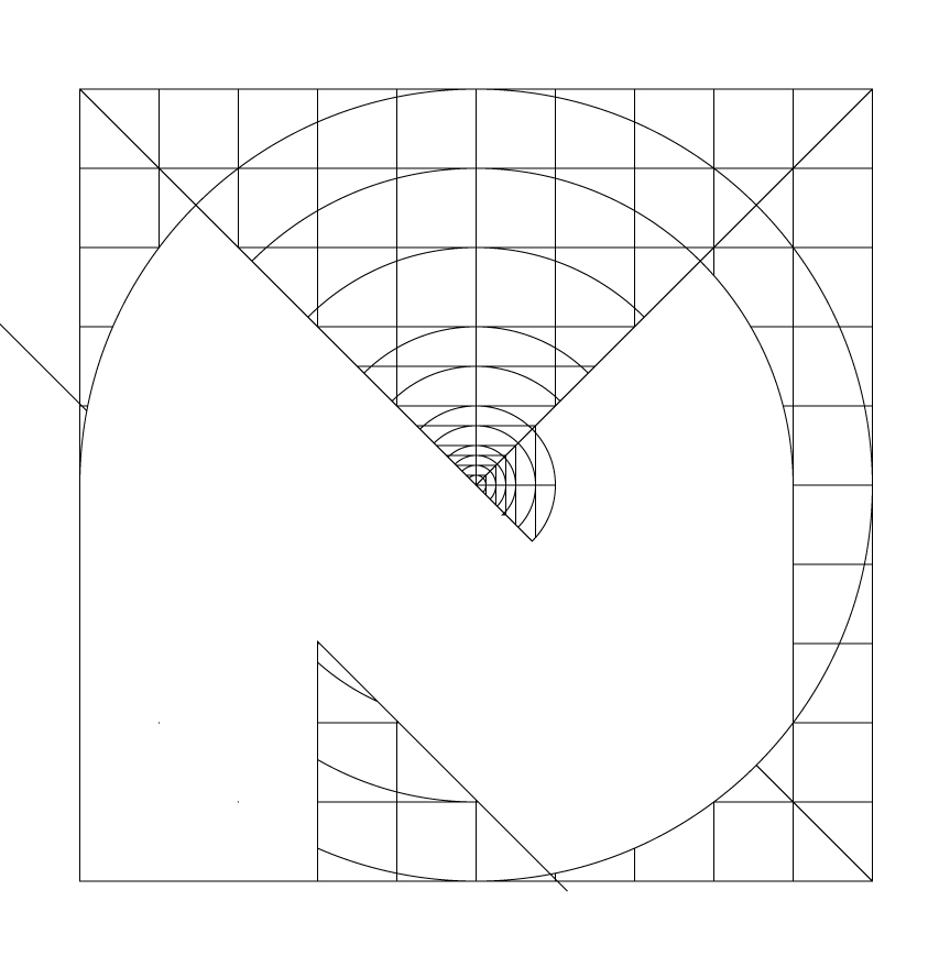
For this logo, I created a grid system based on the aesthetic of a Queen Anne's Lace.


Initially, the JKN was to just stand alone, as 3 seperate letters that made a single logo.


The K and the N, however, did not interact well. I fixed this by pushing the two letters into each other. After this, the letters interacted much better and the logo as a whole had much better motion and energy.
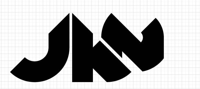

The icon is simply an O, also created in the grid. To represent the idea of wholeness, strength, and stabilty. The strong geometric shape balances and works along with the flowing, more organic shapes of the lettermark.