
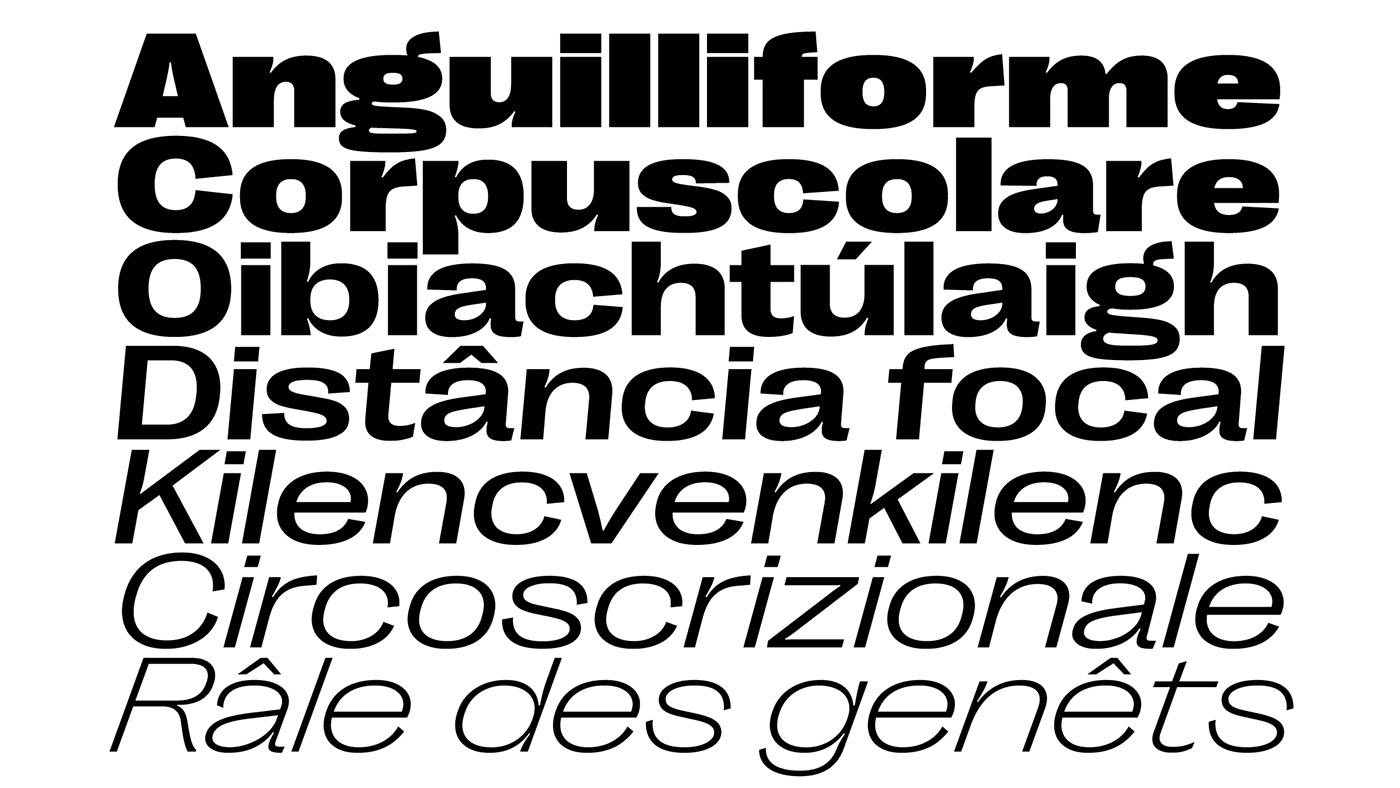
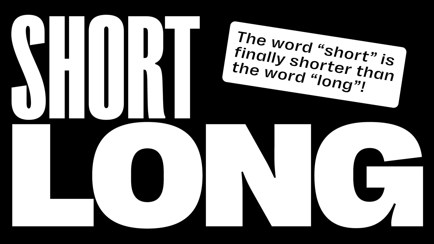
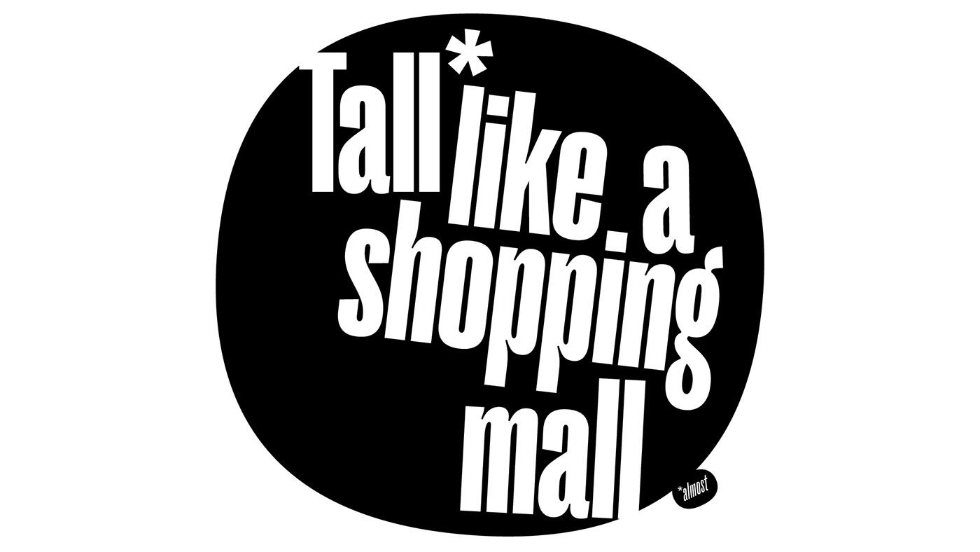
Right Grotesk blends neutrality and functionality of workhorses with a good touch of a distinctive personality. Featuring many fine details, smooth curves, moderate contrast and slightly unusual anatomy, the typeface can be a loud and proud hero or a humble supporting actor for all sorts of designs. Not trendy, not timeless either, it was designed to be a versatile and high-quality type family for both serious and fun projects. It was designed to be just Right.
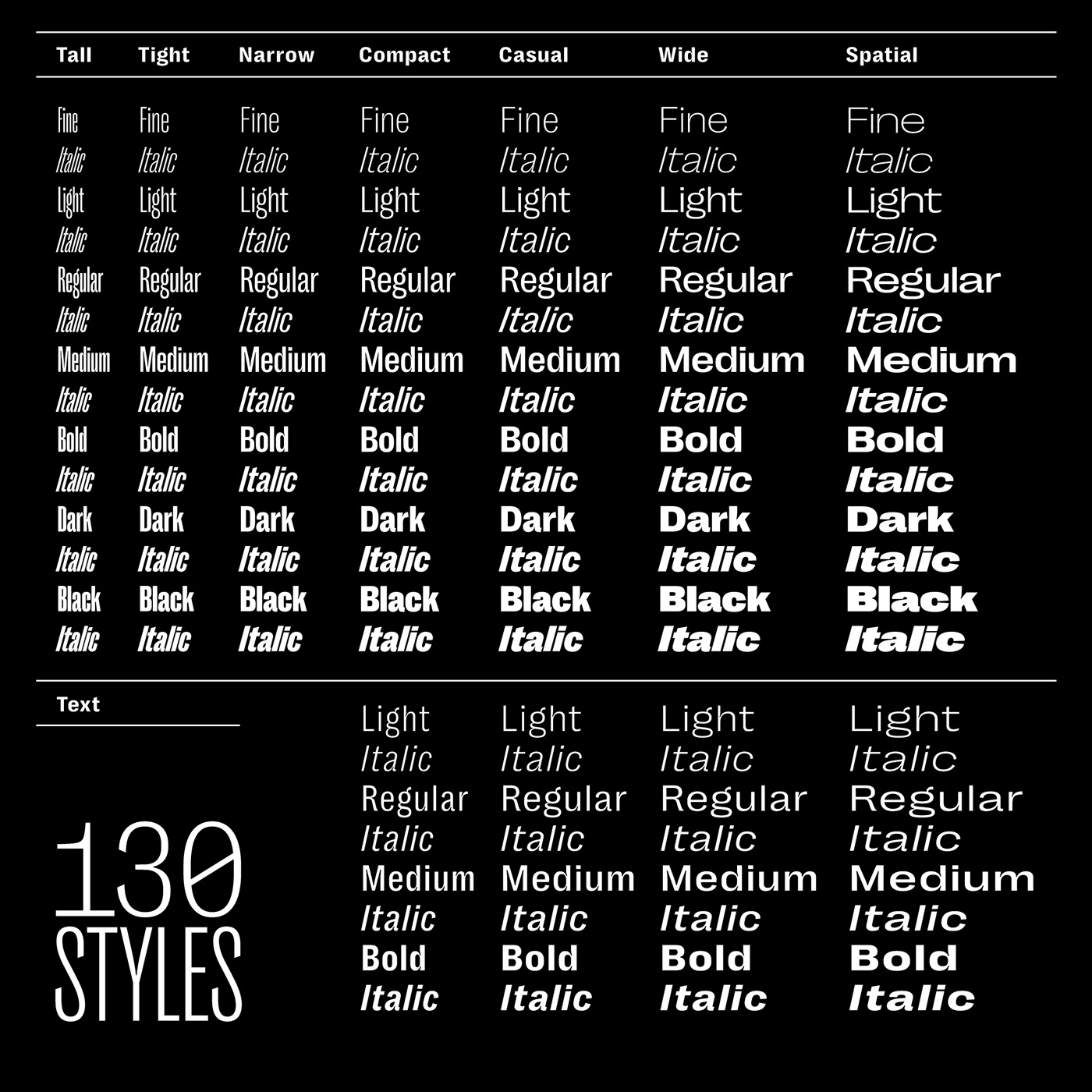
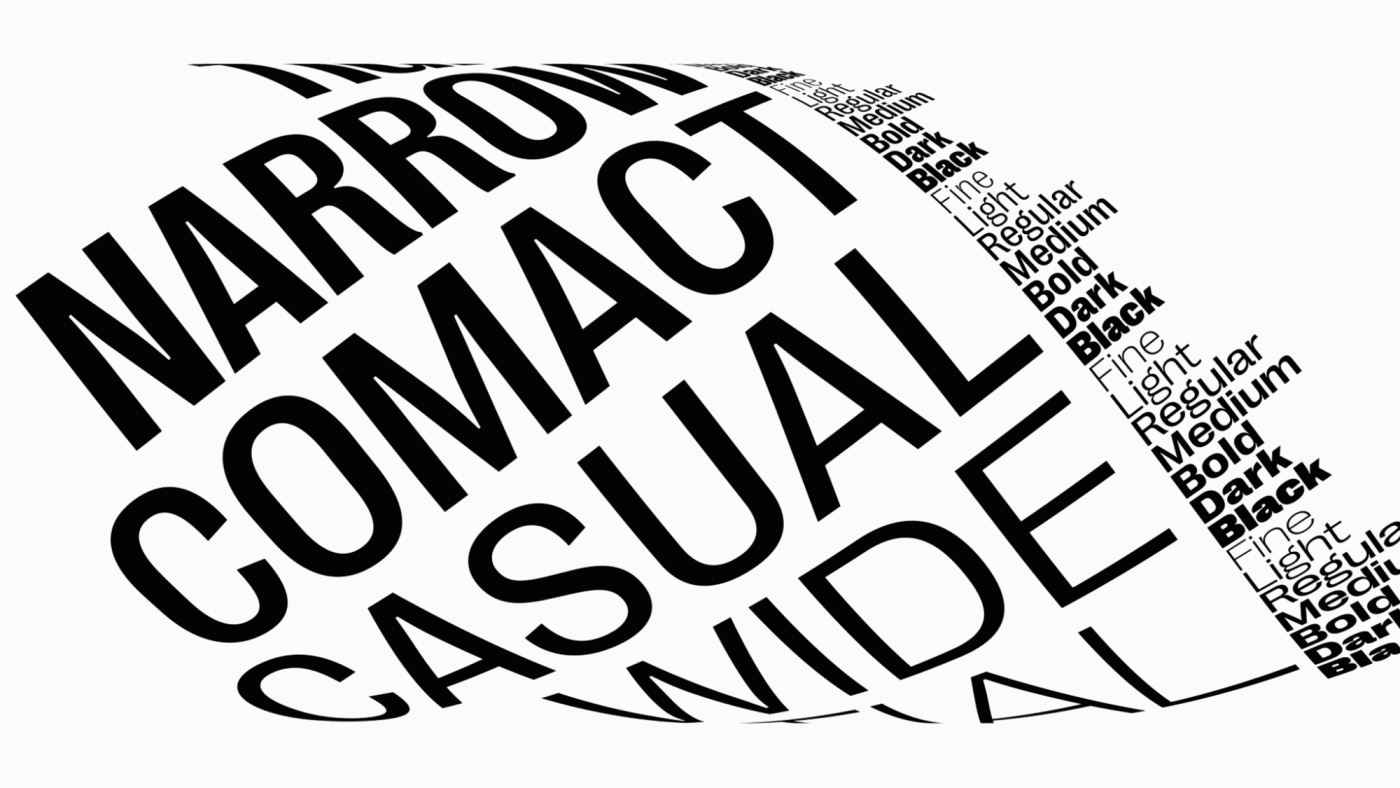
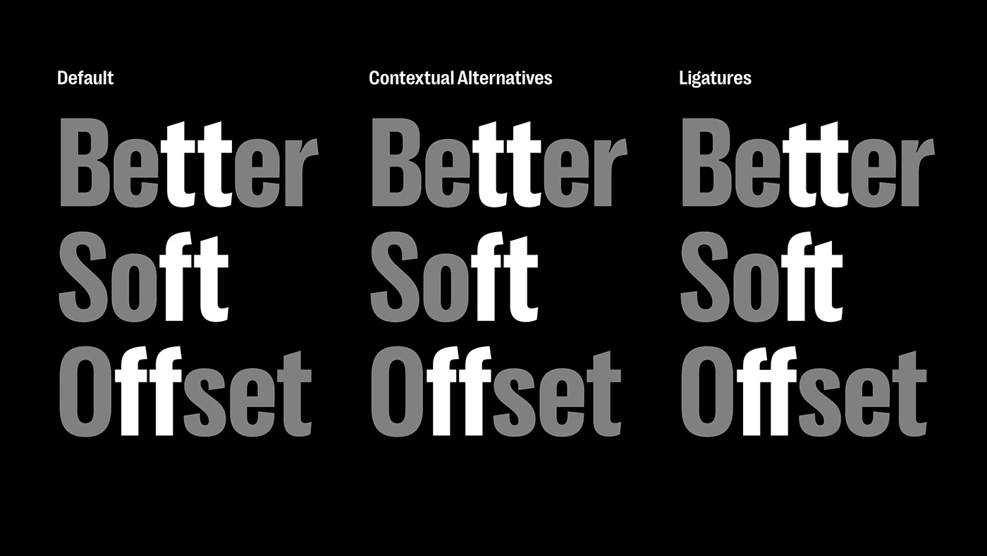
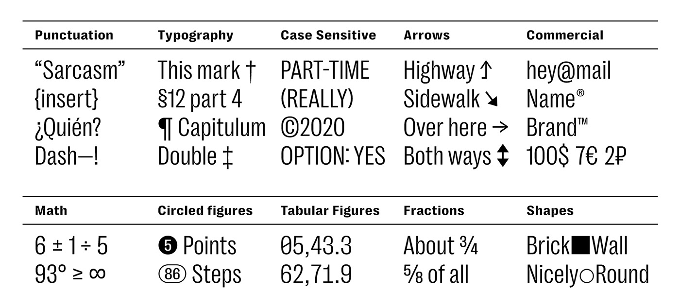
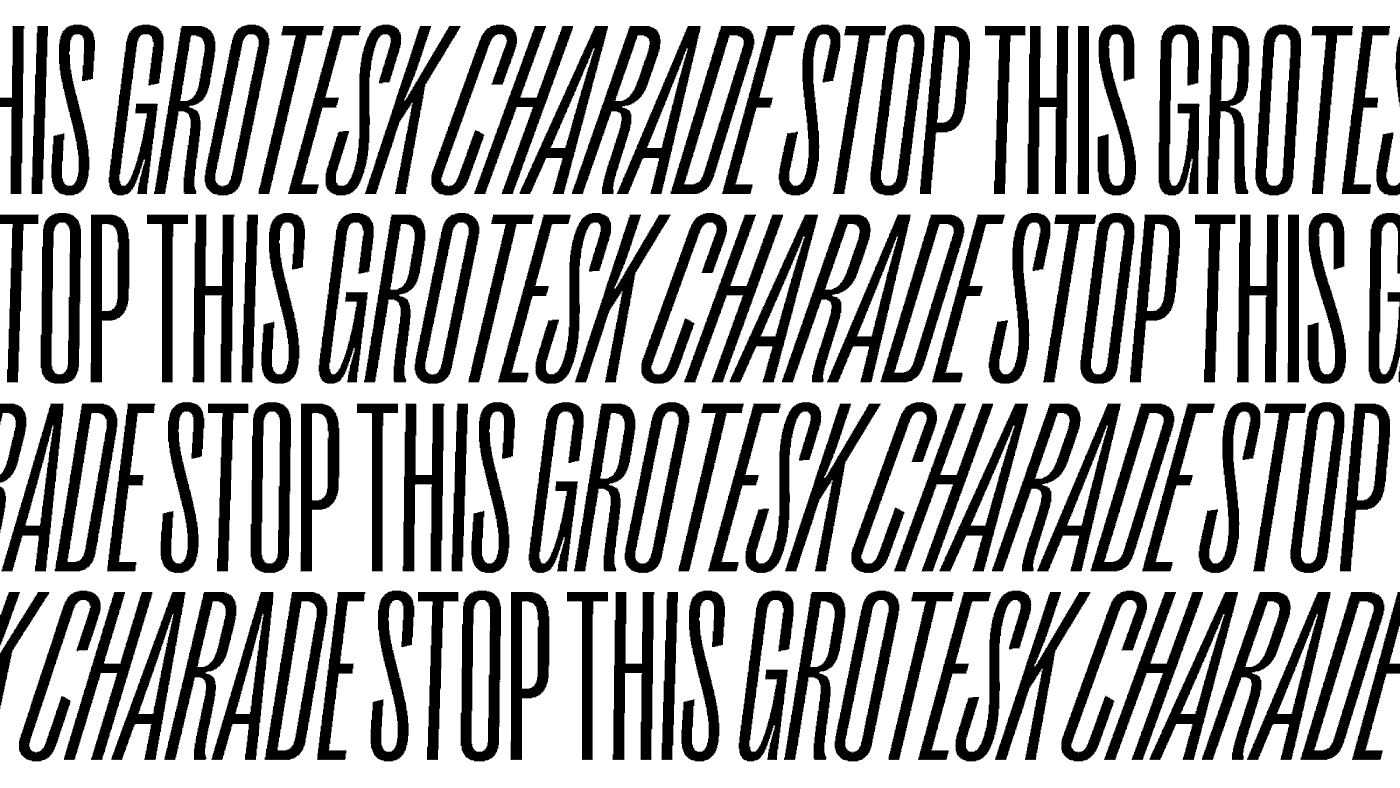
Right Grotesk is large. It covers the most used range of weights and widths and features a dramatic 20° italic angle. All of that is available as 98 classic fonts or just 1 flexible variable font. For more sophisticated design, it supports case sensitive forms, ligatures, tabular figures, circled figures, arrows and other symbols.
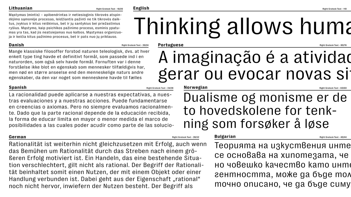
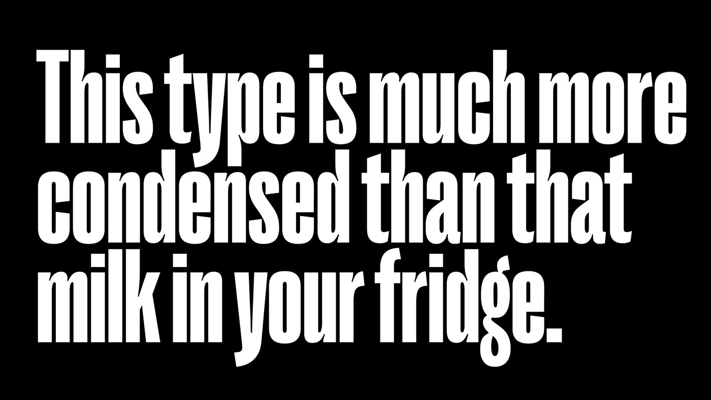
For small sizes, there’s now Right Grotesk Text, which is actually more than just a ‘text’ font. It brings the variable flexibility to tiny sizes — less radical range, more usual 12° italics, adapted letter forms and all that jazz. Text is a good friend to body texts, compact captions, interactive UI, adaptive logotypes and, potentially, mosquito street signs.
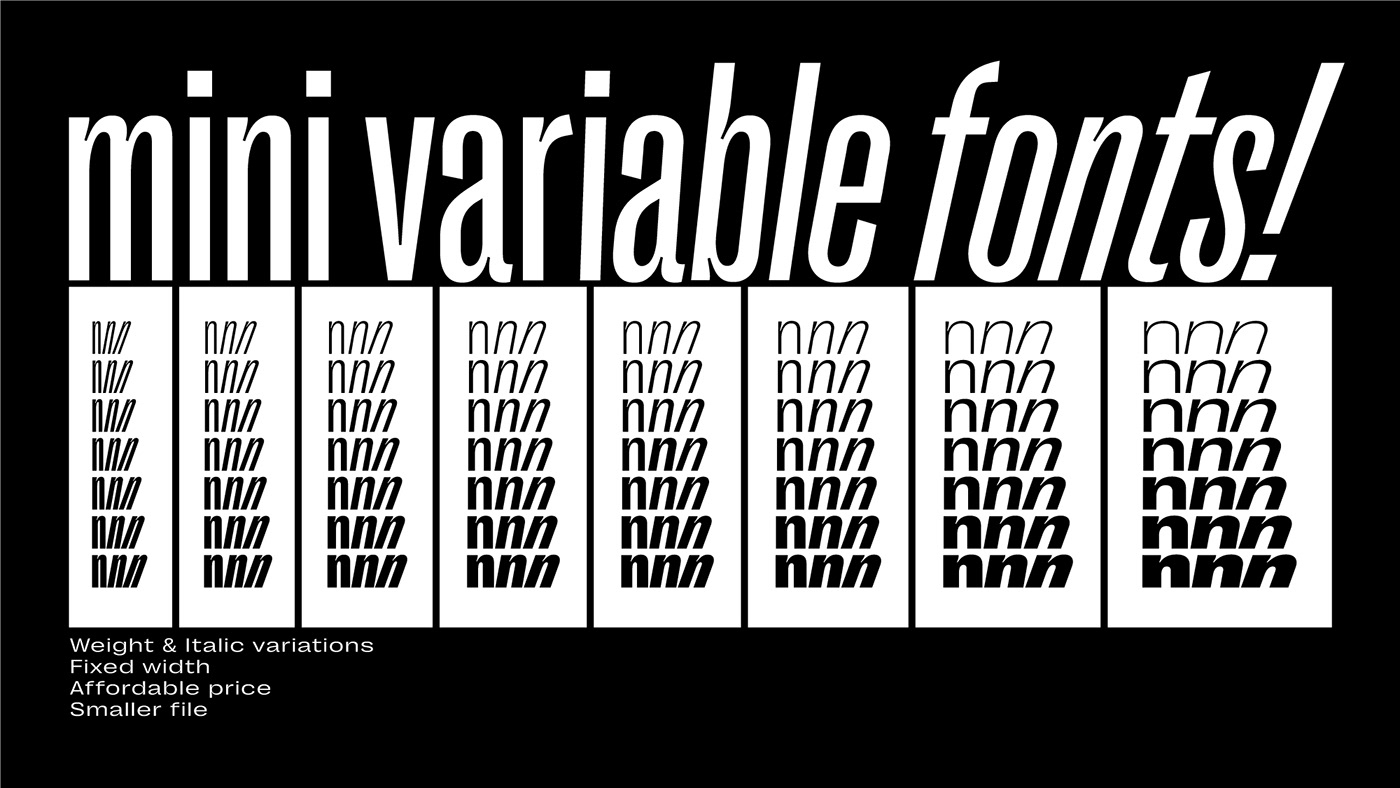
The power of variable fonts got more affordable! Each sub-family now goes with a Mini Variable Font covering the same range. Custom range upon request! Cool, Right?
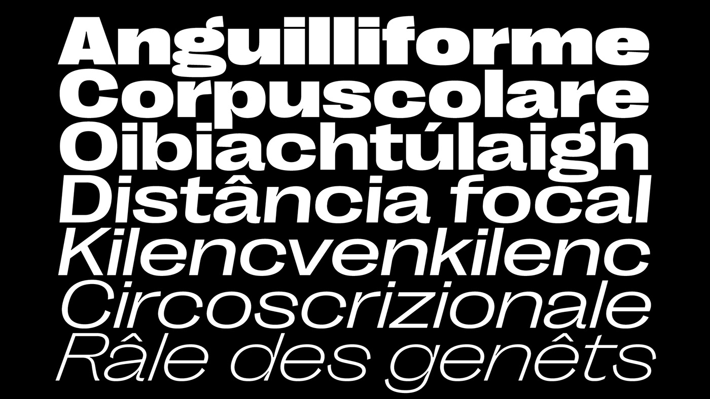
About 200 Latin and Cyrillic-based languages are supported:
Latin: Abenaki, Afaan Oromo, Afar, Albanian, Alsatian, Amis, Anuta, Aragonese, Aranese, Aromanian, Arrernte, Arvanitic (Latin), Asturian, Aymara, Bashkir (Latin), Basque, Belarusian (Latin), Bikol, Bislama, Bosnian, Breton, Cape Verdean Creole, Cebuano, Chamorro, Chavacano, Chickasaw, Cimbrian, Cofán, Corsican, Creek, Crimean Tatar (Latin), Croatian, Czech, Danish, Dawan, Delaware, Dholuo, Drehu, Dutch, English, Estonian, Fijian, Filipino, Finnish, Folkspraak, French, Frisian, Friulian, Gagauz (Latin), Galician, Genoese, German, Gooniyandi, Guadeloupean Creole, Gwich’in, Haitian Creole, Hän, Hawaiian, Hiligaynon, Hopi, Hotcąk (Latin), Hungarian, Ido, Ilocano, Indonesian, Interglossa, Interlingua, Irish, Istro-Romanian, Italian, Jamaican, Javanese (Latin), Jèrriais, Kala Lagaw Ya, Kapampangan (Latin), Kaqchikel, Karakalpak (Latin), Karelian (Latin), Kashubian, Kikongo, Kinyarwanda, Kiribati, Kirundi, Ladin, Latin, Latino sine Flexione, Latvian, Lithuanian, Lojban, Lombard, Low Saxon, Luxembourgish, Makhuwa, Malay, Manx, Māori, Marquesan, Megleno-Romanian, Meriam Mir, Mirandese, Mohawk, Moldovan, Montagnais, Montenegrin, Murrinh-Patha, Nagamese Creole, Ndebele, Neapolitan, Ngiyambaa, Niuean, Noongar, Norwegian, Novial, Occidental, Occitan, Oshiwambo, Ossetian (Latin), Palauan, Papiamento, Piedmontese, Polish, Portuguese, Potawatomi, Q’eqchi’, Quechua, Rarotongan, Romanian, Romansh, Rotokas, Sami (Lule Sami), Sami (Southern Sami), Samoan, Sango, Saramaccan, Sardinian, Scottish Gaelic, Serbian (Latin), Seri, Seychellois Creole, Shawnee, Shona, Sicilian, Silesian, Slovak, Slovenian, Slovio (Latin), Somali, Sorbian (Lower Sorbian), Sorbian (Upper Sorbian), Sotho (Northern), Sotho (Southern), Spanish, Sranan, Sundanese (Latin), Swahili, Swazi, Swedish, Tagalog, Tahitian, Tetum, Tok Pisin, Tokelauan, Tongan, Tshiluba, Tsonga, Tswana, Tumbuka, Turkish, Turkmen (Latin), Tuvaluan, Tzotzil, Uzbek (Latin), Venetian, Vepsian, Volapük, Võro, Wallisian, Walloon, Waray-Waray, Warlpiri, Wayuu, Welsh, Wiradjuri, Wik-Mungkan, Xavante, Xhosa, Yapese, Yindjibarndi, Zapotec, Zulu, Zuni.
Cyrillic: Russian, Belarusian, Ukrainian, Kazakh, Bulgarian, Serbian, Macedonian, Montenegrin and some others.
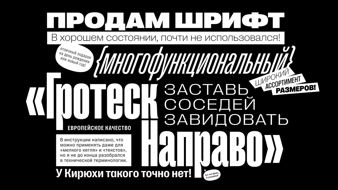
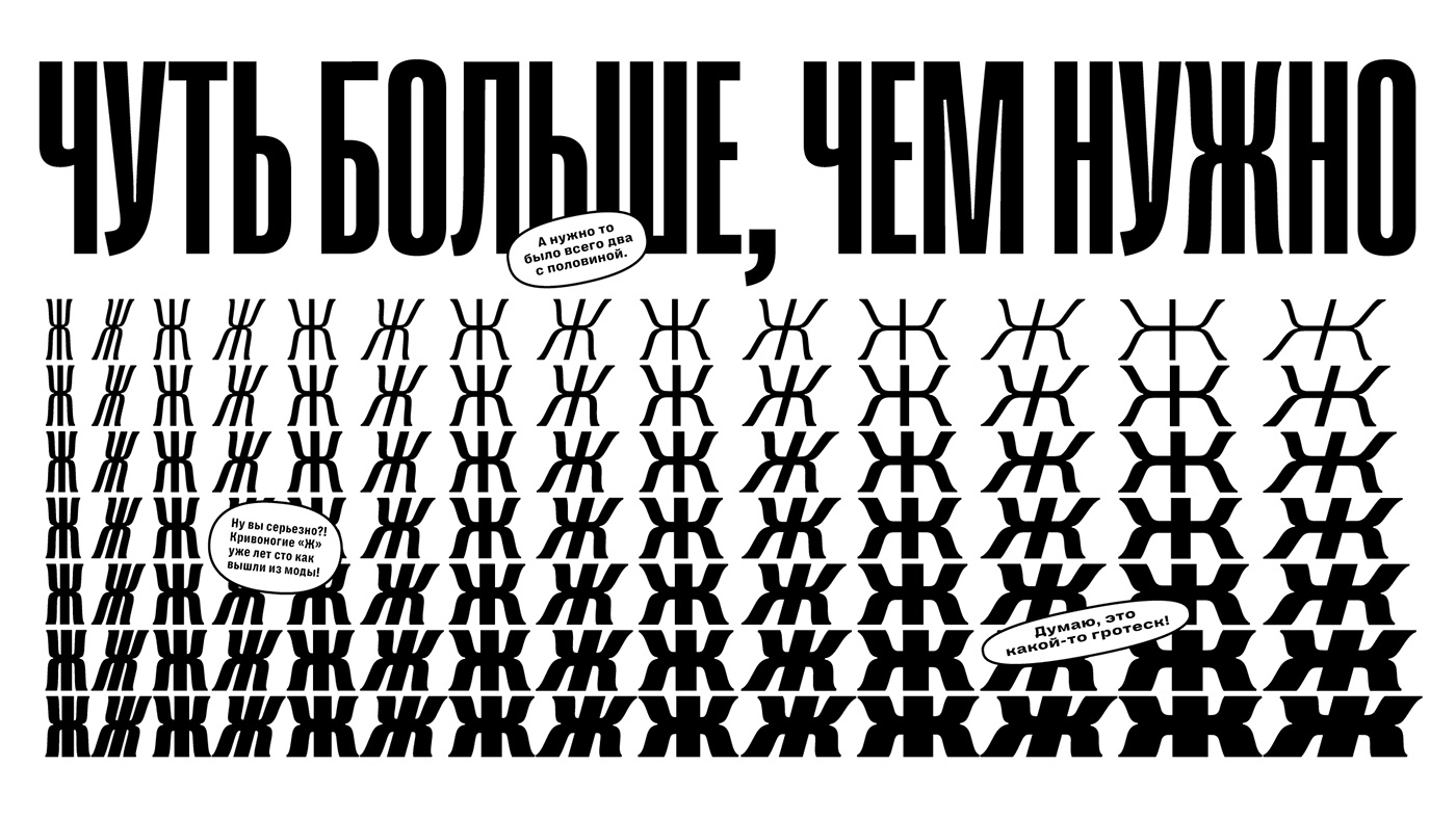
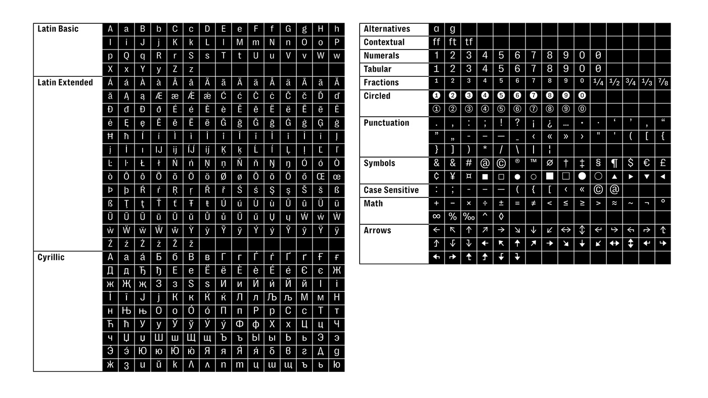
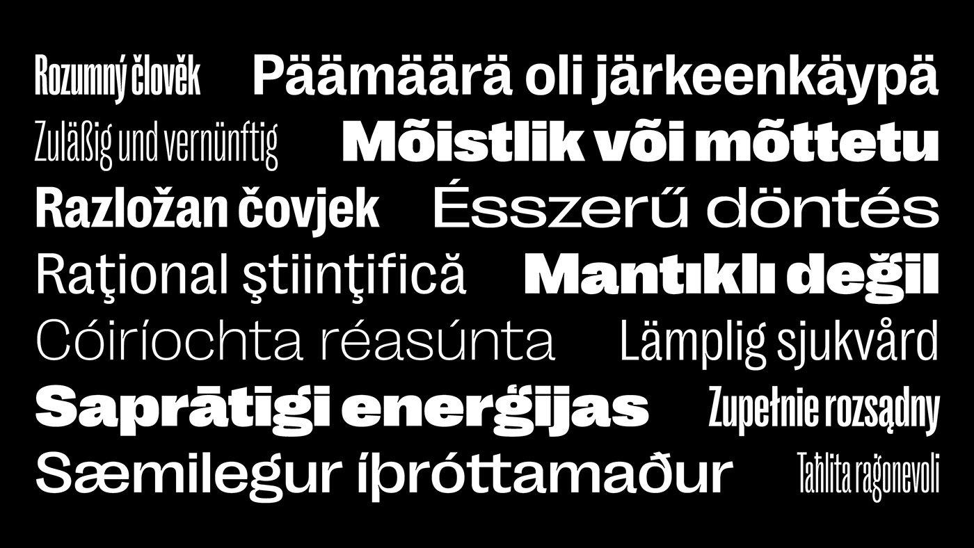

Thanks Ilya Bazhanov for a lot of help with Cyrillic!
Download the fonts for free for your personal projects or get a commercial license from Pangram Pangram Foundry!
More works
Let’s keep in touch
slobzheninov@gmail.com
Thanks for watching!


