

Z89Design - NHL Concept Series
Imagining a more colorful, expanded league
Welcome to the final project site for my NHL Concept Series! I've loved hockey sweaters since I was a little kid and always thought it would be a blast to put my spin on what the pros wear. Thanks to some fantastic tools and templates, I've been able to bring my ideas to life! My goal with this project was to conceptualize more unique color schemes and imagine a league in which no city ever lost its NHL team. I've reimagined what the divisions would look like and designed 4 jerseys each for 40 teams. All concepts feature a 3D version viewed head-on along with a full 2D set, front and back, complete with gear. The series number assigned to each jersey is the order in which it was created. Also, to further show off the color schemes and designs, I put together a goalie mask and team puck for every franchise.
Update - 9/21/2021: In early 2021, I launched a new series called "NHL ColorTown" that aims to combine the Color Rush series from the NFL and the City jerseys from the NBA. Each jersey features a new primary color not used in the previously released four jerseys for each team, along with a design element that is unique to each team's locale. All jerseys have been added to this project along with commentary!
A New League Map
In this 40 team league, divisions are re-aligned to five teams each, 20 in each conference. The Eastern Conference is divided into the Atlantic, Mid-East, Provincial and Southeast. The Western Conference is divided into the Central, Northwest, Pacific and Westward.

Eastern Conference
Atlantic Division
The new Atlantic division in my NHL features the most tightly clustered group of teams geographically. Imagine the rivalries between these five teams playing 4x per year!
The new Atlantic division in my NHL features the most tightly clustered group of teams geographically. Imagine the rivalries between these five teams playing 4x per year!

Boston Bruins
For the Bruins, I took the opportunity to bring brown to the forefront. No current NHL team uses brown as their primary color, and for Boston it just works perfectly, especially given that it's part of their history. The striping on the home and away set mirrors their 1974-1995 look, which is the best in their history, in my opinion. A yellow alternate returns as well, using a pattern in the numbers that matches the logo. The second alternate is a slightly different take on the 2019 Winter Classic jersey, featuring black as an alternate color, rather than as the primary they actually use.
ColorTown Commentary: Coke Bear says surprise! I hadn't used black for the Bruins in my series as the primary, so it's front and center here. The "Town" element in this one is subtle - the Boston city grid is sublimated in the numbers as a tribute to the Marathon.


Hartford Whalers
An untouchable logo... one of the greatest in sports history. I loved every second of creating a modified look for the Whalers. Their original jerseys are fantastic, but I always thought it would be cool to see a blue logo, along with some green at the edges of the home set to tie in with the main part of the sweater. I added that detail here with some piping around the main blue stripes. The first alternate brings royal blue to the forefront, something they never did but nonetheless would have looked great. And, for a bit of a departure, why not give Pucky his moment in the sun via a 2nd alternate? This set is one of my favorites in the series, and with that logo as a starting point, these were a blast to design.
ColorTown Commentary: They get the navy blue treatment for the first time in this series (minus the excessive gray) + a "town" themed shoulder patch. The crest from the CT state flag surrounds Pucky with a touch of gold that hearkens back to the OG color scheme.


New Jersey Devils
In aiming to create a more colorful league, it was pretty noticeable just how many red & blue and red & black combinations there are in the NHL. That red & black scheme is now pretty iconic in New Jersey, since they've won 3 Cups wearing it, but they've also got green in their history. My take? Why not combine them all? Take the original green plus the iconic red and black and fuse it into something new. It results in a totally unique color scheme that I'm not sure is used anywhere else in pro sports. The jerseys all use a slightly modified version of the original striping pattern, and the 2nd alternate features an unused logo from the team's past.
ColorTown Commentary: I already used red, green and black, in the main series so I had to get creative here. The "town" element of this design is a silhouette shoulder patch of the original "Jersey Devil" drawing.


New York Islanders
One of my favorite experiences in designing these jerseys has been when fans of the team love the concepts. It went to the next level when I collaborated with an Islanders fan to mix some of his great ideas with my own. The result are four jerseys I'd love to see the Islanders wear. The home and away set features some slight updates to the Cup era jerseys worn by greats like Bossy, Potvin and Trottier. Then, I couldn't leave the lighthouse behind and featured that iconic 90's logo on the first alternate. Last is "The Island" jersey, complete with a new logo! The crest is partly original, but also incorporates some logos from other places. The outline is the road sign for Route 24, which connects the old Nassau Coliseum to the new arena opening in 2021 at Belmont Park. Nassau's logo is in the "east" part of the crest, while a horse that represents Belmont Park is in the "west". The horizontal divider represents the actual road connecting, and there are 4 road stripes representing the dynasty era cups. LI, of course, stands for Long Island!
ColorTown Commentary: Teal was the only color that made sense, and I think it creates a "Reverse Retro" feel. Would have loved if they'd done something like this. Also, this is the biggest the "Island" has ever been on a jersey, to complete the "town" element.


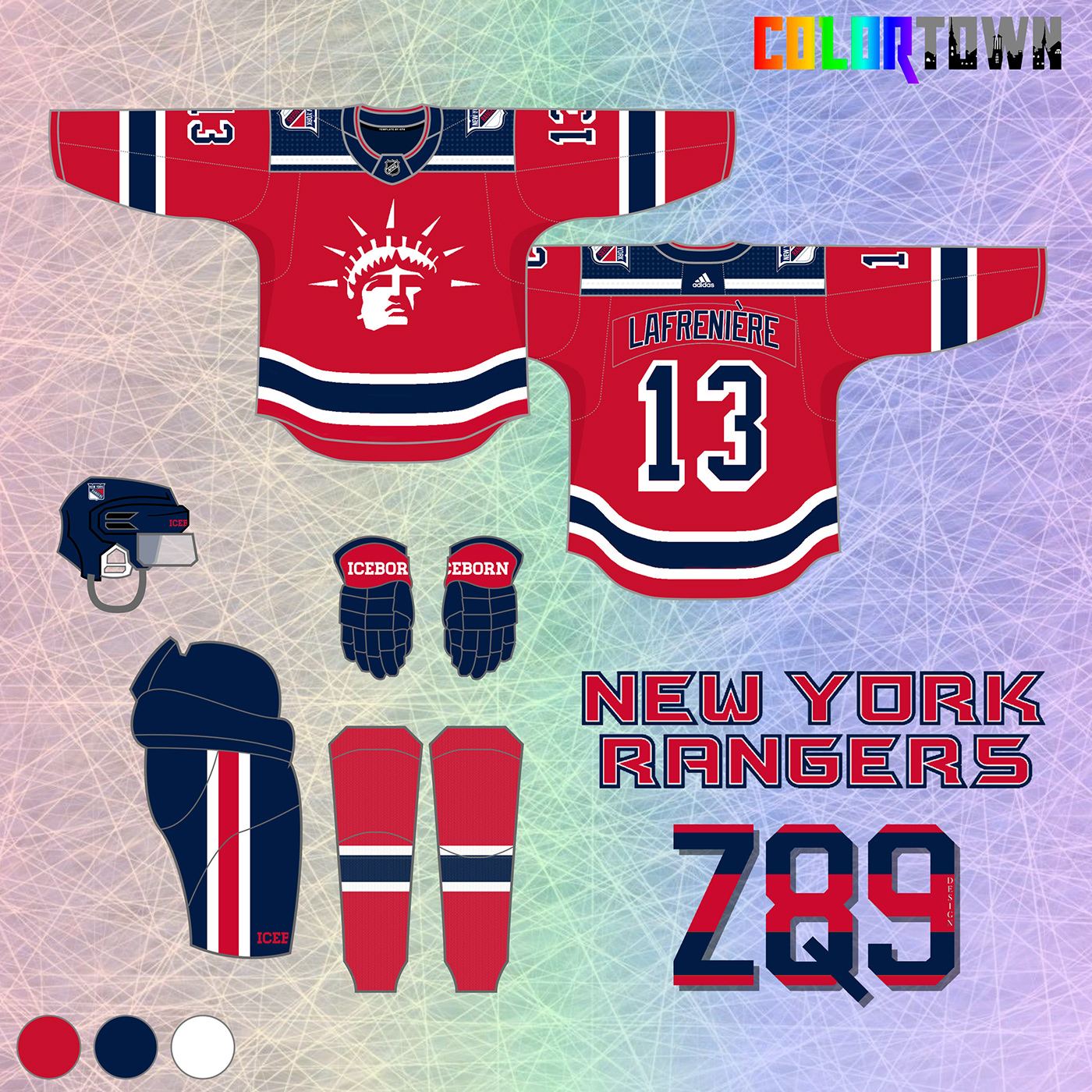
New York Rangers
Of course, I'd never change the actual Rangers home & away jersey, but for a concept series, this is how I'd do it. Lady Liberty returns for the 3rd jersey, along with a vintage looking 4th. If I was going to alter anything, I'd have the stripes mirror each other, so that's the key change here, plus the home jersey gets a yoke. Also, I love when teams use the city/location name on the road set, so that comes back here too. The Lady Liberty jersey might be the greatest alternate of all time, so this is my modern take on it. And lastly, I wanted to feature the Rangers logo on one of the jerseys, so the 4th features a neat version of that.
ColorTown Commentary: I was dreading having to put them in red, but I'm pretty stoked with how it turned out! Lady Liberty is already a top tier "town" element, and I minimalized it here, combined with some simple, bold stripes.


Mid-East Division
In what is another tight cluster of teams, I wanted to keep Pittsburgh and Philadelphia in the same division. Plus, Cleveland and Columbus would be another great in-state matchup. Buffalo rounds out hockey's rust belt.

Buffalo Sabres
I love the recent return to their original look, but I always thought a little more white would look nice on the Sabres home blues. The road set uses a slightly wider middle stripe... that variation between home & away isn't something I usually do, but it just popped here and didn't work on the home set... so I went with it. I love the buffalo logo with the wordmark, so it's featured here too on the shoulders. The Sabres tried a yellow jersey a few years ago, and it was a disaster... but I think it could work in theory! The first alternate uses a re-colored version of that fantastic buffalo logo, along with some really bold stripes. Lastly, the Sabres alternate from 2010-12 is one of the few wordmark-based jerseys I've ever really liked. I go vintage white with this one and used the crossed sabres from the main logo on the sleeves. Hopefully, this pulls off a classic, yet modern look!
ColorTown Commentary: The Goat Head is back, but in navy, yellow and white. I also returned to royal with my Buffalo designs in the main series pictured below, so this keeps the navy around as an alternate. The flag pattern moves to the sleeves as the town element.


Cleveland Barons
I always liked their look, short-lived as it was, but couldn't help but go with another unique color scheme here, rather than overused red and black. The old-English script in the logo inspired me to go gothic. For the home and away set, I picked the darkest red I could that still looks distinctly different from the black. I used a gothic pattern sublimated in the stripes and couldn't help but have a little fun inside the collars! I enlarged the state outline and B for the main crest. For the first alternate, I know diagonal lettering gets old. but something about it in that old English script looks cool, right? Also, the state outlines around the sleeve numbers pay homage to the original jerseys. The 2nd alternate mimics the original stripes, but implements my new red along with a cream color.
ColorTown Commentary: I return to the original color scheme here and an element of the city flag on the shoulders. This has a retro feel that echoes the original look, mixed with some modern touches.


Columbus Blue Jackets
For the Blue Jackets, the cannon comes to the forefront full time here with 3 jerseys modeled after Union Civil War uniforms. The cannon logo comes to the forefront on the home and away jersey. Gray takes over more on the road set so that the cream color doesn't clash with the normal white. I also think there's just too many red/white/blue combos in the NHL... It makes sense for the Jackets because of the Ohio flag, but it also works to not feature red, in my opinion. The 1st alternate is based around the "Great Coat" uniform in the top right corner of the graphic below. The canon logo leaves the circle here as well, while the arm stripe pattern mirrors several other uniforms seen below. I wanted to do a lime green jersey somewhere in my series, and Columbus was about the only place it made sense... I'm picturing this as a promotional "Stinger Night" uniform worn 2-3 times a year - the fans get lime green t-shirts... etc...
ColorTown Commentary: I've always thought their current logo was a little generic-looking, but what about as state-flag themed stripes wrapping around the arms? The under-used Union soldier cap logo is featured front and center here, and once again, NO RED!


Philadelphia Flyers
I always liked the Flyers sweaters from the 80's and 90's that featured a little more black than their current sets (although both are great). I built in a little nod to the logo in the arm stripes as well. Black is back as an alternate, and the 2nd alternate features larger arm stripes and a logo reversal. This is one of only a few sets in the series where the primary logo is used on all four jerseys... It's so iconic, I'm not sure any other way works for Philly!
ColorTown Commentary: We go vintage white here, with the primary logo featured in orange combined with some extra thick black outlines. The "town" element in this one is fun, featuring the "Broad Street" road sign on the right sleeve!


Pittsburgh Penguins
I love both the classic era and robo-penguin jerseys and you'll probably notice elements of both here. The original logo wins out, but the stripes reflect the design of our 90's friend. I think it results in a nice mix of the two eras! The road set mirrors the home. It doesn't quite reflect the robo-penguin connection as well but still looks pretty sharp. For the first alternate, I wanted to incorporate the famous bridges in Pittsburgh somehow. I messed around with a lot of ideas and settled on this unique stripe pattern on the arms which most closely reflects the Clemente bridge. The logo colors are adjusted here too. Last is a throwback-themed second alternate. It mixes elements from a few of the Penguins' jerseys from their early years.
ColorTown Commentary: A Steel City theme comes front and center both with the primary gray color and the texture inside the arm stripes. And, since I didn't use "Robo-Penguin" in the main series, I had to bring him back here!


Provincial Division
With Hamilton and Quebec back in the mix, I thought it would be awesome to have an all-eastern Canada division. These matchups would make for some fantastic rivalries!

Hamilton Tigers
The Tigers were only around a few seasons and wore primarily black and yellow. Since there's a fair amount of that in today's NHL, I used their classic logos, but created a totally unique color scheme (burnt orange, charcoal, light gray and peach). I wanted to use a primary color that no team is using in today's NHL, so I picked this dark orange color that I thought was fitting with a team named the Tigers. I also used a light orange/peach color that pops against the darker gray. For the first alternate, I combined the classic H logo with the walking tiger and used the charcoal color as the backdrop. The second alternate features a tiger stripe pattern sublimated in the jersey against a light gray background, reminiscent of a white tiger.
ColorTown Commentary: I went all out with "The Hammer" city nickname on this one, even using it in the stripes. We return to the team's original yellow and black color scheme, along with the charcoal gray I used in my original designs.


Montreal Canadiens
Of course, Montreal is possibly the most untouchable of the Original 6 teams. If I had to change the home and away (I wouldn't), here's how I'd do it. I wanted to use similar striping patterns on the home/away set, unlike the non-matching actual jerseys and tried to make the logo pop by having it "interrupt" the stripes using negative space. A little more blue is featured around the waist than on the current set. The stripes on the away jersey match the home set minus the outlines. A red shoulder yoke is a must, and the red collar ties it back to the greatest eras in Habs history. It's very cool that the Habs reverse retro goes blue. Mine first alternate is blue as well, but changes it up from home/away stripe pattern and features a re-colored logo. Last is a throwback-themed second alternate, using a few of the early 1900's logos on the front and shoulders. It's a simple, but unique look thanks to the diagonal striping on the torso.
ColorTown Commentary: Maroon is back for the second time in this series, combined with a brighter blue and the logo from the 2016 Winter Classic. The city logo is used as a shoulder patch here as well.


Ottawa Senators
The home jersey is black again, as it should be (just like real life), while the newer 2D Logo (it really is better, guys) takes center stage. A key change here is that I brightened the gold color to more of an old gold, rather than a mustard color. I've always liked the Roman pattern, so it's in the stripes of my set. Red takes center stage again in the first alternate, and I used a very under-appreciated logo as the primary. The stripes are similar, but slanted on the arms, and the primary logo goes to the shoulder. The 4th jersey is more or less a replica of the 2014 Heritage jersey, which is one of their best ever. The only critique of that jersey is that it's a little boring, so I added a laurel pattern around the numbers on the arms to add a unique design element.
ColorTown Commentary: I deconstructed the 2D logo here and feature silver as the primary color, which I've always liked as an accent for them. The stripes are derived from both the logo and the Ottawa city flag to incorporate the "town" element.


Quebec Nordiques
The Nordiques are one of my all time favorite NHL looks, so it was a blast to bring it to the Adizero template and update the look. The home and away sets spread the colors around a little more than the originals and add some waist and arm stripes. The fleur-de-lis match the main jersey color and migrate from the shoulders into the stripes on the arms. I've always liked the old igloo logo in white from their WHA days, so I put it on a red alternate. Also, I had an idea to do a second alternate that mirrors the city flag itself. I think it works pretty nicely and looks unlike anything you see in the NHL today.
ColorTown Commentary: I'm pretty excited about the "town" element in this one... Québec is derived from a native Algonquin word that means "where the river narrows"... So, I took that meaning and applied it to the stripes of this jersey. The fleur-de-lis symbol sits in the stripes right where they're starting to get thinner. Navy blue was used as the new color here, mimicking the color of a river and still fitting with the Nordiques classic color scheme.


Toronto Maple Leafs
For the Leafs home and away sets, I went with a combination of eras. I love the 60's logo with the double outline, so I applied that to the current logo. I'm also fond of the more simplified 80's-2000's leaf logo, and that's featured on the shoulders. Shoulder yokes are included and double stripes are featured on the arms and waist. Most of Canada would hate the first alternate, but for a concept series, why not? The 80's era Team Canada jerseys are some of the greatest of all time... I figured, why not give the best sweater to ever feature a leaf "new life" with the one team named after a leaf? The second alternate is play off of the 2018 Stadium Series jersey with some new design elements, namely the leaves sublimated into the arm stripes. You gotta love that all white look!
ColorTown Commentary: Two-color teams are tough in this series, since I can't use a color I've used previously, so I went with green, reminiscent of the team's 1st year as the Leafs and the preceding years as the St. Pats.


Southeast Division
To round out the Eastern Conference, the old Southeast Division reunites in its entirety. This might be my favorite division aesthetically in the whole reimagined league!

Atlanta Thrashers
The Thrashers always had a bit too much going on with their color scheme, so I simplified it in my series by using red-orange, sky blue, and a midnight blue color that's on the line of crossing into purple. The goal was to bring a very 2000's look in to the 2020's. For the home set, that totally unique red-orange is married with an unused logo from their history... I love the A combined with the bird... the curved stripes also match the curve in the logo. The road set mirrors it. The 1st alternate abstractly shows the "T-bird" flying through the sky, and the stripes convey motion while serving as an extension of the logo. The 2nd alternate features the team's original logo re-colored and takes away the shoulder yoke, so the midnight blue color is out in full force.
ColorTown Commentary: Colors from the Atlanta flag are featured here, along with a throwback to the team's classic look that featured an "Atlanta" wordmark down the sleeve.


Carolina Hurricanes
For my Canes concepts, I aimed for an intimidating, intense look by removing white from the primary logo and stripes featured on the home, away and second alternate. The gray alternate is dubbed the "Storm Warning" jersey and features some "cyclone" stripes that wrap around the arms. Carolina has struggled with a unique identity throughout their history, and I'd love if they fully dove into the "hurricane warning" motif. They really need to abandon traditional elements and fully embrace their 90's era roots - in other words...go a little nuts!
ColorTown Commentary: I used a cutout of the team's primary logo as stripes here on top of a stormy gradient background. One of the never-used prototype logos is featured on the shoulders, while the state flag symbol comes front and center as the main crest.


Florida Panthers
The Panthers are featured as one of the most colorful concepts in my series, and rightfully so. This is a franchise that should use its unique location as the southernmost team in the NHL to the fullest throughout their identity. The jumping panther comes back to the forefront, albeit the modern version. It's a great logo they never should have abandoned, and the modern version looks great. I took a lot of the old sun themes and applied throughout all the stripes. The color palette is expanded too to include a "Caribbean blue" and bright orange to round out the sunny Florida theme. I also brought back the old Florida flag/stick/sun logo on the shoulders. The first alternate features a modified jumping Panther logo and no shoulder/upper arm stripes. I like the navy blue contrast with the brighter stripes, and it uses negative space to depict the panther attacking from the shadows. The second alternate is one of the most out there concepts I've created, but we've seen crazier things in the NHL before. The bright blue is front and center here with the old shoulder patch featured as the main logo. Sunshine themed stripes are featured on the arms.
ColorTown Commentary: The vice theme may be a little overwrought at this point, but I went for it anyways. Plus, it was a great opportunity to incorporate a prototype logo that I actually saw for the first time this past weekend in the new
@icethetics video!


Tampa Bay Lightning
The Lightning currently have one of the five worst jerseys in the NHL, in my opinion. Like the Hurricanes in the mid-2010's, they need to stop trying to be "faux-Original 6" and fully embrace the fact that they're less than 30 years old. Additionally, not featuring black is a crime, because the blue and white is a straight up Toronto ripoff. My series aims to rectify this problem. The home set brings some lightning stripes to the sleeves and most importantly, adds black back to the core color scheme. The road jersey gets the same treatment, but adds white piping to separate the blue from black. One of the problems with a darker blue and black color scheme is that they blend together too much, hence the piping. Our first alternate brings black to the forefront and uses the awesome silver lightning bolt from the team's actual alternate jersey, and the stripes on the arms change here too, so it feels like a significant departure from the home/away sets. Finally, for the second alternate, I went with a gradient for the first time in my series, adding a rain pattern. The look mimics a storm landscape if you follow downwards from head to toe. It's a modern take on the infamous storm jerseys from the 90's, which are the definition of "so bad it's good."
ColorTown Commentary: The town theme for this one is a derived mostly from personal experience. I've been to Tampa several times, and it seems like at any given moment you can look over the ocean on a nice day and see a storm brewing. Distant Thunder is the theme!


Washington Capitals
The Caps desperately need a refresh from probably the "Edge-iest" jersey left in the NHL. While it was cool to see them return to the patriotic red, white and blue, their template is a relic at this point. On top of that, they're sitting on what might be the best secondary logo in sports. The "Weagle" gets its due here, coming front and center on the home and away set, coupled with stripes that mirror the DC flag. For the first alternate, the Screaming Eagle logo comes back, with a jersey that's a hybrid of the original and late-90's color schemes. Lastly, the 2nd alternate is a refreshed version of the 2015 Winter Classic jersey, using a unique modification of the home/away stripe pattern. Also, since the top of the W is shaped like the top of the Washington monument, the stripes are meant to abstractly represent the iconic photo shown below the jerseys here... with the blue being the water:
ColorTown Commentary: A bit of a Reverse Retro vibe here, using the original royal blue as primary. The "Town" element here is that there's 50 stars from head to toe... (I'll add a 51st somewhere if they become a state :))


Western Conference
Central Division
Moving over to the Western Conference, you'll notice that Detroit comes back to the Central. In my expanded league they're the current East's most Western team, and they have great rivalries historically with several of the other teams in this new division. I'd love to see my Blues play the Wings five or six times a year again, so this is admittedly a selfish move :)
Moving over to the Western Conference, you'll notice that Detroit comes back to the Central. In my expanded league they're the current East's most Western team, and they have great rivalries historically with several of the other teams in this new division. I'd love to see my Blues play the Wings five or six times a year again, so this is admittedly a selfish move :)

Chicago Blackhawks
Early on in my series, I left a few jerseys mostly unchanged. Seeing as I wanted this project to represent my ideal looks for every team, it was hard to imagine the Hawks doing anything different from their current home and away set. As much as I hate the team as a Blues fan, there's no denying they look great. There are some minor changes, however. Laced collars are added, and the city flag stars are featured inside the collar. Also, the black on the road jersey extends to the edge of the waist, aligning it more with the home set. For the first alternate, I was inspired by several other recent concepts to expand the feather colors throughout the jersey. I love how all those colors pop against a black background. Lastly, for the second alternate, I wanted to create a "city jersey" that takes those flag elements and spreads them throughout. I even experimented originally with some ideas that used the city flag colors as well but ended up sticking with the original scheme.
ColorTown Commentary: The city flag colors take over here, and a variation of the classic secondary logo is front and center.


Detroit Red Wings
Detroit is another of the "untouchables," but controversially, I've always felt that their red jersey is a little... boring. The road whites with the red sleeves, on the other hand, are one of my favorites. Here, however, I went with a different stripe pattern that features more white on the home uniform and matching red stripes on the road set. The first alternate jersey is a play off of the 2014 Winter Classic jerseys, but uses a wide barber pole pattern and square frames around the numbers. The second alternate is the "Motor City" jersey, themed after the city's well-known automobile manufacturing history. Looks fast, right? Checkered sleeves, racing stripes and that great winged "D" logo are featured, while the classic logo makes a great shoulder patch.
ColorTown Commentary: Rules of the series dictate I couldn't use red or white as primary, so the fans voted on black! I used that classic 90's "Hockeytown" logo, aptly, as the "town" element here. The slanted stripe aims to convey the wheel flying down the road.


Minnesota Wild
I've always thought the Wild had a pretty brilliant logo. It was certainly tough to replace the North Stars, but the landscape/bear combo is so clever. That said, there's always been a little too much of a Christmas feel that I've never been able to get out of my head. These concepts aim to change that by implementing the yellow color from the sun in the logo. That yellow hearkens back to the North Stars in a more subtle way, than say, their new reverse retro jersey. For the home and away set, red is less present in the logo and is more of an accent color throughout the jersey. I also took the shooting star from the logo and made it part of the striping. It kind of has this cool orbiting effect around the arms based on how the logo element curves - this is best seen in the 2D renderings below. The home and away especially are relatively simple, but clean. For the first alternate, red comes back, but with some yellow elements that separate it from the green. I personally just don’t like red and green right up against each other, but if you introduce too much yellow, you’re moving too close to the Flames. This is a balance. The final jersey features the old number font and script logo, which I normally don’t like, but I always thought the jersey that featured it was one of the Wild’s best. In the center stripe, the trees from the logo are sublimated.
ColorTown Commentary: This is by far the most out there design of the series so far, but I got some major inspiration from another designer's (SethR94 on Twitter) aurora-themed Timberwolves design and used the same color scheme here!


Nashville Predators
The current Preds jerseys are bottom five in the NHL for me, but not because they wear yellow. I love that they have a unique primary color that nobody else uses. Yellow is actually my favorite color, which is weird... but I especially adore it in sports design, especially outside of basketball, which is about the only place where it's consistently at the forefront. The home jersey introduces a more balanced blend of yellow and navy, and I used the state flag logo as part of the sleeve stripes. On the road set, I reversed the colors of the main crest to make the yellow pop more against a white background. The Winter Classic patch shows that the “Predator” doesn’t necessarily have to be only one color, so I expanded on that idea. I incorporated the checkerboard pattern on all 4 jerseys, which Nashville used on an old alternate. You can actually see it more clearly with mine than the originals, though. The Winter Classic patch takes center stage on the first alternate, and I think it pops nicely against the center stripe. Lastly, I wanted to pay tribute to the Preds original jerseys, complete with some shiny silver! Yellow takes a more background role here, although it is present to accent certain elements.
ColorTown Commentary: The crest is combo of the city flag and an old secondary logo. It also features an interesting steel blue color that I pulled from the original 90's palette. Silver accents round out the scheme for a unique look!


St. Louis Blues
This whole series kicked off because I wanted to put together a few Blues jerseys! They're my childhood team, and seeing them win the Cup in 2019 was a dream come true. In my opinion, their current alternate is a perfect hockey sweater, so I barely changed anything there, save for a reference to "Gloria" inside the collars. My road jersey takes the original 1967 whites and simplifies them by removing the very "stripe-y" shoulder yoke. These are my ideal home and away set for the Blues. For the first alternate, I put the Blues in yellow, something I've always wanted to see (don't get me started on their reverse retro). It's been their secondary color since they came into the league, and on top of it being my favorite color, I think it would contrast beautifully with the blue note. For the second alternate, I wanted to pay tribute to team I grew up watching in the 90's, so I put a new spin on the "clown" jerseys and brought the underrated trumpet logo front and center.
ColorTown Commentary: Navy is used as the primary, since I haven't used it yet for the Blues, and elements of the St. Louis flag are used on the arms and shoulder patches for the "Town" theme. I think it rounds out my Blues concepts nicely!


Northwest Division
The Northwest Division features four Western Canada teams and the new Seattle Kraken. Winnipeg was a natural fit, coming over from the Central.
The Northwest Division features four Western Canada teams and the new Seattle Kraken. Winnipeg was a natural fit, coming over from the Central.

Calgary Flames
I created these Flames concepts before they went back to their original look full time. The home set features similar stripes to the team's new (also old) jerseys, but features white arms and a re-colored shoulder patch from '13-'16 alternate jerseys that I really like. The road set is simply reversed. Black is removed from the core home/away set. I'm 100% pro-original Flames color scheme. The first alternate is based off of smoldering/embers - all black with red and yellow outlines and stripes. Blasty gets a nod inside the collar. Black is a significant color for the team historically, so I wanted to create a new riff on that. Last is a jersey that uses different colors of flames as a stripe design. This is obviously based off of how the colors of a flame change as fire gets hotter (example below). Plus, I love maroon as a main jersey color!
ColorTown Commentary: Yellow is used as the primary, and Blasty is front and center! The "town" element is subtle this time, as the pattern from "The Bow" skyscraper is sublimated inside the numbers.


Edmonton Oilers
The Oilers should always wear royal blue at home. The primary jerseys riff on the classic 80's set with modified stripes and a sublimated oil tower pattern going down the arms. I think it's a neat detail that wouldn't really be visible unless you were up close. Logo colors are modified slightly as well. The away set features a version of the logo never used before. I don't really like white background logos on white uniforms for the most part, so this features more orange and blue. All 3 sets that feature the variation of the main logo feature the tower pattern sublimated on the arms. Orange reverts to 3rd jersey status and features the more traditional stripe pattern and the logo colors are again modified. Lastly, the second alternate plays with the idea of using navy but is more interesting than the honestly boring alternate they have today. The tower pattern is featured front and center in the stripes, and I grabbed a piece of the '01-'07 alternate logo for the main crest here.
ColorTown Commentary: Since I've exhausted blue and orange in my main series, I went with a unique copper color and mixed in the rest of the 90's-00's color scheme. Part of the Edmonton flag makes an appearance near the sleeve cuffs to bring in the "town" element.


Seattle Kraken
I'm a big fan of the new Kraken branding. It fits the region and is an outstanding addition to the league. For the home set, I wanted to use a unique color, so I took the "Boundless Blue" from the unveiled scheme and used it as the primary. I'm ok with the navy blue in the actual set, but my whole series is dedicated to more unique color schemes, so that's what I went with here! I used the tentacle from the logo in the arm stripes of both the home and away set. i think it's a cool design element without going too cheesy. The road set also uses the darker version of the anchor shoulder patch. I HAD to use the awesome intertwining logo from that tattoo that went viral! I used the darker anchor, re-colored the primary logo and made it the crest of my first alternate jersey. The ice blue is primary here and I used some Isles fishstick-esque but more subtle wave stripes. Last but certainly not least is a Metropolitans-themed throwback. Honestly, this is one of my favorite jerseys I've ever made. If you hadn't noticed, I kept the coral color from the pre-unveil branding. This gives a new team a modern, yet awesomely retro alternate look!
ColorTown Commentary: My only real disappointment with their new identity was that the coral color from before the unveil was left behind. It's front and center here, while elements of the Seattle flag are used as the stripes.


Vancouver Canucks
I'm Team Skate all the way! For the Canucks home jersey, the sleeve stripes now use negative space to create a V pattern, while a re-colored stick-in-rink logo is used on the shoulders. Johnny Canuck is featured as the helmet logo, while white is completely removed from the jersey, which I think is pretty unique. The road set adds a shoulder yoke to this look for the first time, while altering the stripes slightly to include all three colors. The first alternate is reminiscent of the yellow jerseys worn from '85-'89, which are sort of forgotten because of the "Flying V" monstrosities that preceded them. I've always loved the yellow jersey that featured the skate logo, so I gave it the same treatment as the main set with a slightly different, exaggerated V pattern on the sleeves. The second alternate is probably the most original jersey in the set. I took out the bright orange/red color and replaced it with maroon, while keeping the yellow and black in the stripes. This is a mashup of the original Vancouver Millionaires jerseys, combined with the colors of the 90's.
ColorTown Commentary: Their "Skate" jerseys are my favorite historically, but I explored that theme completely in my main series. So, to blue and green we go! City flag themes are all over, and Johnny Canuck is front and center!


Winnipeg Jets
I’ve always adored the Jets 90’s logo. It just looks fast and somehow brilliantly uses a wordmark to visualize speed. So, I combined it with a similar striping pattern from the heritage classic jerseys to create a modern, yet retro look. The Jets current logo has always looked like more of a shoulder patch to me, so that’s where I put it! For the road set, I came up with an idea to reverse the logo colors. Interestingly, this was never done (at least that I can find) with this logo. Love how it turned out... it really pops against the white jersey backdrop. Admittedly, I went a little crazy with the first alternate. I really wanted to figure out a way to incorporate the original WHA logo... it was never used on a jersey... but I love the old time hockey feel. The second alternate is my take on a “Whiteout” jersey. That building looks awesome during the playoffs, and I thought having a jersey set that compliments it would be cool. White pants? Yes. Yes indeed.
ColorTown Commentary: I used the Jets modern logos to contrast with the more throwback themed main series. The "town" element is the Esplanade Riel bridge inside a maple leaf on the sleeve.


Pacific Division
The Pacific Division is unique in my league, since it features no red or blue color schemes. The Seals are back, creating a cross-town rivalry with the Sharks. Four California teams plus Vegas creates some tight geographic rivalries!
The Pacific Division is unique in my league, since it features no red or blue color schemes. The Seals are back, creating a cross-town rivalry with the Sharks. Four California teams plus Vegas creates some tight geographic rivalries!

Anaheim Mighty Ducks
Eggplant and jade make a big return here. Let's be real, those colors never should have left, and if the Ducks were smart, they'd bring it back full time yesterday. The goal with the home and away set was to modernize the original jerseys. The jade takes on a slightly reduced role but is still present as a strong accent color. I think the deep eggplant color really pops against the white edges of the uniform. The road set is a simple reverse. Note that the logo on all four jerseys has had the orange color in the stick and black background removed so that the logo blends more consistently than before. All four jerseys have a movie reference inside the collar, but the arm stripes on this one are also a subtle tribute to the infamous “Flying V”. Sorry. I’m a 90’s kid. I also created a new shoulder patch based on Anaheim’s city flag. For the second alternate, the gray accent from the original set moves to the forefront here. This is kind of a color rush vibe, and I think the bold eggplant and jade stripes really pop against the neutral gray main color. I think this set looks intimidating when you visualize it on ice.
ColorTown Commentary: This is my take on the original movie jerseys with more purple, an Anaheim flag-themed shoulder patch containing the original NHL logo, and the team's current number font. A modern update to a classic!


Los Angeles Kings
By not featuring purple (Forum Blue), the Kings current jerseys are currently the biggest missed opportunity in the NHL. In my series, the home jersey features what is the best looking crown in the team’s history. A new striping pattern is used as well. This is really an attempt to take the original jerseys and update to a modern look. The road jersey mirrors the home. Each set features a “royal” pattern at the edges of the arms, a neat detail that wouldn’t really be easily visible on the ice but would look cool up close. The yellow 3rd jersey features the 2000’s logo recolored with big and bold arm and chest stripes. The more current font for names and numbers comes back here. I'm really happy with the blend of old and new on this one. Lastly, the second alternate jersey plays off of the Stadium Series jerseys they wore in 2015, but with purple, no black and less gray. I think the two-toned jersey is a unique look and the purple contrasts well with the white, using gray as a separator.
ColorTown Commentary: The NHL won't give us purple, so I'm giving you two shades on one jersey. Lavender? Yep. Purple and black are used as contrast, and the "town" element here is the arch pattern inside the black stripes, invoking memories of the old LA Forum!


Oakland Seals
For the Seals, I introduced another unique color scheme - dark green, yellow, and seafoam green. I like how it echoes the MLB A's (one of my favorite looks in sports). Honestly, I was never a huge fan of the original logo, so I used some simplified versions here. For the home and away sets, I used a simplified version of the original seal logo with fewer outlines and stripes that match the angle and direction of the seal. The dark green differentiates them from other green teams (Whalers, Stars, North Stars) that all use a brighter shade. The alternates are a little bit "ugly in a good way". The more faded yellow looks retro. I also wanted to introduce an oceanic color. They're the Seals, after all, so I went with a seafoam green that's not really used much in sports. For a 2nd alternate, I think it works!
ColorTown Commentary: The mid-70's color scheme is back for this one, complete with a new crest that's part wordmark, part Oakland city logo. One of my favorites in this series... I think it rounds out the set nicely!


San Jose Sharks
For my Sharks concepts, gray comes back in a big way, as this set blends some of the best elements throughout Sharks history. The home set stripes match the original '91-'97 jerseys, but the shoulder patch and center logo are current. The numbers use the dark to light pattern present in the water element of the alternate fin logo. On the home jersey, it's shades of gray, while on the away set, it's shades of teal. For the first alternate, the gradient-like pattern is expanded beyond the numbers and into the center stripes. I think the Sharks current black jersey is a little boring. A shark on a black jersey will always be cool, but that doesn't mean all color should be abandoned. For the second alternate, gray comes to the forefront, another shark logo variation debuts, and a teeth pattern is used on the arm stripes. Teal equipment is new to this set as well. The gray kind of invokes stormy weather, and this application would be very unique.
ColorTown Commentary: This one is ridiculous, admittedly, but I've always loved the waves in the now retired Sharks secondary logo, so I went crazy with it. This series is supposed to be a little wacky, so as a 5th jersey, why not?


Vegas Golden Knights
I really like Vegas' current jerseys. I love that they use a unique gray color for their primary. That doesn't change here, but a gold castle pattern replaces the current stripes, and red is taken away in favor of a heavier focus on gold. They are the Golden Knights after all. The road set features the same design with black swapped out for gray in the upper arm area. The 3rd jersey expands the castle pattern, and gold is used as the primary. My goal was to make it look "shimmer-y", just like their new, actual alternates (although I put mine out first :)). The helmet is a Notre Dame style gold. I love the way the gold and black contrast, and the stripes really pop. The second alternate is what I'd coin the Vegas (K)Nights jersey. A card suit pattern is introduced to play up the nightlife theme. I created a shoulder patch that is a Knight chess piece with a modification of the word mark embedded. The Vegas star doubles as the horse eye. This jersey was all about playing off of the Knight/Night homonym, so I went a little wild with it!
ColorTown Commentary: I had an idea to somehow visually represent the lights of the famous strip on a jersey... So, I used a "golden glow" that fades into black, complete with some neon stripes! Pretty wild, but I love how this turned out!


Westward Division
I coined this the Westward Division, since it starts at the gateway to the west in Missouri and heads all throughout the Rockies and American southwest. I also love how it would feature another in-state rivalry between Dallas and Houston.
I coined this the Westward Division, since it starts at the gateway to the west in Missouri and heads all throughout the Rockies and American southwest. I also love how it would feature another in-state rivalry between Dallas and Houston.

Arizona Coyotes
The Coyotes Kachina Jersey is a Top-10 favorite of mine, so I ran with it. It’s really the original city jersey, and I’m not sure to this day there’s a better aesthetic representation of a team’s locale. I ramp up those themes here, especially the sun, moon and desert. For the home set, hunter green is primary. I adore the black Kachina jersey, but in my set, it makes more sense to use black for one of the alternates. The yin and yang of the sun/moon themes begin, albeit slight, as the home favors the moon on the shoulders and in the main logo. The road set is the first of a few in my series that uses a variation of white, in this case “sand”, as the main color. Sun themes are more present here in the main logo and in the new shoulder patch I designed that is a combo of the team wordmark and state flag. I've coined the first alternate the “Valley of the Sun” jersey. The burnt orange, brick red and sand colors come to the forefront here, and I altered the logo to remove the “moon” half so the coyote face is fully “sun”. The new shoulder patch elements are faded behind the Coyote logo. On the flip side, the second alternate is the “Desert Moon” jersey. The opposite alteration occurs with the main logo, and purple, hunter green and black dominate the scheme. For both alternates, there are some cool inside collar designs and the pants feature a cactus element.
ColorTown Commentary: I started with the Yotes, because they already capture the main idea of this series so well.


Colorado Avalanche
The Avs are one of my more divisive designs but one I love nonetheless. The current blue color is "split" into navy and ice blue. I’ve always loved how the Avs logo conveys motion, so I tried to abstractly reflect that in the stripes too. I went back and forth with navy as the primary color for the home set but settled on the more unique burgundy color. It's a similar story here for the white jersey plus an added shoulder yoke to round out the look. The first alternate is the “Deep Freeze” jersey. Burgundy is removed and navy/ice blue dominate the color scheme. I wanted this to look “cold” and love how it turned out. There’s also a neat mountain pattern sublimated in the center stripe. Lastly is the “Ice Storm” jersey. This is a really unique color, and since I love unique colors, I made it the primary. I made sure to incorporate the Colorado flag logo here and implemented some bold stripes. It's hard to say how this would look in real life, but I like it in theory.
ColorTown Commentary: I used navy and ice blue in my main series, so I went back to their current blue for this concept. The Colorado flag and a mountain pattern are used on the sleeves, while the old yeti foot comes back front and center!


Dallas Stars
As much as I would typically love a team to use green instead of black, the Stars differentiated themselves from the North Stars when black became part of their color scheme. So, I went with that here, along with some strong green accents. I like the combination with gold, rather than silver as well. The Winter Classic logo is front and center on the home and away jerseys with their classic logo sublimated in the chest stripe. I love the use of negative space, and I think it works really nicely here with a pretty simple, but bold logo. For the first alternate, I did throw it back to that North Stars heritage but used a combination of logos that I think looks pretty cool. The second alternate is essentially a reverse retro that I made before that was even a thing. I'm going to brag by making a purely subjective statement here... mine is better than their real reverse retro... I've actually changed this one a little since the original Twitter post too, as it now features the original Texas state outline alternate logo in green on the shoulders.
ColorTown Commentary: I didn't want to put them in gold or silver, so I went with about as dark of a green as you can without being black. The city flag is featured fully on the shoulders as the town element here. I think the white and silver really pop!


Houston Aeros
In my design version of the NHL, the Aeros get promoted and round out the league as the 40th team (32 current NHL teams, 7 defunct NHL teams, + 1 defunct WHA team: the Houston Aeros). I kept the diagonal letters and added directionally matching multi-shaded blue stripes, representing the different shades of the sky. For these, I wanted to do something really unique with the Aeros classic dark blue, light blue and white. The colors of these stripes remind you of the different altitudes and clouds a pilot might see. It’s also a play on the famous Tequila Sunrise look used by another Houston team. The first alternate is a sky blue, using the same template as the home/away, while the second alternate is a retro themed throwback using the team’s original logo.
ColorTown Commentary: In my version of the NHL, the Houston Aeros are the 40th team, rounding out the existing 32+7 cities that lost their teams. One of the reasons I wanted to do this series was to OCD complete every team's look. The Aeros were top of mind here. This concept fully completes the theme of "Altitude." The 1st Alternate is "below the clouds", Away is "in the clouds", Home is "Above the Clouds", and ColorTown is "Above the atmosphere." The 2nd Alt doesn't fit the theme, but this is a historic franchise (albeit non-NHL), so they deserved a throwback too! The space theme also brings in the "town" element, considering NASA's history in Houston. Sorry for the long post, but it's one of my favorite sets in the whole series! Hope you all enjoy.


Kansas City Scouts
For the Scouts, I shifted the original royal blue to navy, which really makes the red and yellow pop. A different perspective of the Scout statue is used here too, "overlooking" the city skyline inside the collar. I really like how the navy/red/yellow color scheme turned out here. I found a silhouette image of the scout statue and thought it would look great on a modernized version of their jersey inside a circular logo. The first alternate uses red as the primary and introduces a unique chest stripe, and for the second alternate, I used a barber pole pattern on the sleeves, which I hadn't done yet in my series (waited until the end too... since this was the 39th of 40 teams I designed!) It's kind of wild, but fun for a 4th jersey.
ColorTown Commentary: For this one, I went back to their classic color scheme, combined with the newer NAHL logo as the main crest. The "town" element here is the script on the shoulder pulled from an iconic mural in the city.


That's all, folks! I hope you enjoyed this series, whether you're checking it out for the first time, or you followed along the whole way through. This was a blast, and I loved exchanging ideas with all you hockey aesthetics nerds out there. More to come! A few shout outs:
Credits
3D Templates - Adizero 2.0 Jersey, Hockey Puck, Goalie Mask, Sports Fabrics Mockup Pack - sportstemplates.net
2D Jersey Template - KP8Design
2D Gear Template - Iceborn
Logos - Sportslogos.net
Thanks to the following for inspiration, retweets and support that helped grow my account:
Bardown, Pete Blackburn, Lucas Daitchman, DetroitSportsNation, Eric Dunkel, Gateway Grinders, Andrew Harrington, Hockey Central, Icethetics, KP8Design, Paul Lukas & Phil Hecken (UniWatch), Pensburgh, Brandon & Jordan Santalucia, Jeff Tasca, The Jersey Nerds, The ScoutLook Podcast, UniMockups, Amanda Zielonko (my wife), Sofie Zielonko (my daughter)... and my dad, mom, brother and buddy Mike (who got way too many of these sent to them before I actually published!) + Many more that I didn't intentionally leave out!
...& all my Twitter followers and fans along the way!


