


Arizona Iced Tea: Rebranded
(For Graphics Project)
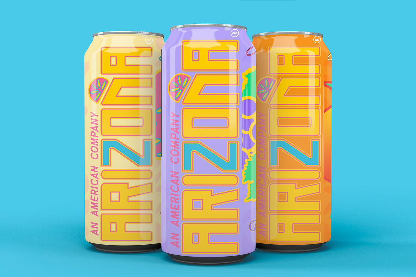
For my Graphics Project, we had to pick an food/drink and redesign the logo. I chose Arizona because I love their drinks and the uniqueness of their can designs. I decided to change their logo by giving it a more fresh, bolder, saturated, 90s look. When I'm shopping, the color of a logo and packaging design stands out to me the most first. For my logo, I decided to use a bold font and medium-saturated colors that are visible to the eye from far away.


ORIGINAL LOGO DESIGN MY LOGO DESIGN


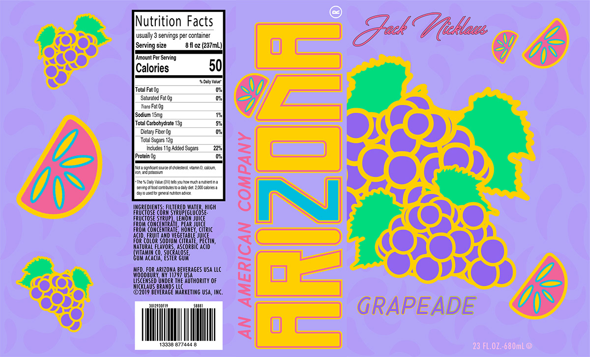
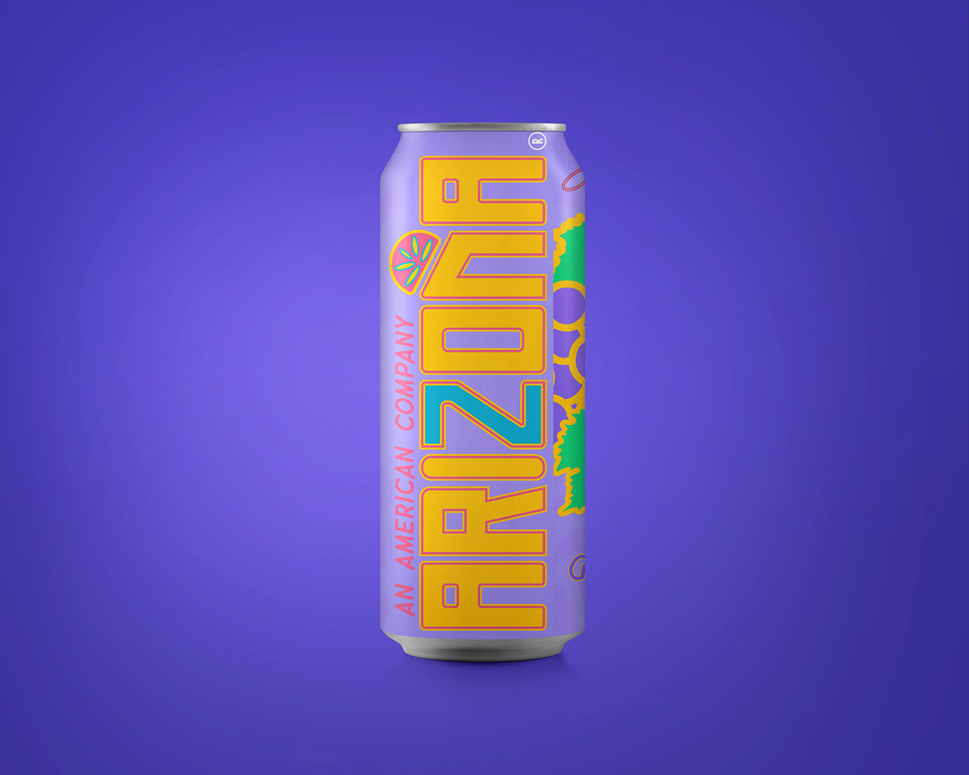
The original Arizona logo has more muted colors and uses geometric shapes with pointed edges in their logo design. The logo is only used on certain flavors such as lemon-flavored iced tea and the cranberry juice iced tea. I decided to design my logo so that it could be the same on every can. Instead of the changing the logo for each flavor, I would only change the designs' can label to go with each can, which included the fruits used and the background color of the can. Since the "Z" stood out in the original design, I made the "Z" in my design blue to stand out. I added a lemon slice on the slant on the "N" as the illustration to go with my redesign of the Arizona logo. My logo design is fun and very inviting and can be seen from far distances. The target audience for Arizona Iced Tea is for all ages! Since the cans cost only $0.99 in stores, anyone and everyone can purchase it. It's the perfect drink for kind of occasion!

For my color palette, I chose to use blue, yellow and pink. These colors have very nice contrast when set next to each other and stand out the eye. They are also very inviting, fun colors and give off a nice energy that is playful.


Poster Design Concept


Strawberry Lemonade
Grapeade

Mucho Mango


Wallpaper


