
Product branding and packaging design for a Japanese tableware brand, KINTO.
My challenge was to express the concept of each product with a simple and minimalistic design while distinguishing the identities.

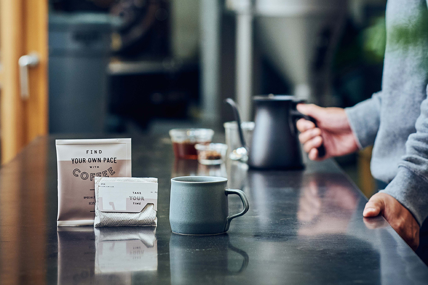
DRIP BAG from KINTO makes single-origin coffee accessible for everyone and its packaging carries a message wishing people a fresh start to every morning.
Combining letterings inspired by vintage food labels with a sleek colour palette, the design gives a friendly yet sophisticated impression to the specialised coffee.


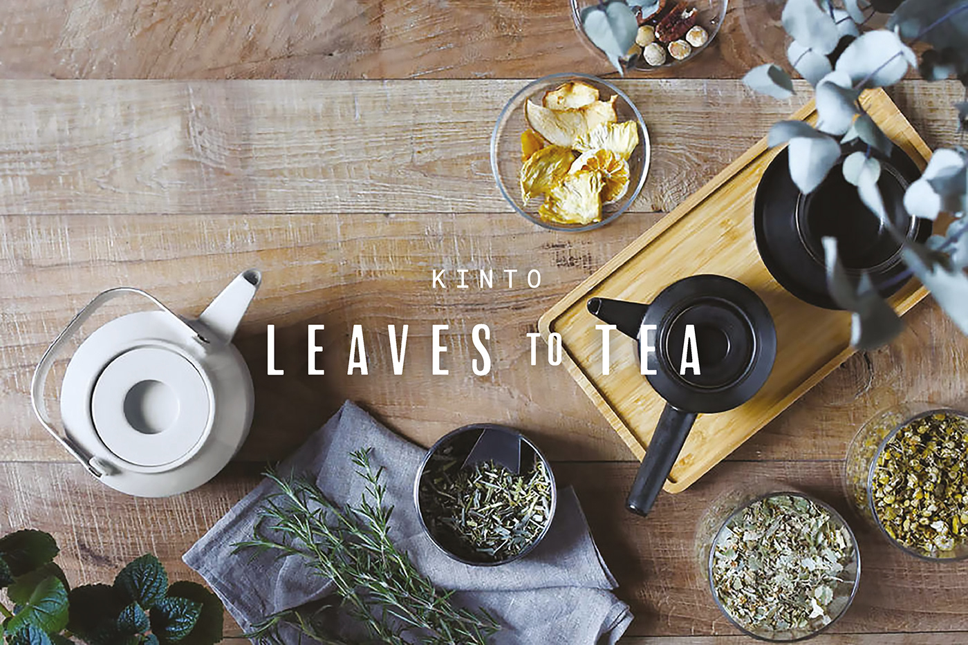
LEAVES TO TEA is a tea-ware collection by KINTO, which invites users to appreciate the roots of different tea cultures while bringing in a fresh perspective and sensation to the everyday tea experience.
The lettering was created with thin rectangles and delicate curves to express the formal and modern characteristics of the product. The large letter spacing represents the product concept that leaves room for each user to reinterpret their tea experience.


SACCO is a single-flower vase with playful and organic form. You can enjoy pairing various flowers and plants with it.
The packaging design is inspired by a perfume box, making you imagine the presence of flowers in your life. The typeface aims to match with a round yet elegant shape of the vase.

DAY OFF TUMBLER is for a relaxing yet active day off. With a rounded handle that is comfortable to hold, it is perfect for carrying around on walks or day trips.
The logotype is designed to match the modern, understated mood of the product. The packaging design emphasises the iconic shape of the bottle.

Year: 2016-2019
Client: KINTO
Photo: KINTO
Client: KINTO
Photo: KINTO


