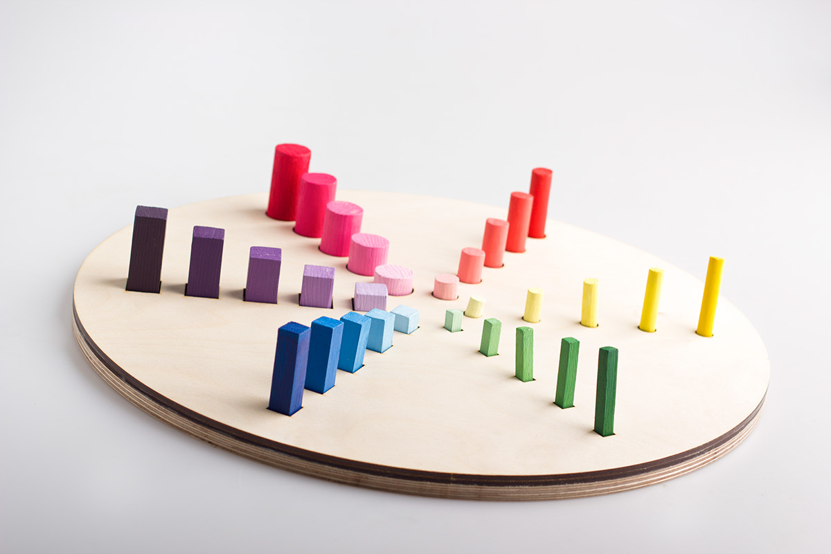
A color wheel for blind and side-blind people.
Thanks to a cooperation with a school for blind and sind-blind teenagers I larned that sightless people are capable of creating beutiful paintings (both abstract and realistic). Even though they can't see they can still learn how to use colors in an extraordinary way. To help them understandend the relations between colours I build the object that is presented below.
The explanation attached to it says:
The round blocks represent warm colours, the square - cold.
The higher the piece the more saturated and "strong" the colour is.
Pieces that are close to each other are similar. By using these colours you will create a soft, mild image. The colours of blocks that are far from each other differ a lot. The biggest distance means that they are the complementary (opposite) colours so putting them on one picture will make it vivid.


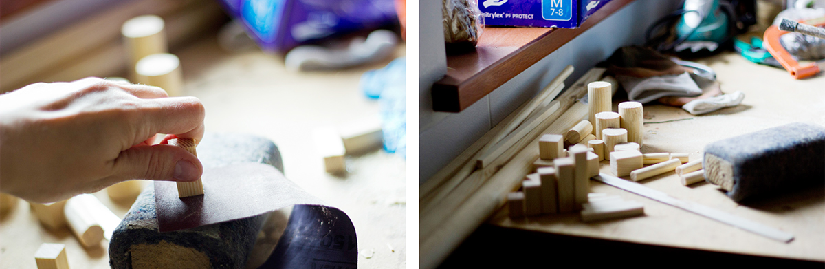
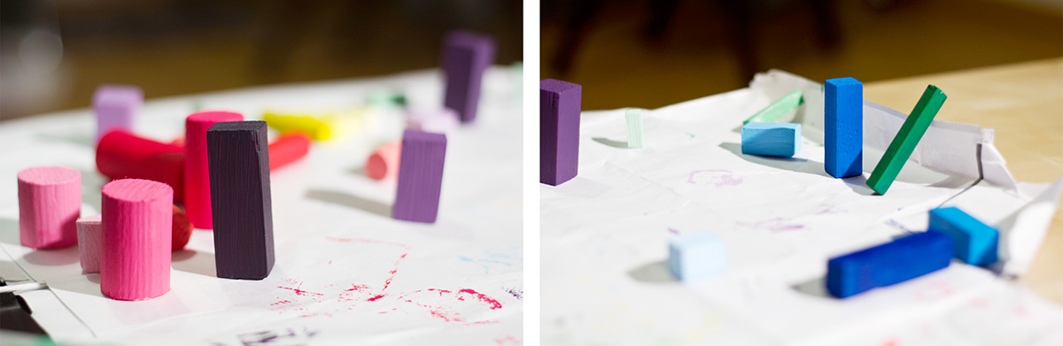
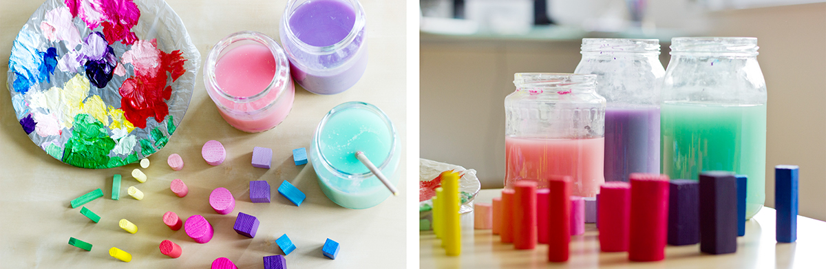
making of: