


Fashion Curation Platform i TOO
Brand Identity Development
Apr – Sep 2020
As an household name in the Korean home shopping industry, Lotte Homeshopping has been pursuing digital transformation. With new mobile content and platform businesses, the company plans to address the rapid growth of the online mobile market and changes in the main target groups.
As a part of the efforts, Lotte Homeshopping planned a new fashion curation platform where a diverse community of users share style suggestions and communicate with each other.
Plus X
Creative Director: Myungsup Shin
BX Director: Tyodi Hyojin Lee
BX Team Leader: Bohyun Kook
BX Strategist: Yurim Kim, Sunyong Kim
BX Designer: Sungeun Lee, Sieun Baek, Hwan Kim
LOTTE Homeshopping
DT Division Director: Ho Jin
Project 2 Cell Leader: Dohee Jung
Project 2 Cell Manager: Ted Choi
PMO Cell Leader: Kyungtae Ryu
PMO Cell Manager: Joonghyun Park
PMO Cell Associate: Jiyun Choi
© 2020 Plus X Co.
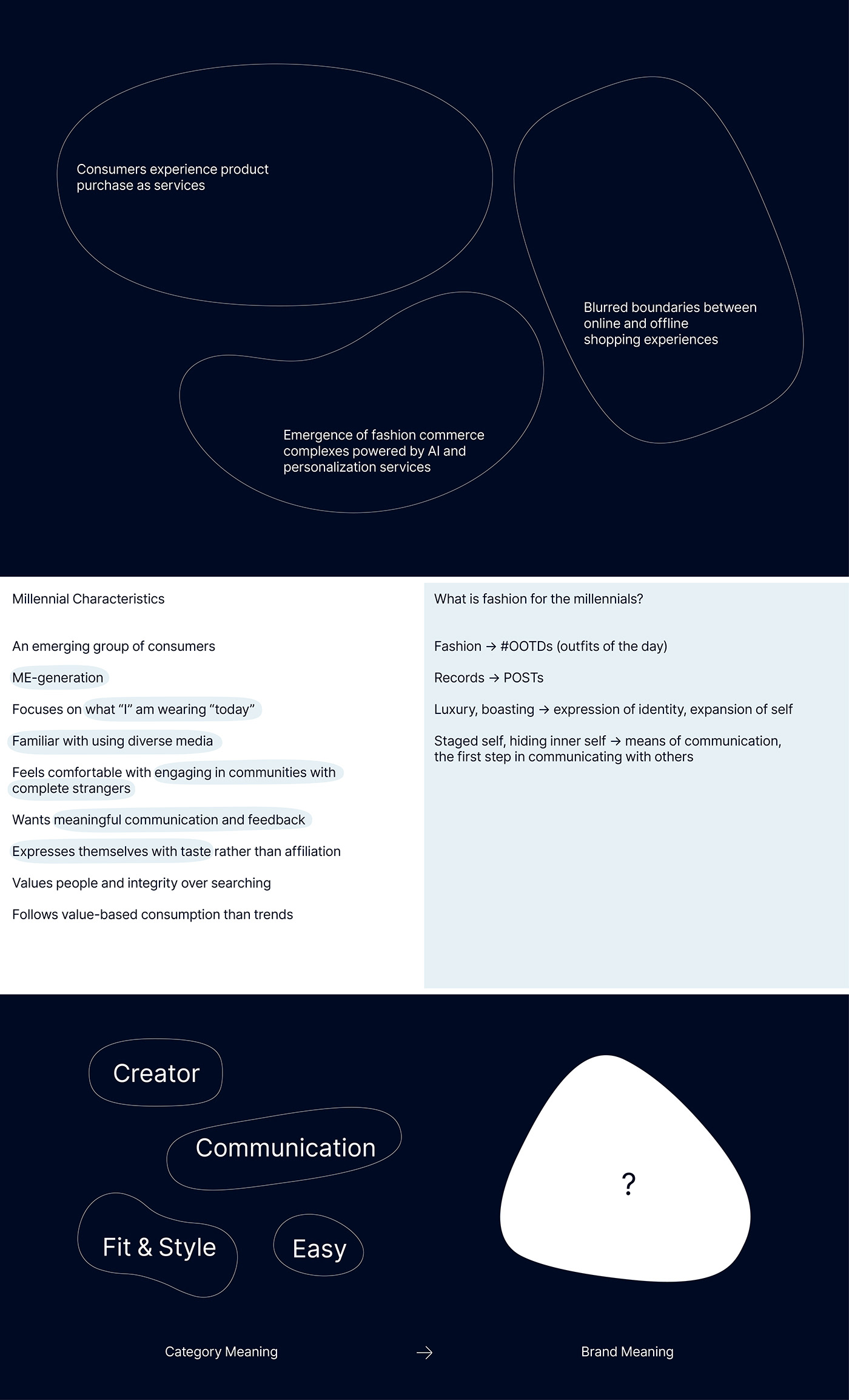
To define the new brand’s identity, we defined the core values and the essence of the business by analyzing three C’s: category, customer, and competition.
Category
In recent years, timeliness and convenience have gained greater significance in the online fashion market. Various platforms provide services that narrow the gap between online and offline shopping experience, such as early morning/same-day shipping services.
Korea’s fashion platform market began with the soho malls in the Dongdaemun area in the early 2000’s. Since then, the market has witnessed the emergence of new “commerce complexes,” and the evolution of personalized consumer services power by latest technologies. Examples include personalized curation, AI, and mobile services.
Customer
As heavy content users, the millennials lead the mobile shopping market across various digital media.
For the millennials, fashions mean their “OOTDs,” or outfits of the day, and “POSTs,” or records with clear intentions. For them, fashion is not a way to boast luxurious lifestyles; it is a means to express their identity and expand their boundaries. Through fashion, they do not share a staged version of themselves; they communicate with others while staying true to their inner selves.
Competitor
We studied what values similar service platforms appeal to consumers. Most players rely on values such as fit & style, easy, communication, and creator. They create their images with key words highly associated with their business categories. In response, rather than creating images bound with certain categories, we decided to create unique images and values that will generate preference for our brand and build it into a leading presence in the market.
Business Definition
Based on the 3C analysis, we identified the essence of business for the new fashion curation platform.
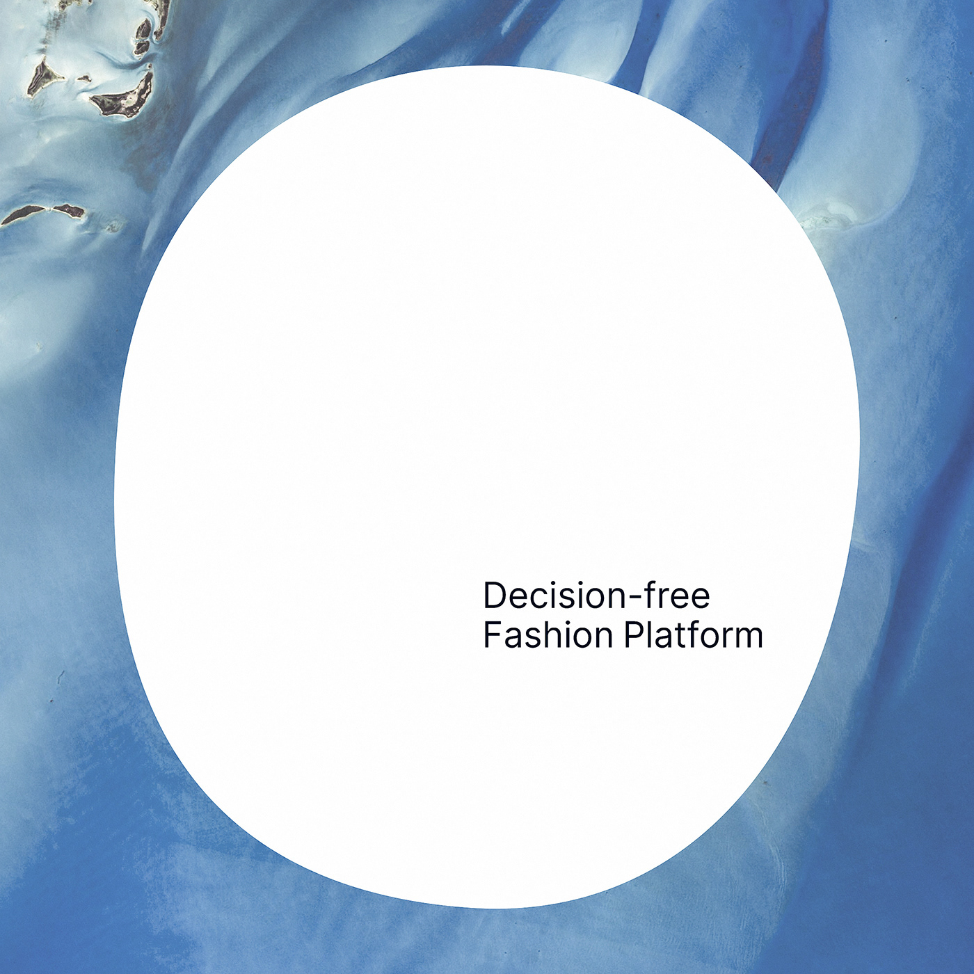
For us, curation is about liberating customers from the very idea that they have to “choose” something. It is about helping customers form relationships with others, grow confident about their own taste, and find unexpected joy in the process. For us, curation is a decision-free fashion platform liberated from all types of “choice.”
Brand Essence
As the core idea guiding the fashion curation platform, we defined our brand essence based on the core values and essence of business. Brand essence represents the raison d’être of a brand and guides all activities related to it. It proposes directions for the brand.
A brand that allows customers to share their fashion needs without limit, in the most familiar and smartest way. A brand that brings like-minded customers together, offering opportunities to experience the joy of finding confidence in their own tastes and styles.
Brand Core Value / Design Principle
We defined the core values for the fashion curation platform as a “Decision-free Fashion Platform.”
Self-expressive: allows users to discover their true selves
Warm Technology: provides technologies directly affecting customers’ lives for a better shopping experience, which helps them define their tastes and styles through fun and new discoveries
Seamless: provides fail-proof and comfortable shopping experience

Brand Name
With the new brand name, we sought to symbolize a platform where people of various body types and styles can communicate through fashion. We finally decided on the name i TOO. It stresses the community aspect of the platform, where people of different styles can share information and experiences.
From ‘i’ TO ‘O’thers
Meet others, both similar and different,
to discover myself both old and new.
The A to Z of fashion,
Bringing diverse body types and styles together.
i TOO.

Brand Slogan
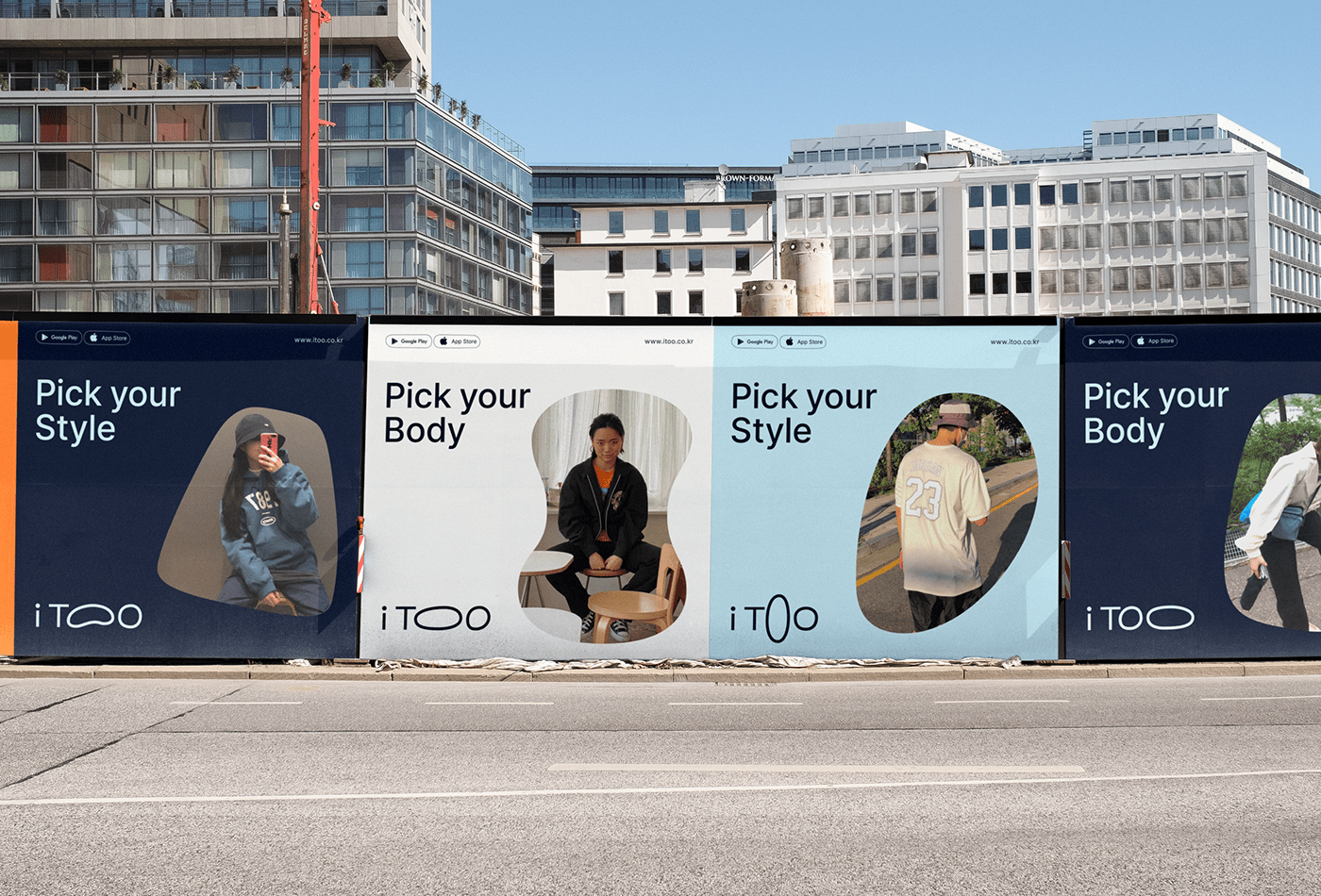
As a new brand, i TOO needed a slogan to deliver a recognizable message that accentuates the nature of the platform. Our answer to the need is the brand slogan, “Pick your Body, Pick your Style.” It represents the platform’s focus on diverse body types and styles.
Pick your Body, Pick your Style
Pick your own body type and style
Pick the body type closes to yours
Pick your favorite style
Discover the style that fits your body type and taste
Your body type translates into your taste
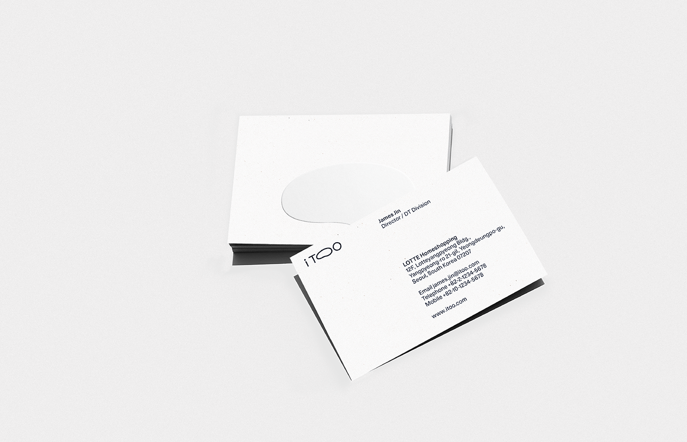
Logo Design
The i TOO logo was inspired by the human body. The logos curves and shapes are modeled after the human body, and the oval shape signifies “being together,” and “connecting different styles.” To sum, the logo symbolizes the platform brand where people of different body types share their OOTDs. The free and dynamic platform serves as a bridge among different users, body types, and styles.
The i TOO logo offers opportunities for dynamic variations. From lean to plump types, it can be adapted to a wide range of Fashion DNAs. The logo can be adapted in various ways, centered around the letters “I” and “T.”
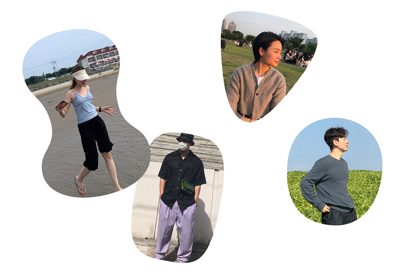
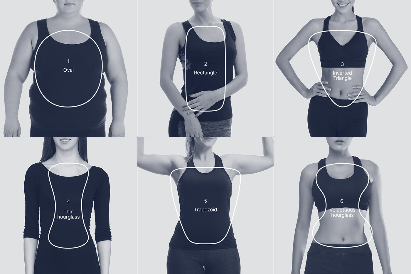
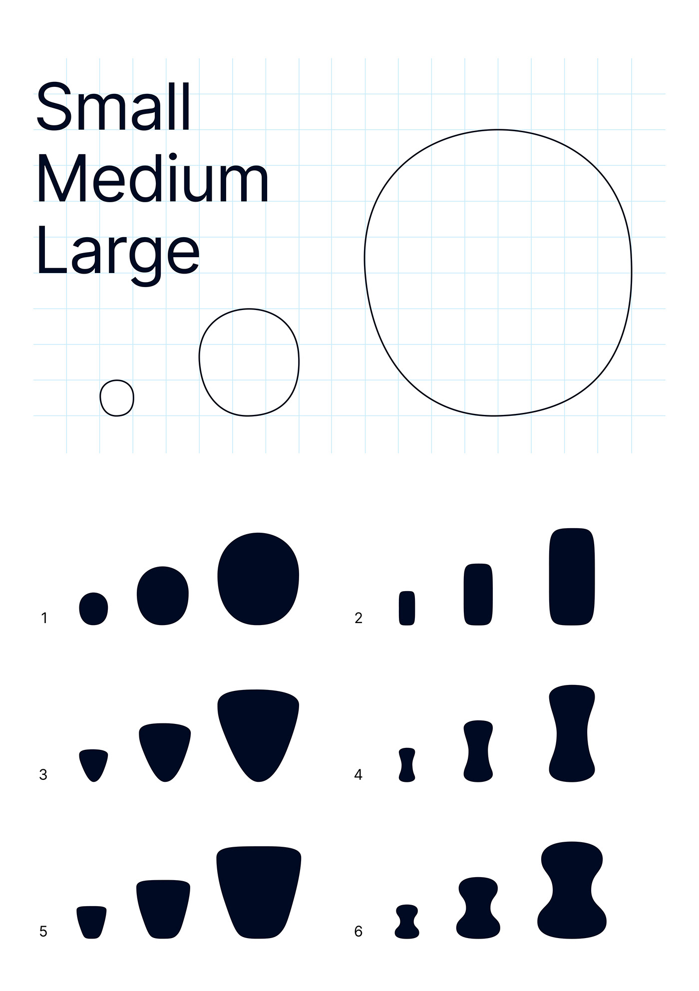
Key Visual System
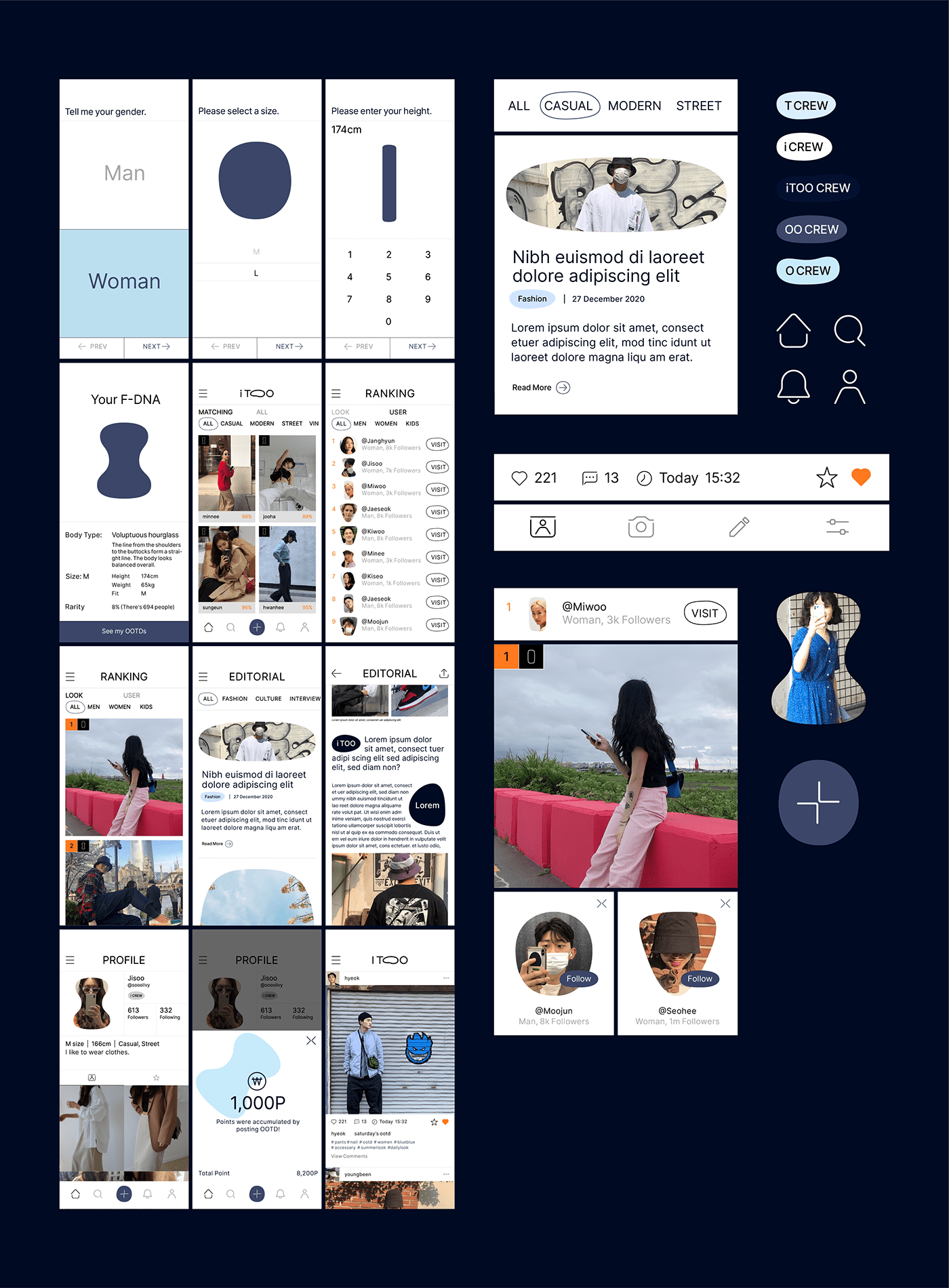
The key visuals of i TOO are inspired by human bodies of different types. The visuals’ soft curves and odd shapes depict human bodies in an intuitive and aesthetic way. The key visuals are organized under different systems, depending on gender. For women, they are grouped into inverted triangles, ovals, voluptuous hourglasses, rectangles, and lean hourglasses. For men, the visuals are categorized into rectangles, hourglasses, ovals, trapezoids, and inverted triangles. Body type graphics are also divided into small, medium, and large. They also serve as intuitive icons designed to help app users identify their Fashion DNAs.
Key Visual Usage
The key visuals of i TOO are divided into three types: line, solid, and image. They can be flexibly applied to different touchpoints and environments, helping the brand expand its identity. The visuals come in a wide range of shapes, representing the i TOO’s range of Fashion DNAs.

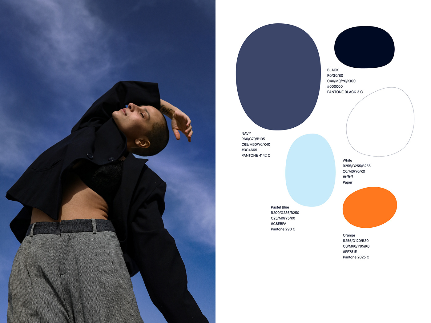
Color Palette
Navy is the main color of the i TOO brand. The color stands for the subliminal, creativity, and inspiration. It is a perfect match for the inspiration-sharing and culture-creating value of i TOO. We also added more weight to the colors, to represent our neutral and refined image. Our brand color palette captures the trendiness, modernity, and diversity of the i TOO brand.
Typography / Icon Palette
When selecting the typography for the i TOO brand, we looked for neutral and simple designs not associated with specific genders. Also, the typography had to have room for diverse Fashion DNAs. We also selected functional and practical fonts without needless frills. These approaches allowed us to create efficient designs for consistent and optimized usability across various environments and media.
Icons are used to help customers recognize a brand’s characteristics, and create a more refined brand identity system. The iconography of the i TOO brand consists of functional and intuitive icons. They help customers create their own experience with ease. They also inherit the formative characteristics of the brand logo. That is why these tiny elements help us form the brand’s distinguished identity.

UI Elements
The i TOO app is the most crucial touchpoint where consumers directly come in contact with our brand. It makes active use of the brand’s visual assets: logo, typography, key visuals, colors, and icons. It also relies on consistent hierarchies and layouts for intuitive delivery and efficient designs. All of these factors into creating i TOO’s unique brand experience.
Application Design
A brand’s application designs utilize the brand’s core visual assets at various touchpoints. i TOO’s application designs use the brand’s logo, colors, typography, key visuals, and other visual assets at the right touchpoints, from app services, online banners, to offline commercials.

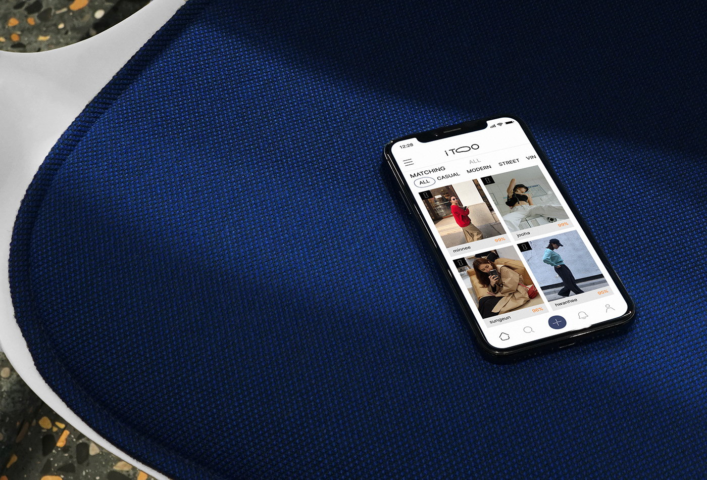
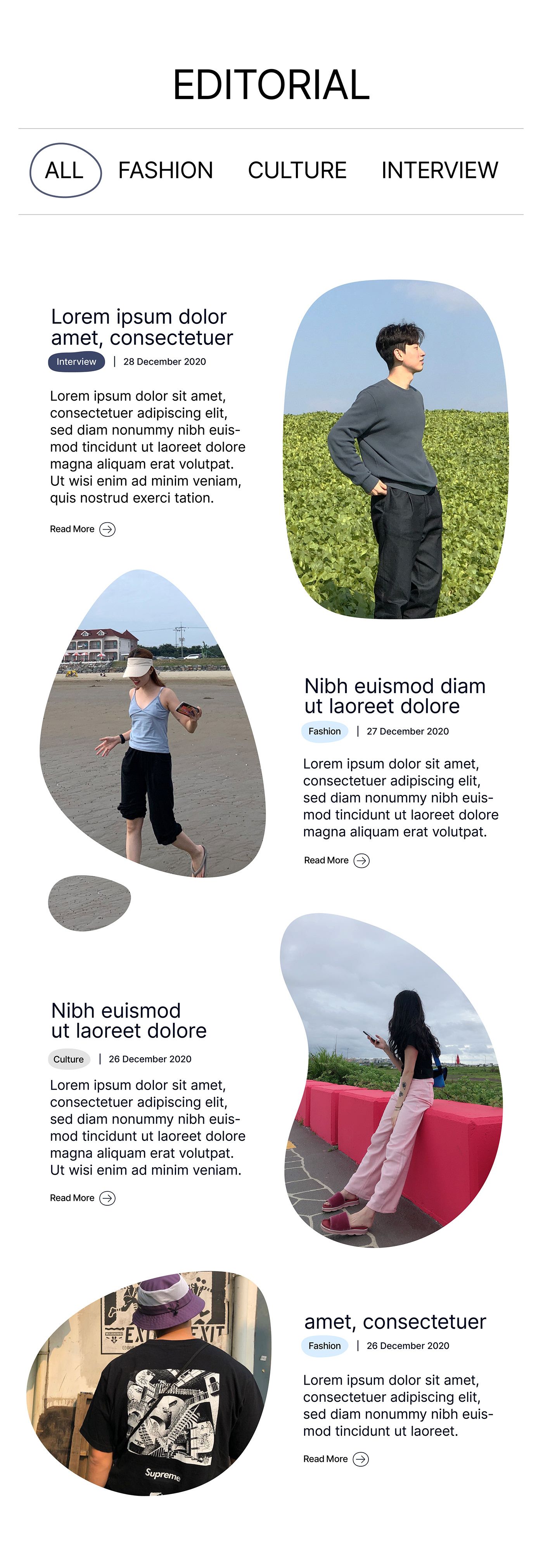
i TOO Style Survey
Users who visit iTOO will be the first to proceed with the profiling process to fill out their body types and tastes. i TOO provides you with a styling style based on data that reflects your body shape and taste.
Landing Page
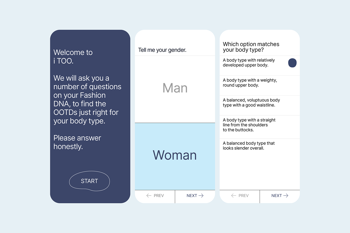
Based on the data about your body shape and taste, we recommend a variety of OOTD and style leaders that are perfect for you. Apply the corresponding body icon to the recommended OOTD and style reader to intuitively convey that the content is perfect for you. In addition to custom content, we offer a variety of styles of OOTD to help you discover new styles that go with you.
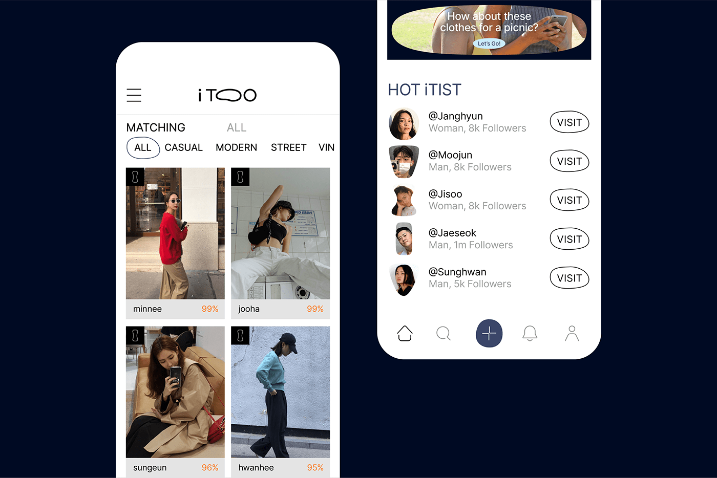
OOTD Upload
i TOO pays points for uploading OOTD so that various OOTDs can be continuously shared. We added fun with Fluid effect of key visual so that the experience of receiving points can remain a more enjoyable experience for users.


Fashion Curation Platform i TOO
Brand Identity Development
© 2020 Plus X Co.


