
Reinventing The Familiar Taste Of Home
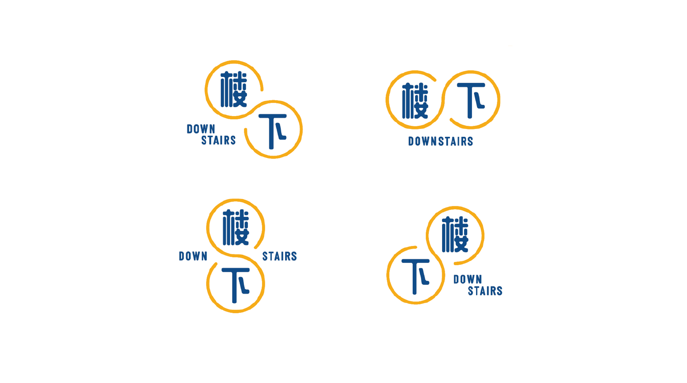
Downstairs (楼下) is a Singaporean casual eatery focused on the simple ethos of delivering good food and good memories with a smile. The name is a playful nod to the common local saying of “going downstairs” for a quick meal.
Expanding on the local identity associated with ‘Downstairs’, it was important for us to capture the nostalgic feeling of an HDB (Singapore public housing) void deck experience in a fresh way. Inspired by the joys and quirks of bonding over a simple meal with friends and loved ones in common areas, we developed an approachable brand narrative for Downstairs that exudes warmth, familiarity with a touch of reinvention.

The logo design is a stylized lucky figure 8 featuring staggered Chinese and English characters visually representing the idea of ‘Downstairs’ and how food brings people together.
The brand colours, a complementary pairing of Toasty Yellow and Enamel Blue, reflects Downstairs’ refreshed heritage and nostalgia. Secondary colours such as Chili Red, Kopi Khaki and Terrazzo Grey were based on hues usually found in our local heartland HDB blocks.

A custom-illustrated set of 40 geometric icons were created specially for Downstairs' debut. Whether it's a Kopi Sock, Nasi Lemak or a Biscuit Tin, we wholeheartedly embraced the little quirks that made for a quintessential Singaporean family dining experience.


Throughout the design process, we were blown away by our client’s commitment to serving good food and convenience at affordable prices and it was our pleasure to have partnered with them to create a brand that is designed to be friendly, and approachable to a multi-generational and multi-cultural, Singaporean audience.
Client: Downstairs
Industry: Food & Beverage
Our Role: Creative Direction, Art Direction, Graphic Design & Spatial Art Direction
Food Photography © Downstairs


