88 Roasters
Via a recommendation from a previous client I was put in touch with Jin from Jeju Island in South Korea, who was looking to give his coffee roastery a fully fledged brand. Under this same proposed new brand he was to open a cafe, introducing a new demographic of customer to his roasts.
I worked with Jin to establish what he wanted the brand to be, and how we could communicate this through an aesthetic that made sense to his business.
I worked with Jin to establish what he wanted the brand to be, and how we could communicate this through an aesthetic that made sense to his business.


The duality of a coffee roastery and a cafe meant that the identity would need to easily establish a visual language that was stamp-able across the two functions. This would enable a seamless transition from purchasing a coffee in Jin’s cafe, to recognising his roasts in competitors cafe’s who purchase it from him in bulk.
Jeju Island is a hotspot for cafes due to its high national tourism, therefore we worked on a name that represented that national pride in a way that wouldn’t intrude on its simplicity and modernism. 88 Roasters was a good fit as it harked back to the popular 1988 Olympics held in Korea and also represented the year that Jin was born. The number 88 is also visually balanced and bold.

The simplicity was a key element of the identity, Jin wanted to make it evident that real, high quality coffee wasn’t some dark art unavailable to the everyman, it was instead something easily within reach, every day.
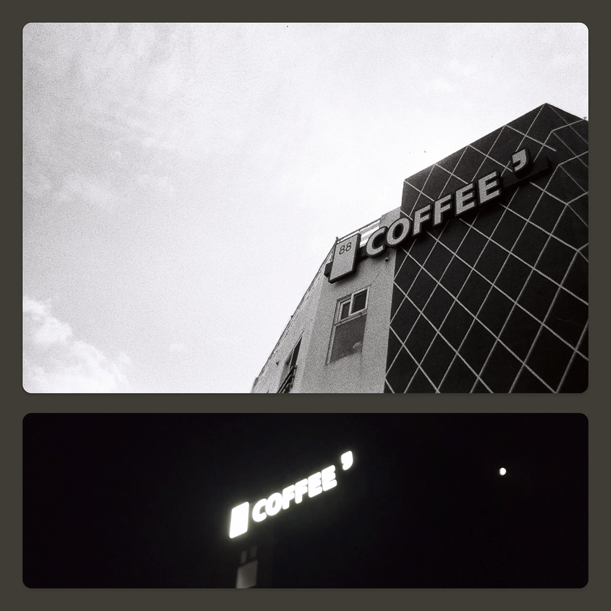
The community aspect of having his own cafe was also important to Jin so I worked on incorporating that into the identity in a way that would communicate universally. The inclusion of a single quotation mark made sense because the discussion and community it represents is understandable by all, and it also completed the minimal image of a coffee cup’s handle.
Due to the various ways that a roastery/cafe brand can be interacted with, inevitably there are some instances where a simple branded mark is sufficient, and others where a more descriptive version of the identity is needed.
I devised a system where the coffee cup handle would animate to expand outwards revealing the required length of title for the cafe. This flexibility allows Jin’s business to grow and expand into various different areas while maintaining the same overarching “88____” identity. For example:
• 88 Roasters
• 88 Special Roasts
• 88 Cafe
• 88 Coffee House
• 88 Roasters & Coffee House
• 88 Juice Blends
• 88 Book Club
• 88 Staff
• 88 Bakery
...and so on.

In order to provide further flexibility to the application of the 88 Roasters identity, I created a logotype that can exist outside of the coffee cup motif, to ensure that it isn’t overused in situations where not completely necessary.
This version of the identity could come into play is around letterheads, menu sign-offs and other external graphic communications.
In places where the plain coffee cup kite-mark has been used such as the business cards, it would not be ideal to see the expanded version of the same mark used again. In this situation the logotype seen here can be used to reaffirm the identity and complete the layout.