


.travellista
Based in sunny California, .travellista is a young company whose business focuses on building and providing extraordinary experiences for travelers and tourists. Young and energetic, .travellista has gathered much attention from travelers from all over the world. Preparing for further growth, .travellista decided to turn its company into a global brand with three sub-brands designed for three main branches of the company's current business: BEVR (beverage and refreshment), FASHIION (clothes and fashion for traveling), and DISCVR (traveling information).
Understanding the company's needs, this comprehensive project was launched to design a brand new identity for .travellista, creating a suitable foundation for the brand's further development. In addition to the new identity, the project will also design the logo for each of the three sub-brands as well as sample products for BEVR and FASHIION. For DSCVR, the project will also develop a new website and a promotional video, creating a guideline and an overview of .travellista's new strategy.

Color Palette
Being a young company, .travellista primarily focuses on promoting traveling among the younger generations. Most of the company's customers are young expats, aged 20 to 30, who love to travel and discover new experiences. As such, instead of choosing a saturated color palette, the project employed five bright colors from Pantone as primary colors, in addition to pure black and white, to create an energetic feeling, appealing to the new brand's customers. These five colors are: 7463 C, 485 C, 151 C, 136 C, and Cool Gray 1C.

The Logos
In this project, a total of four logos were designed. One for .travellista's main brand and three for each of the company's sub-brands. With most of its customers from the younger generations, .travellista hopes for its new logo to be modern, simple, yet recognizable. Resultantly, this project has employed the image of a traveling suitcase with the initial ".t" imprinted on the front as the brand's new logo mark, while using sans-serif fonts as a base to create the type mark for the logo.
Following the main logo, the three logos designed for the three sub-brands: BEVR, FASHIION, and DSCVR, were also designed. For these logos, the project employed sans-serif fonts as the base of all of the type marks used in the three logos to create a unified image with the primary logo. However, the project also created distinctive features for each of these logos to make them also stand out as a single image.


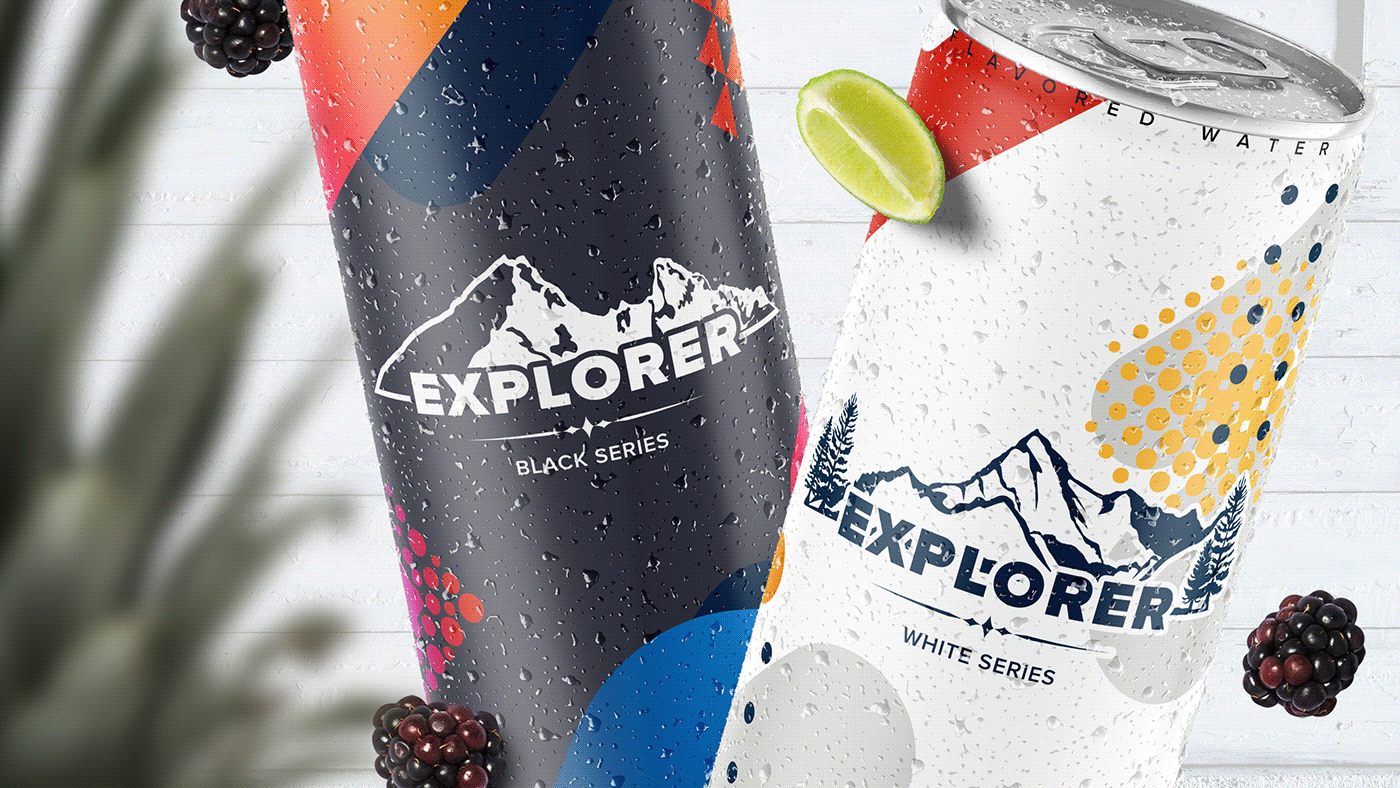
BEVR by.travellista
BEVR (abbreviated from the word "Beverage") by .travellista is one of .travellista's sub-brands. Most of BEVR's products are non-carbonated drinks, energy drinks, canned beverages and refreshments for travelers and tourists of all ages and ethnics. With the rebrand of .travellista and with the creation of its new logo, BEVR also requires a new packaging system for its widely-loved products.
In junction with BEVR's new logo, the project stepped up to create a new packaging system for the brand's products. Taking .travellista's image as a young, simple, yet energetic brand, the project employed a combination of 7 colors, including 5 accent colors from the defined color palette and neutral black/white, along with customized patterns, custom gradients to create simple, yet attractive and energetic designs.


FASHIION by.travellista
Similar to BEVR, FASHIION is also a sub-brand created by .travellista. Focusing on general fashion and light apparel for travelers and tourists, most of FASHIION's products are designed with simple illustrations and direct messages. These designs contribute significantly to building the image of FASHIION as a modern and energetic brand, fitting the unified image devised by .travellista.
For FASHIION, the project has designed sample products to promote this image, while creating promotion materials in a distinctive style to bring out the beauty of the brand's products.


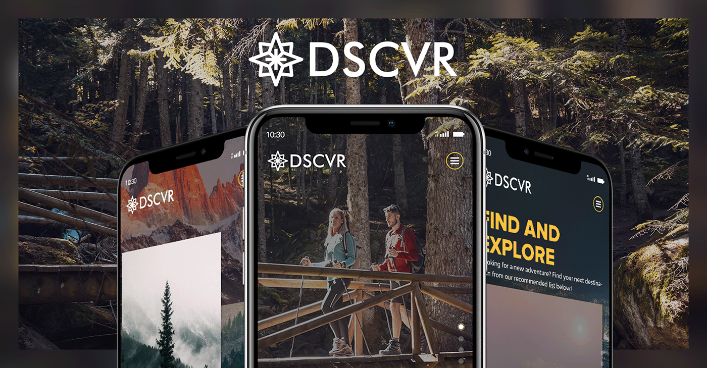
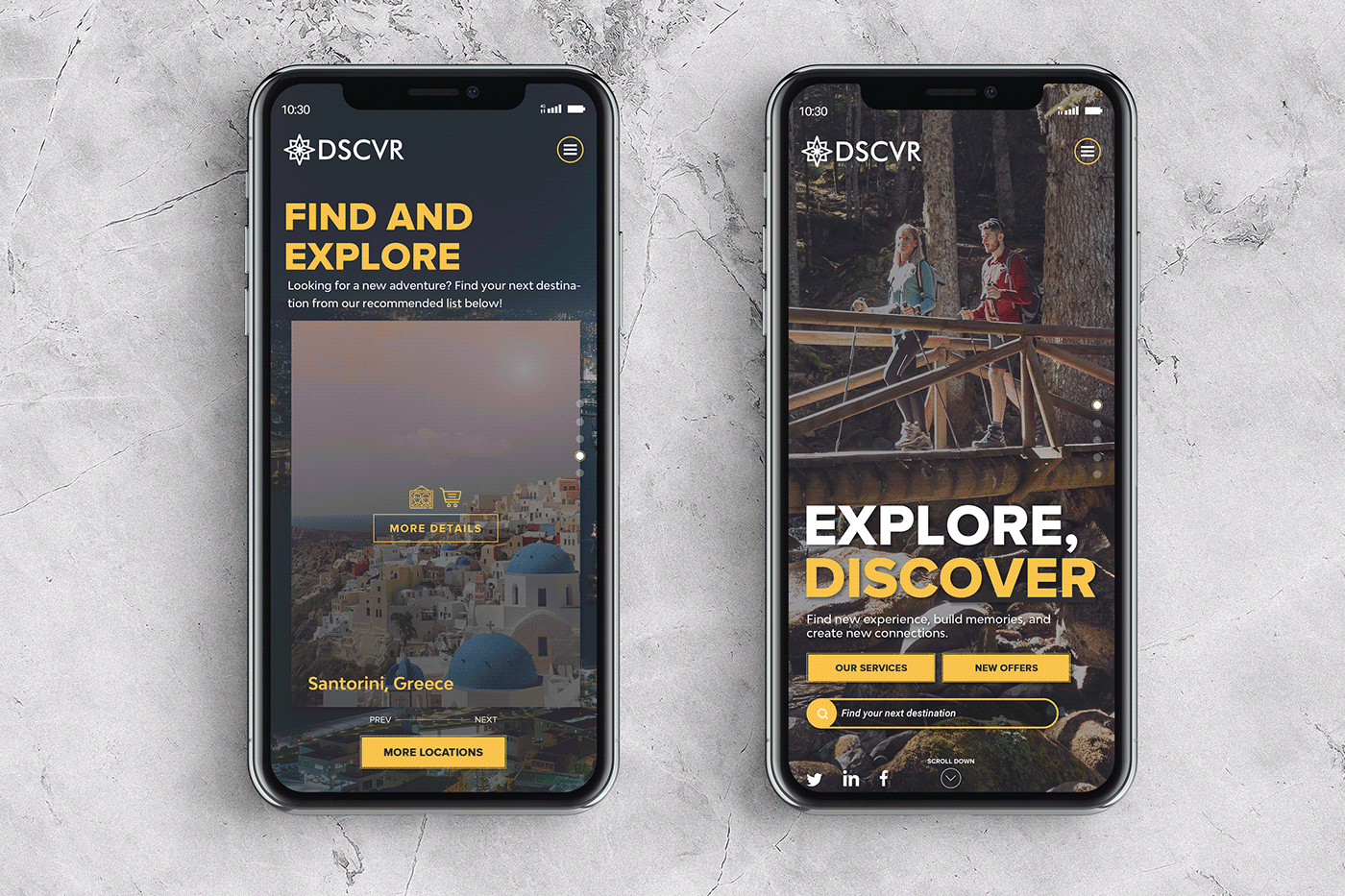
DSCVR
As the last sub-brand of .travellista, DSCVR focuses on providing booking service and latest traveling information for its customers. For DSCVR, the project has designed and developed a dedicated website for the brand. Understanding that the major of customers at DSCVR are young expats, the project employed the one-page design style with a simple layout, in addition to using beautifully taken photos to create a visually energetic and attractive website. The developed website also employed three colors: Neutral White, Neutral Black, and 136 C as defined in the unify color palette as the main accent colors to emphasize the energetic and young image of the brand. The color 7463 C is also used as the semi-background color to further improve the website's contrast and enhance the readability of the contents.


This Concludes The Project! Thank You For Your Interest!


