Logo
I used arrows as they are a recognisable identifier for change and moving forward. The negative space created by the arrows pointing outwards reflects the idea of 'thinking outside the box'.


Typography
Noto sans is a sans-serif font with clarity and simplicity. The typeface gives a range of weights, giving bold and elegant options as you move through headings to the body copy.

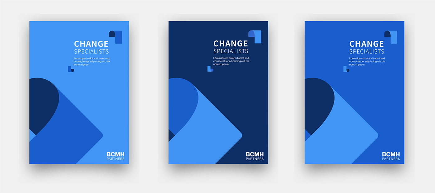
Colour palette
The blue palette represents professionalism and trust, while the pop of bright colours are to show the extra creativity the team brings to their projects.

Iconography
The arrows from the identifier are used as bullet points in presentations, as well as creating interest on other collateral.