


“Very effective interpretation. Very good typographic standards, layout and design.”
ISTD – International Society of Typographic Designers

“Dialects differ from immediately neighbouring dialects only slightly,
and can be heard to change slowly and word by word,
pronunciation by pronunciation, as you travel from one village to the next”.
and can be heard to change slowly and word by word,
pronunciation by pronunciation, as you travel from one village to the next”.
Peter Trudgill, Sociolinguist.
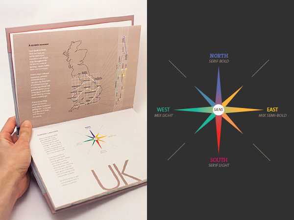
The introduction page explains how the book will guide the reader along the journey.

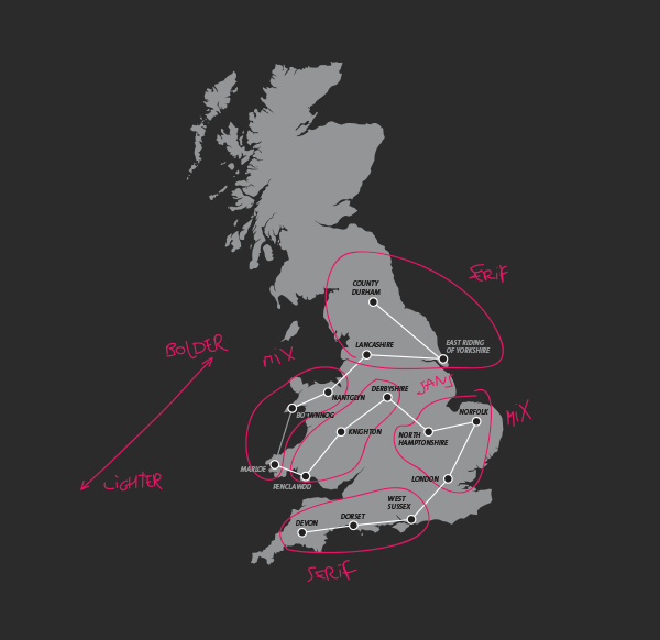
Everytime a region border is crossed a new chapter begins and with it an specific type setting
and colour.
and colour.

As the journey progresses, the body text smoothly changes, and for that the super-family Thesis (TheSerif, TheMix and TheSans) was selected, so a wider variety of typefaces could be used to paint every shade of this “typographic gradient”.
The logic behind the choice of typefaces and its weights for each accent/city is based on my personal interpretation of it, after listening and analysing the recordings used as content.

On the map, the highlighted white text corresponds to the boundaries of that county.

The left margin of the text moves forward along the journey, following the correspondent position of the city on the grip map. In this particular case the text is aligned to the right, because the journey went backwards latitude-wise, as you can see on the map located on the head of the page.

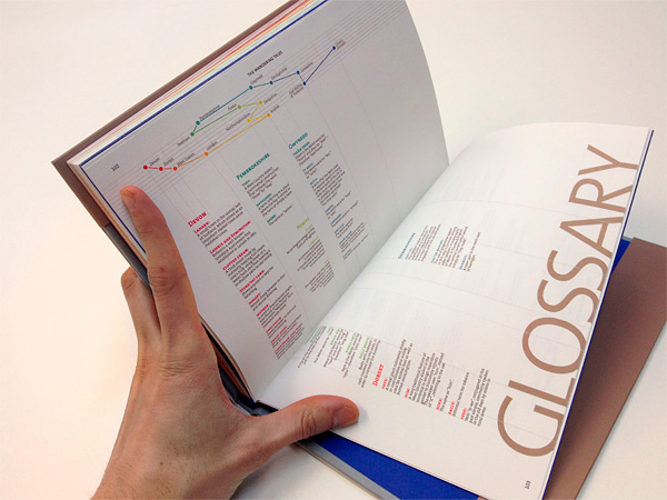
All over the book footnotes explain the meaning of speficic terms and slang words of that region.


The headbands and end pages also follow the colour system, which starts with warm colours in the South and ends with cold colours up North.


