Identity for the Music and Exhibition Hall "Tarilka"
What is Tarilka?
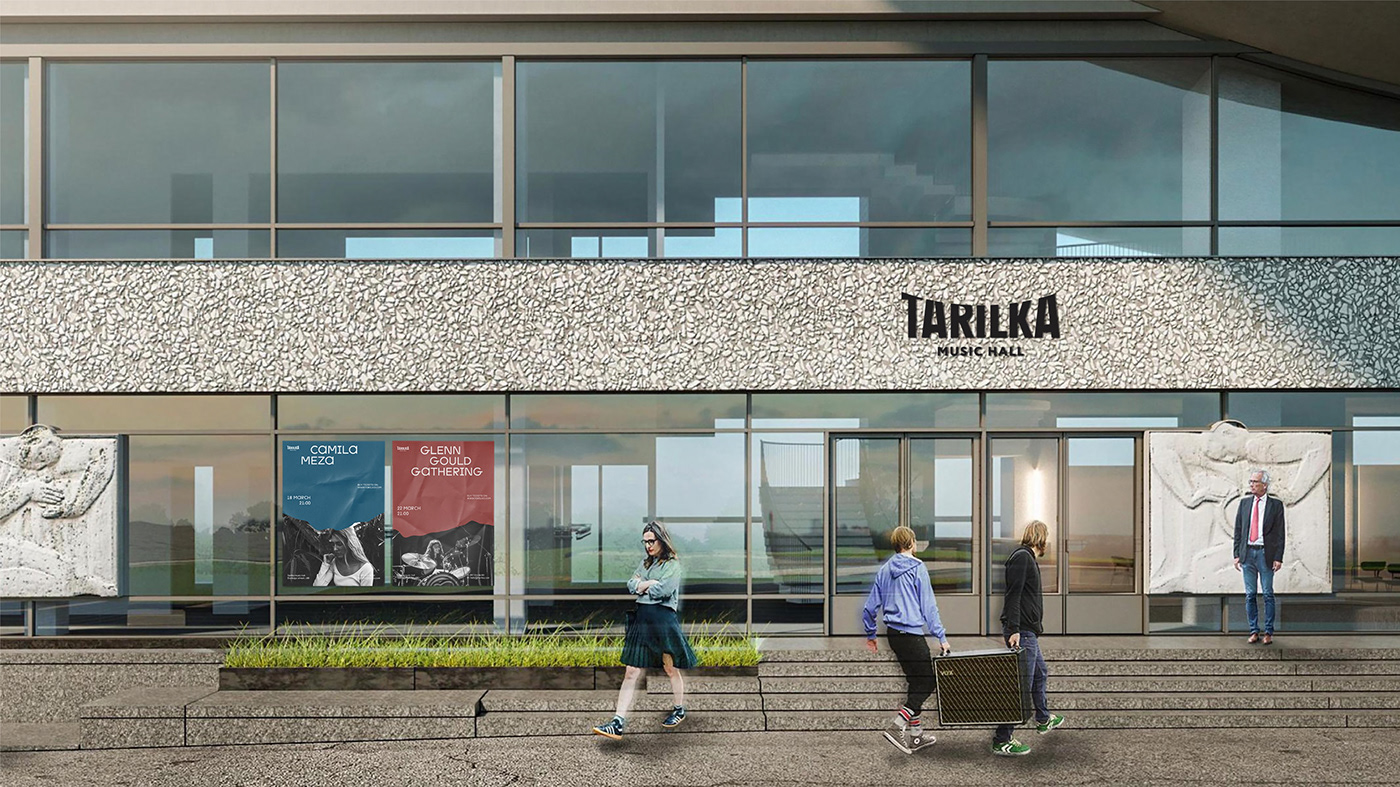
Tarilka — is a unique example of soviet modernism architecture situated in Kyiv — the capital of Ukraine. The renovated building is to become a new cultural space for concerts, exhibitions, and lectures. The main feature of the Ukrainian Institute of scientific and technical expertise and information building (that's the actual name of 'Tarilka') is its shape. It has a rounded design and reminds a plate (in Ukrainian 'plate' is translated as 'тарілка' [tarilka], thus citizens started to call it like that.) But Tarilka is not only about Form, but Function. Such a shape creates amazing acoustics and helps to reveal the versatility and fullness of sound.
Visual communication is built around the plan of its architectural renovation created by the group of activists from the SaveKyivModernism organization. According to the plan, Tarilka may become a modern cultural platform with an exhibition hall, a music hall, and cafes.
OUR GOAL
Create a Visual Style for а new concert venue with one of the best acoustics in the city. Tarilka’s Identity should complete the architectural plan and its Visual style is to distinguish Tarilka among other concert halls in Kyiv.
CONCEPT
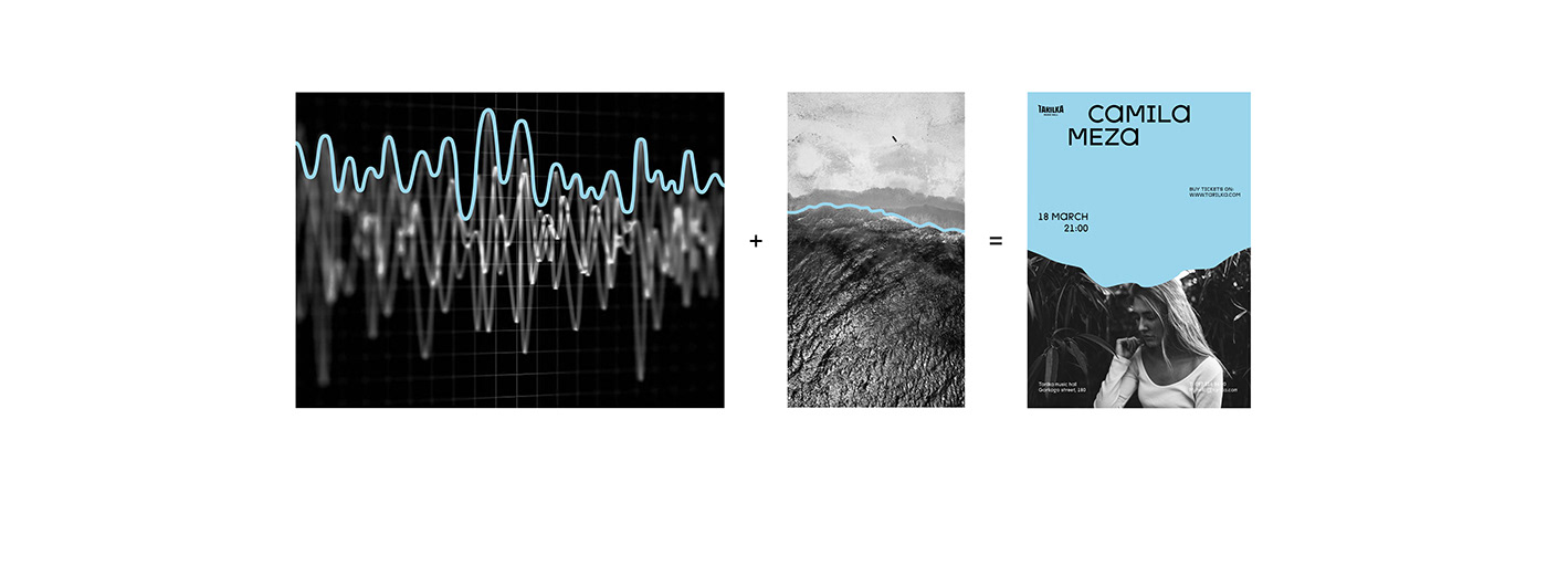
The concert hall visitors witness all greatness of sound through the prism of its unique acoustics. A similar feeling may appear on a seashore, where the open space and silence are perfectly balanced with the pleasant sound of the surf.
We decided to identify Tarilka with a borderline between the city rush and the greatness of music. Just like the seashore separates water from land.
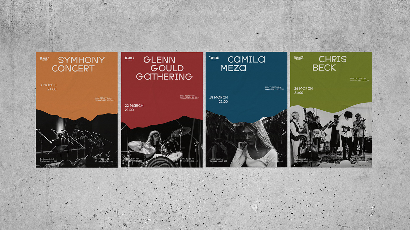
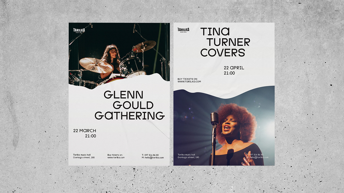
Seashore has its unique line, that changes its shape every time during the tide and due to the weather. Likewise, Tarilka changes its look in line with the occasion (sits in the music hall are rearranged from event to event).
LOGO IDEA
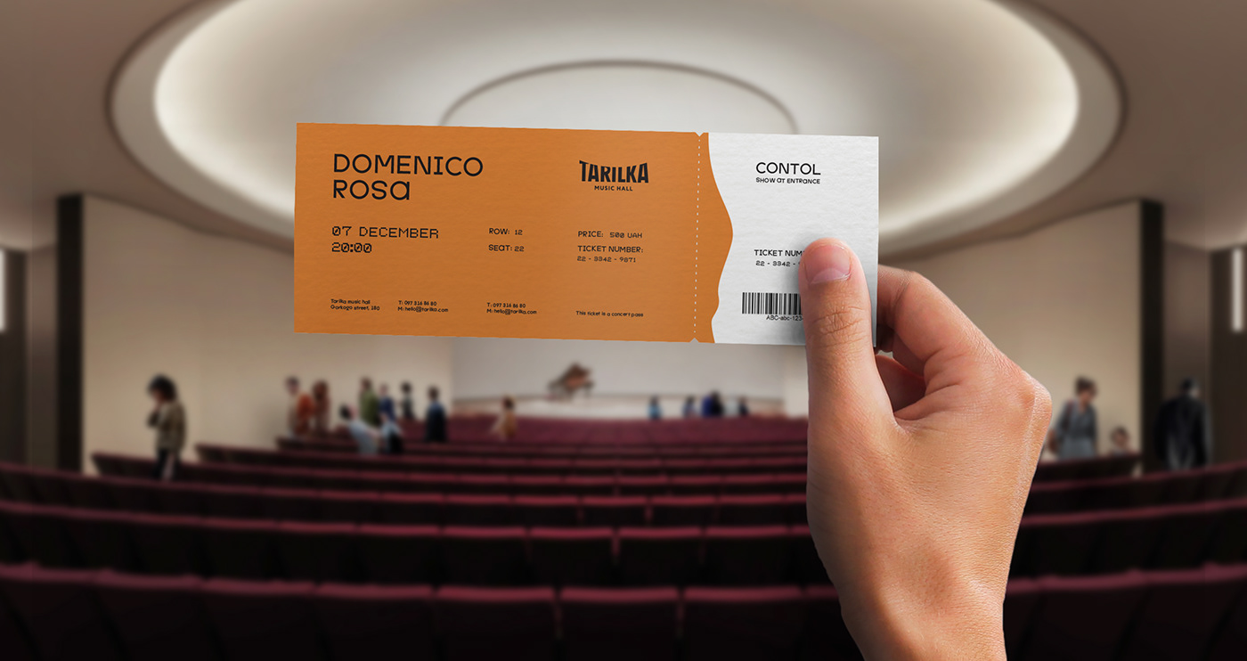
A logo is extremely important for any concert hall because it will appear on the tickets, posters and at the box offices. Tarilka is the physical space, so we tried to build a direct association with the place itself. To design the visual image of the hall, we referred to the well-known shape of the building and round it up with letters.
SLOGAN
Every day we are surrounded by a great variety of unpleasant noises — the poor sound of cheap headphones, the rattling of cars, and the megalopolis buzz.
To enjoy the music we need to deprive it of noises and listen carefully comprehending the full depth of the melody. The music hall — Tarilka was built to make the following way of music perception possible.
To back up this concept, we created the slogan “Keep your ears open!” Which could not have emphasized the idea better that people need to slow down and listen to the world around them.


The idea of corporate graphics
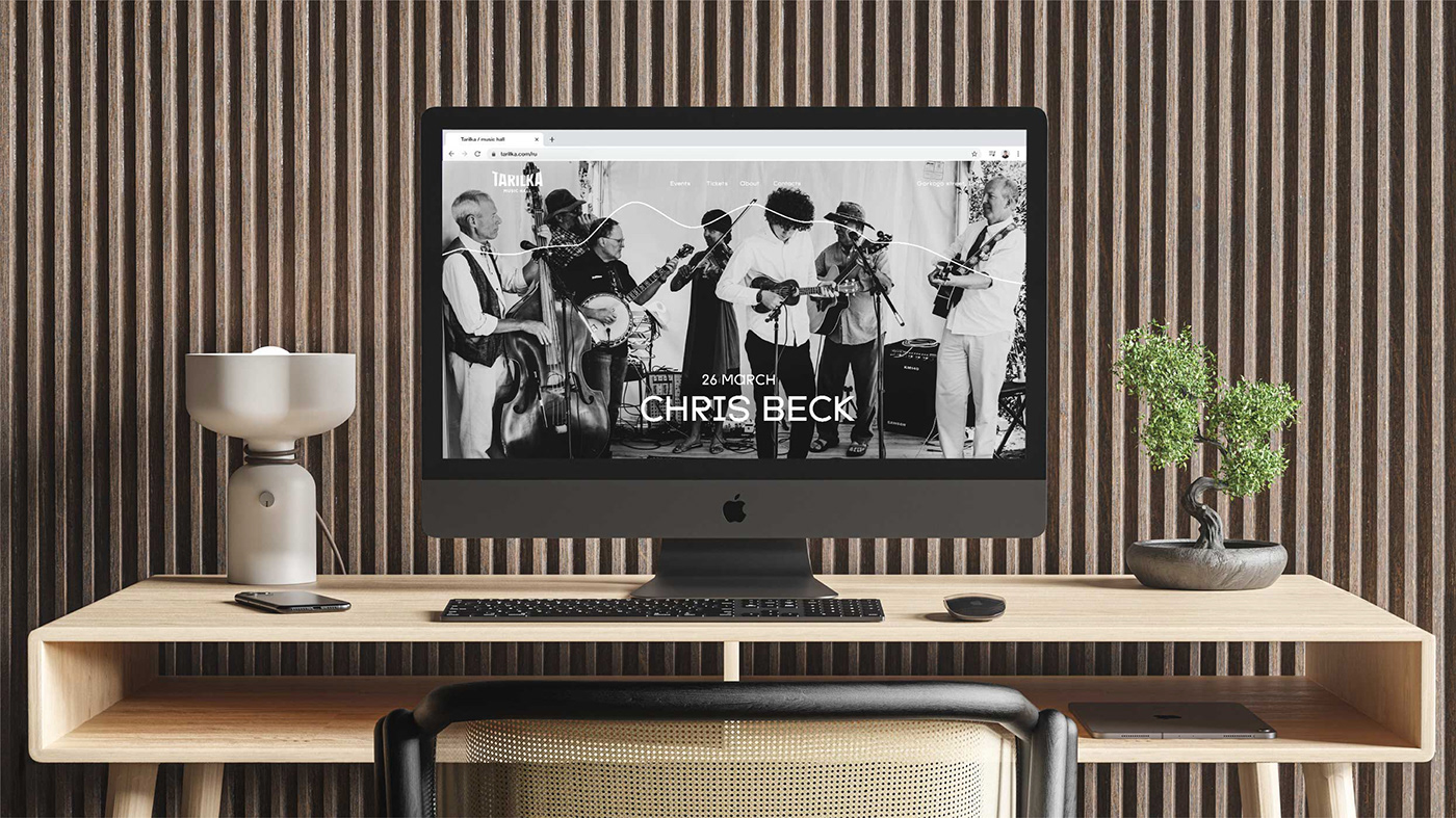
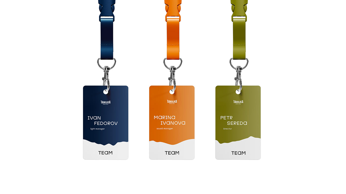
We used the image and mood of a seashore. Wavy graphics became a reflection of sealine as well as curves and bas-reliefs of Tarilka’s building and the sound wave of music equalizer. Thus we separated layout by their functions. One is informative and another one is emotional and visual. We built an association: music is a sea and an auditorium is a land.


Thank you for watching!
Tarilka
Brand Identity Design
League Design Team:
Team Leader: Aleksandr Gusakov
Graphic designer: Anton Bukoros
Special thanks
Special thanks
Architectural project and visualization — Savekyivmodernism
Animation — Alexander Romanenko
Animation — Alexander Romanenko