The objective for Brooklyn Coffee Company was to create a brand that captured the hard working rough-edged attitude of Brooklyn, New York.
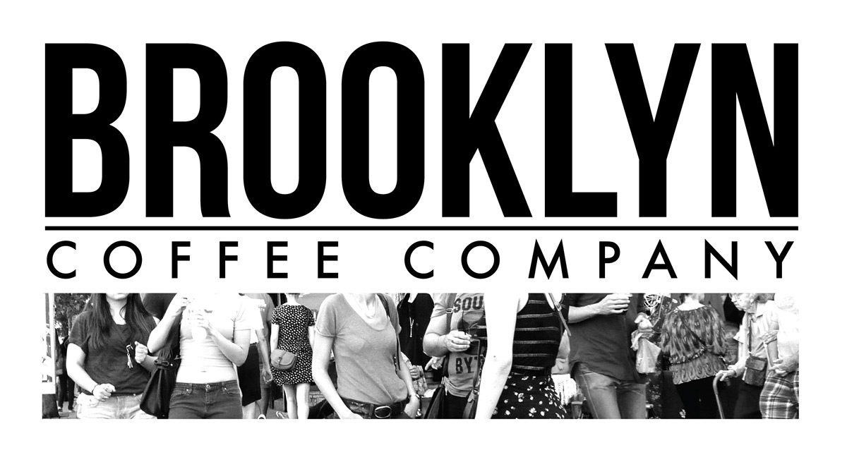
The logo is simply the name of the coffee company with interchangable photos underneath. This is because I wanted to keep the feeling of an old fashioned, no bull type of company. The name is always diplayed boldly in either black or white.


The tags for bags of coffee beans are based off of the texture of a newspaper. This is to continue the theme of hard work and gritty-ness that represents Brooklyn.
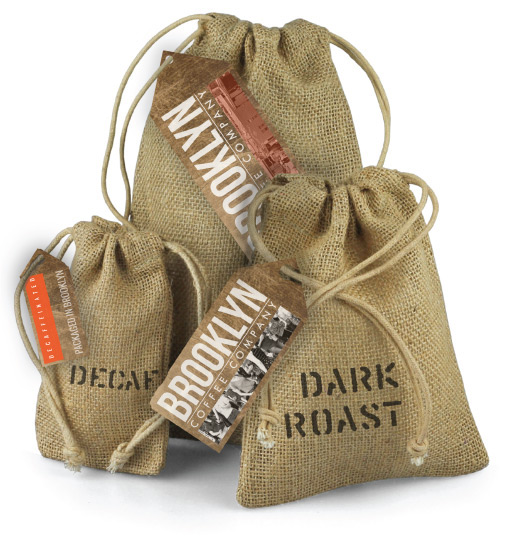
The packaging for Brooklyn Coffee Co is based on the packages of burlap sacks that were full of concrete and other materials that were delivered to the construction sight of the Brooklyn Bridge. Meant as an homage to the history of the city.
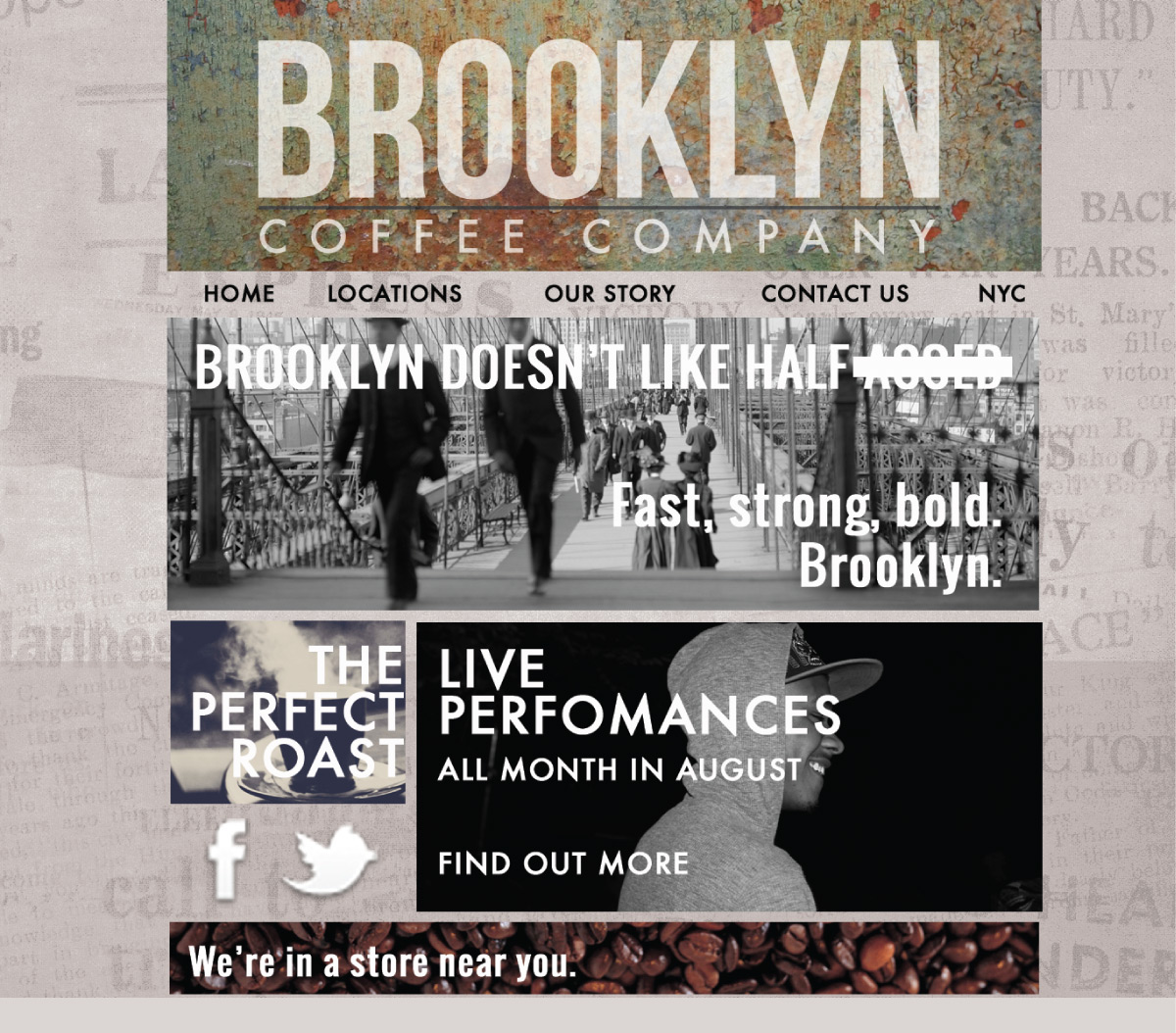
The website encompasses the meeting of the old, gritty Brooklyn style, and the modern traditional web design style. The website is based on textures and images that represent Brooklyn.


