
KD is a brand that will at best represent (and tag) my creative works which hopefully will bring a new perspective into the wonderful exploration in experimentation with different media in seeking understanding. Here, I share with you the proceess of how I came up with the final design.

Sketches through various iterations
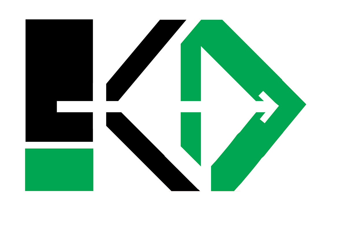
The first piece presented to you tries to capture the vision of KD as a brand which is bold and determined to move forward in time ( arrow) while still keeping things fresh (green) and creatively dynamic( use of diagonals and negative space in the logo) .

This second piece of KD is presented in simple, bold black and white.Its ambition to move forward is maintained while bringing a balance to the eye through use of more negative space (base of K). This is my favorite of the two and thus the one I will take to best represent me.
BUSINESS CARD DESIGN.
Business card design.


