


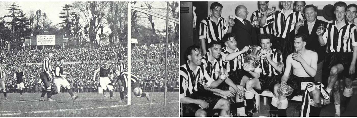
A black and white history
The origins of Newcastle United football club are to be found within two minor football clubs, Newcastle East End and Newcastle West End, merged into one. As of the second half of the 19th century, the club had a great history, filled both with failure and glory, war and peace, but always chaperoned by the power of community.
The city of Newcastle upon Tyne is famed for many things: for the warmth of its people, for its industrial heritage, culture, nightlife, the Great North Run, its favourite sons and daughters of sport, screen and music, and much, much more.

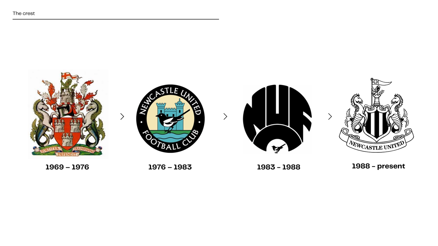
The story of Newcastle United's club crest
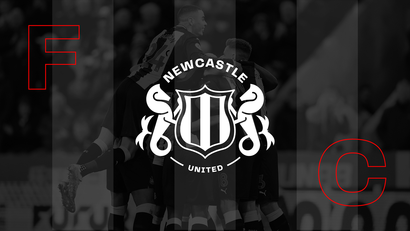
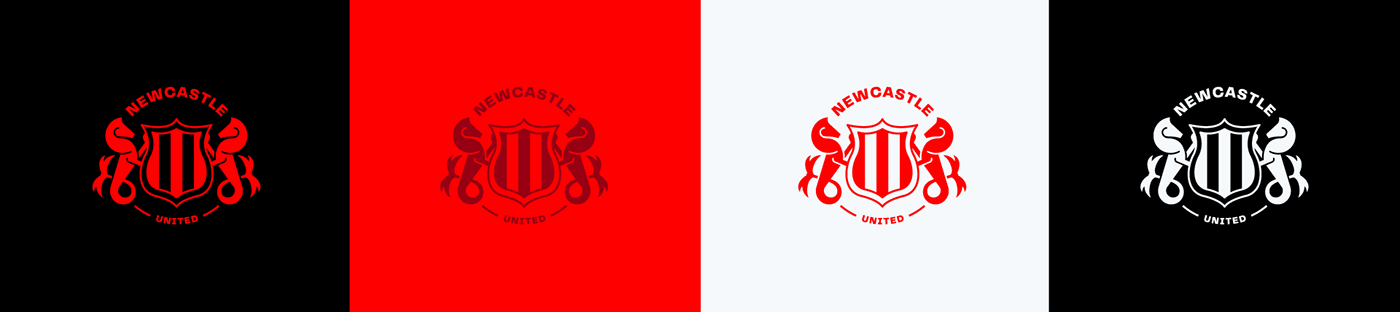
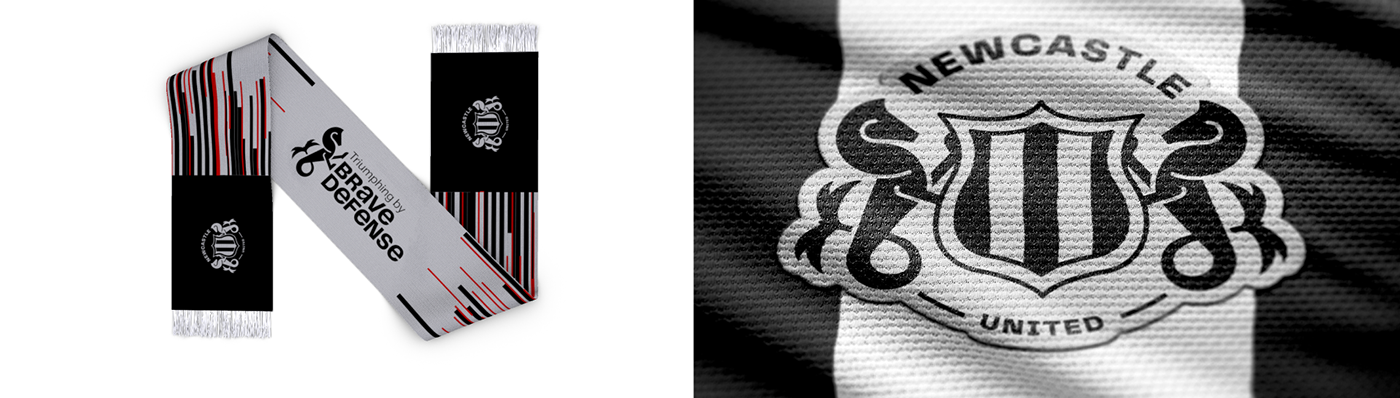
The team’s badge is as iconic as their famous black and white stripes and as unique as the silhouette of St. James’ Park. The club crest captures the identity of Newcastle United and the city of Newcastle upon Tyne. In 1969, the club adopted the city’s Coat of Arms as its first official emblem. Over time, the emblem underwent some modifications applying symbols and strong typography. In 1988, they found the club’s current and perhaps most famous crest heralding the return of the overall shape and several elements of the city’s Coat of Arms, namely the supporting seahorses, castle, demi-lion, and an amended pennon.

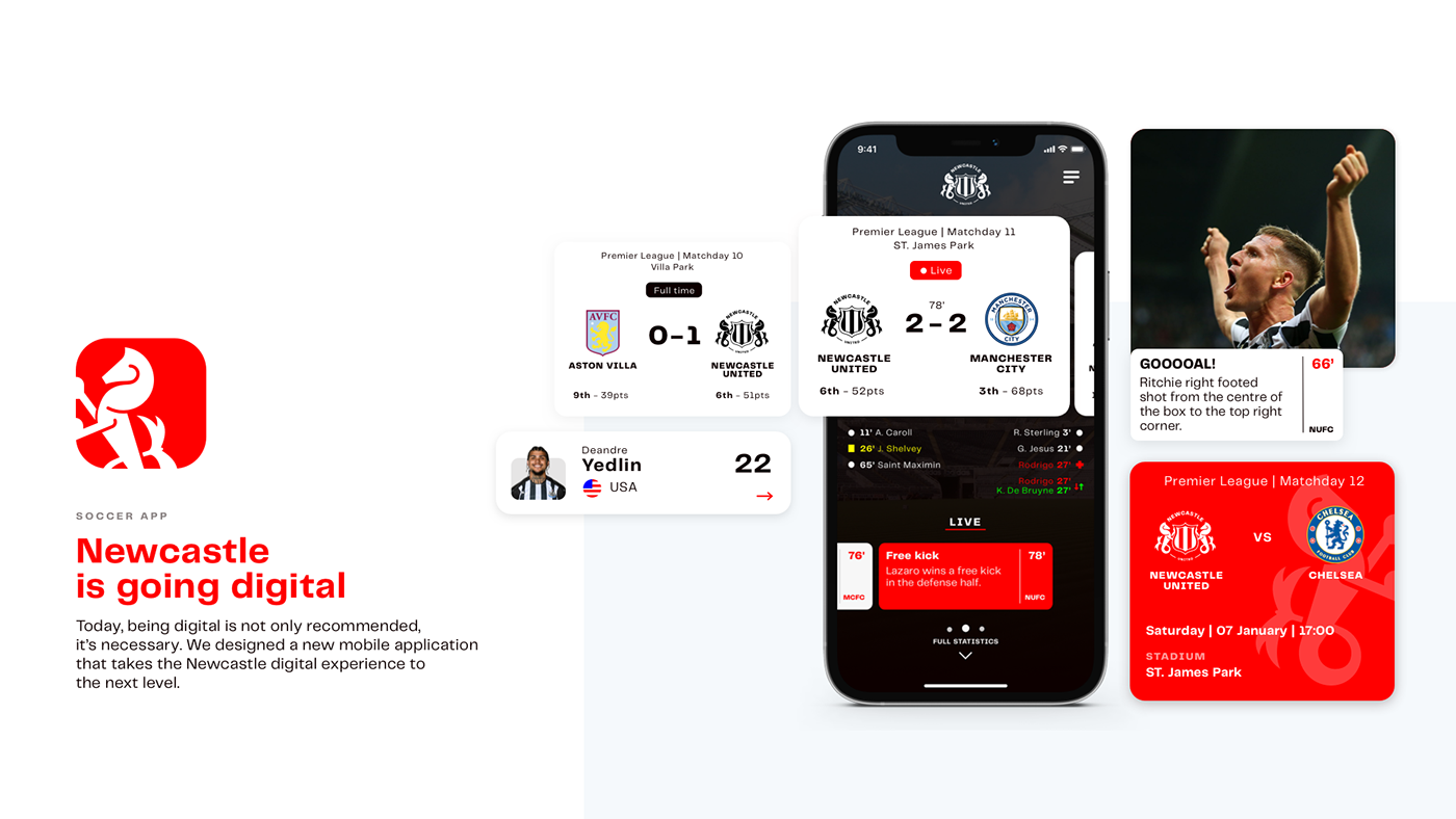
Welcome to the future
Today, we live in the age of digitalisation. All industries must catch up to the current trends to stay competitive. The sports industry is no exception. “Digital-first” visual identities become an aspect of brand building well worth considering. The current emblem of Newcastle has a very old, antique feeling with a lot of unnecessary details and because of that, it is incapable of being dynamically used in different sizes and situations.
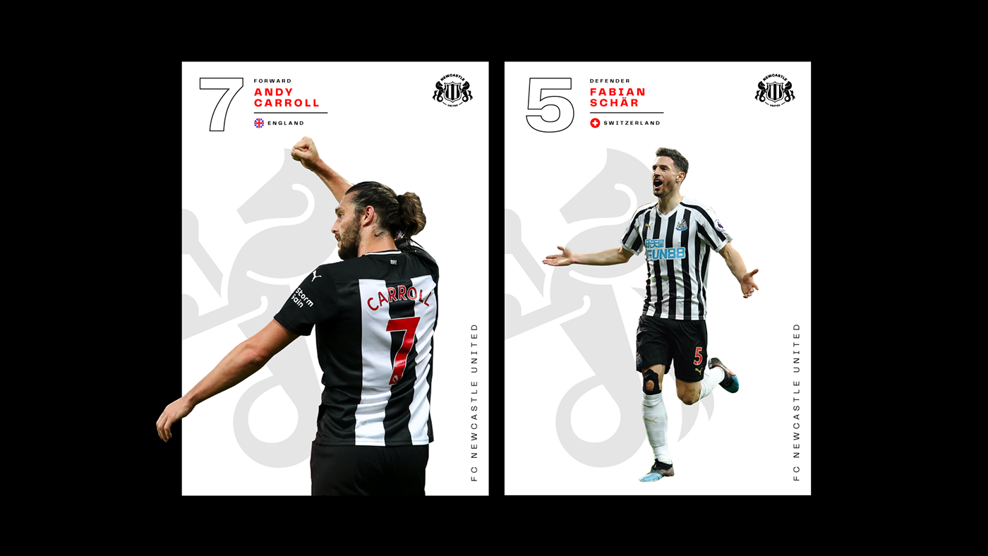
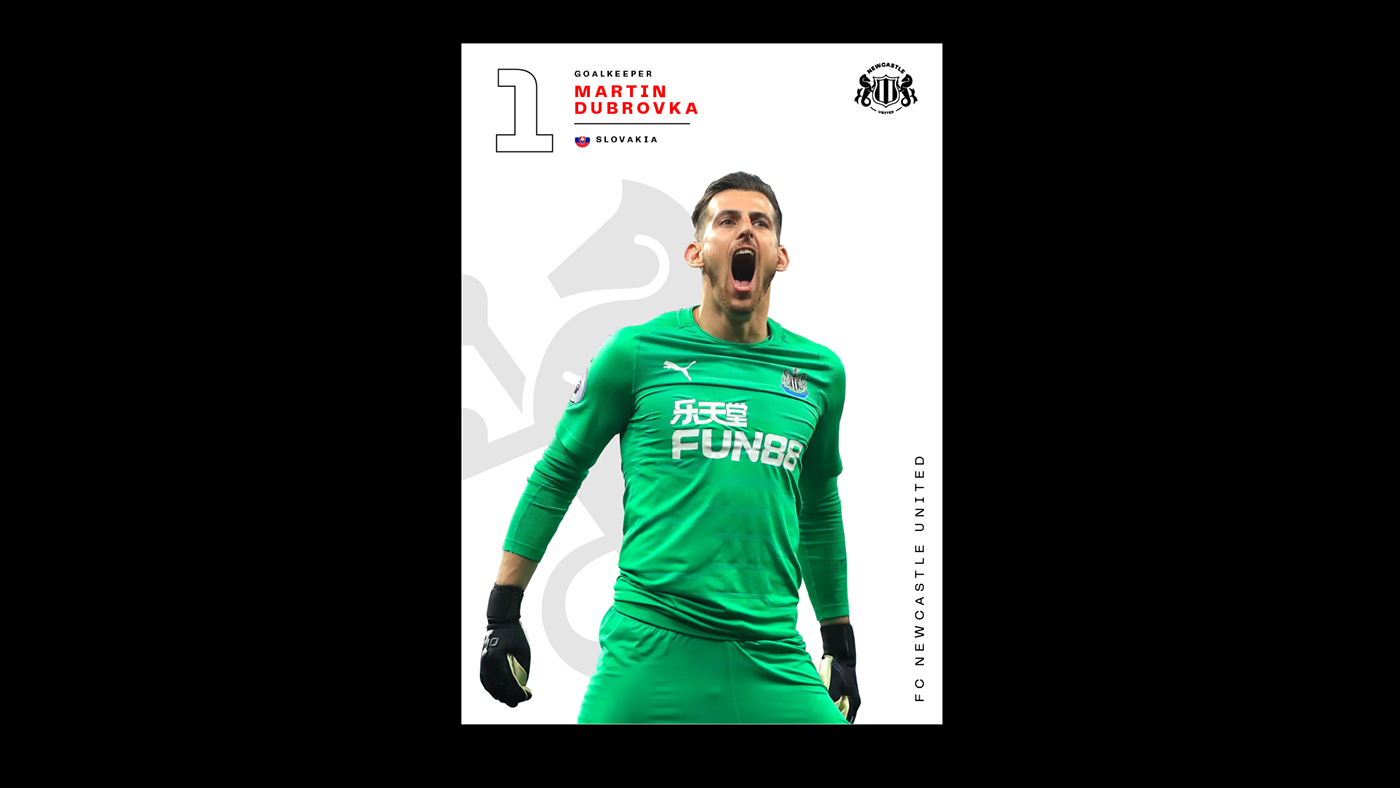
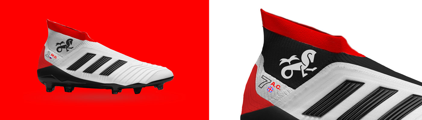
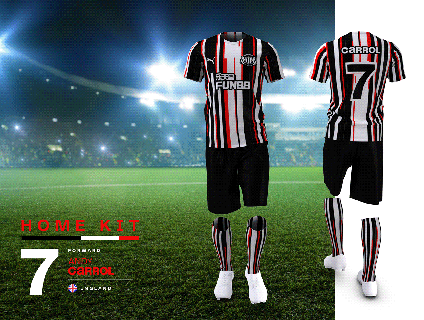
Less sometimes is truly more. The new emblem concept is very clear, simple, and timeless. At the same time, it retains the main motives such as the seahorses, the shield, and the iconic black & white stripes. The emblem looks good as a large, stadium-sized banner or as a small signal in a live TV broadcasting. During the design process, the first standpoint was to create an emblem that is easy to use dynamically and creatively as a primary brand element.


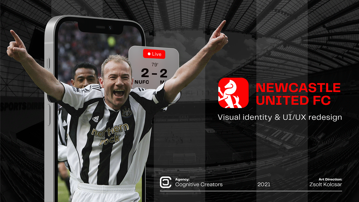
Cognitive Creators is a digital agency that merges industry-leading tech talent with
top class creatives, thus allowing the company to outperform your expectations throughout the product development lifecycle.
Get a free consultation from our experts by emailing us at hello@cognitivecreators.com


