


Hakuhan - Traditional Japanese Cuisines & Dining
Established in 1952, Hakuhan is a traditional Japanese dining hall based in Kyoto. Focusing on preserving the traditional taste, which has been passed down through various generations, of Japan's signature dishes and recipes, in recent years, Hakuhan has been steadily gaining popularity among strict Japanese foodies and curious tourists from abroad. Hoping to bring the traditional tastes and essences of Japanese cuisines further throughout Japan and overseas, from a small dining hall, Hakuhan has decided to expand its business into a chain restaurant focusing on delivering true Japanese experience.
With this decision, Hakuhan requires its brand to be designed into a new identity, which will be recognized not only in Japan but also around the globe. Understanding this request from Hakuhan, project HAKUHAN was launched to design a new identity for the restaurant, a new website, and a new platform for ordering and reservation.

Color Palette
The first step to the project is to define a new color palette, which will later serve as Hakuhan's identity. Aiming to create an elegant, yet simple image while maintaining a Japanese feeling for Hakuhan, the project employed 6 colors from Pantone as the primary color palette. Of these 6 colors, the three colors Cool Gray 1C, 710 C, and Cool Gray 10C are chosen as the primary colors, while the remaining three colors (7579 C, 7622 C, and Black 7C) will be used as supplementary colors. In addition to these colors, supplementary gradients are also defined using various combinations between the chosen colors.
Logo Design
The next step to designing a new identity for Hakuhan is to design a logo befitting the restaurant's image.
As a restaurant based in Kyoto, Japan's old capital, and also its central cultural hub, Hakuhan's logo must represent the restaurant's cultural origin. In addition, the logo's central symbol must represent the restaurant's image as a chain restaurant striving to preserve the essence of Japanese cuisines. Furthermore, understanding Hakuhan's decision to expand its business to not only throughout Japan but also to the overseas market, the restaurant's new logo must also preserve a certain level of modernity, while maintaining a Japanese feeling.
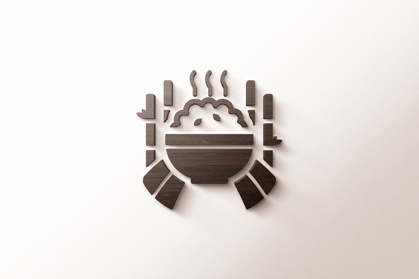
As a result, the project has chosen the two images: the bamboo forest (one of Kyoto's most famous attractions) and a rice bowl (this decision was based on Hakuhan's name, which literally means white rice in Japanese). The rice bowl was put into the center of a road covered by bamboos. Large strokes were used to illustrate the images so as to maintain the details as the logo scales down. The final design is a bamboo road leading to the rice bowl, depicting Hakuhan as one of Kyoto's centers for Japanese cuisines. The logo is available in two version: a vertical version for use in Japan, and a horizontal version for use in overseas.


Promotional Materials
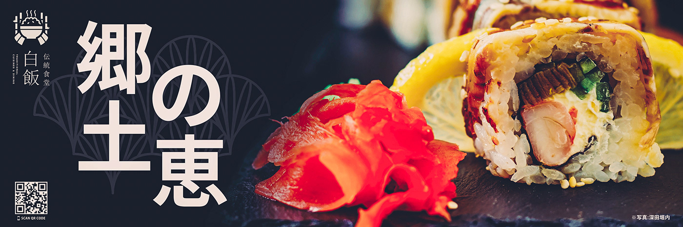
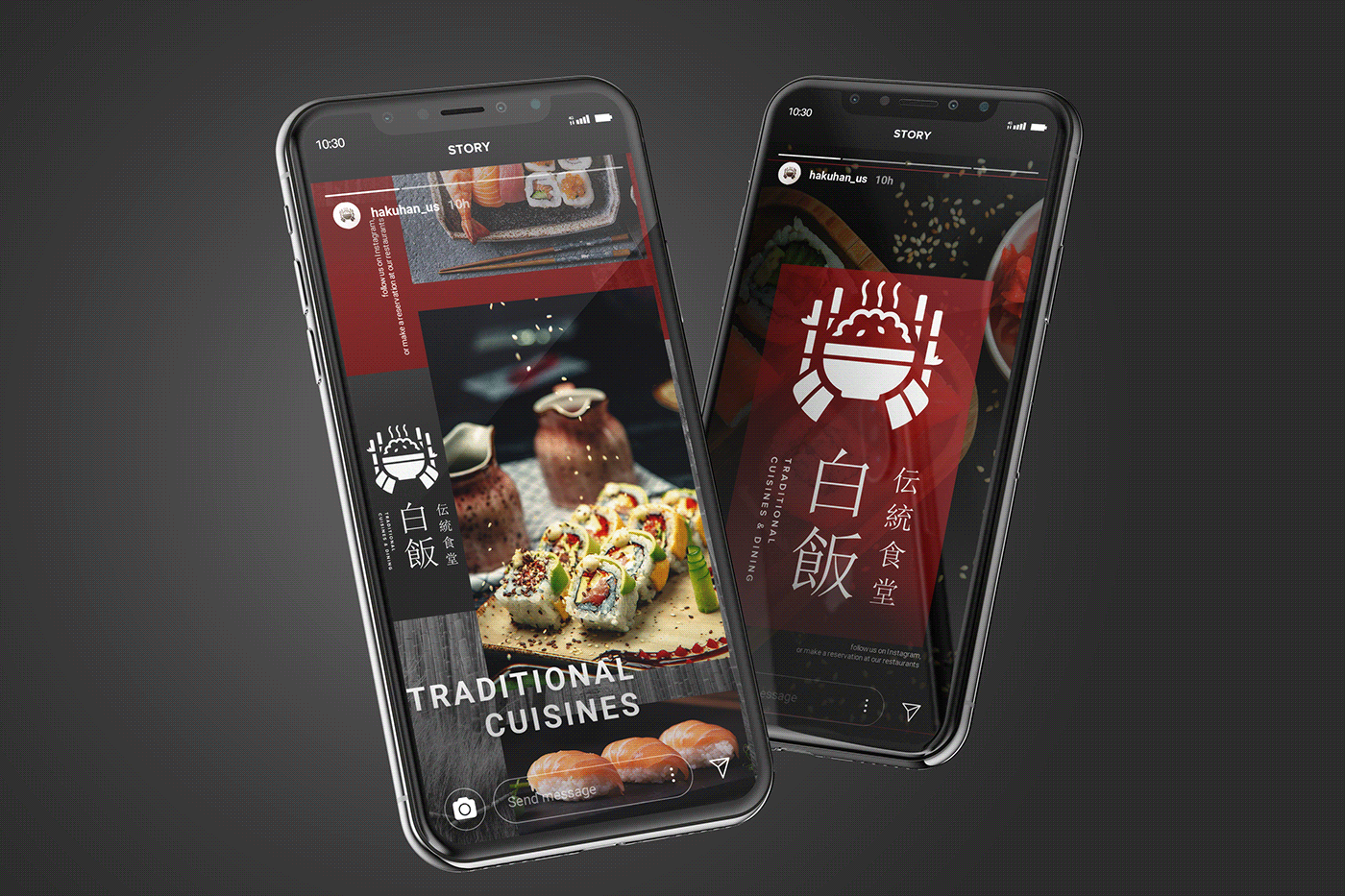
Before proceeding to design a new website and platform for ordering and reservation, the project created a new set of promotional posters, banners, and presentation templates for Instagram and other social networks, which is then used to promote Hakuhan's policies and menu. Instead of using complicated illustrations, the project decided to employ real close-up photos of the dishes being served at the restaurant while utilizing different styles of typography to convey the restaurant's motto and messages. This decision helps to create a simple, yet elegant image for Hakuhan, which suits the overall style of dishes being served at the restaurant.


Website Design (Brand Site)
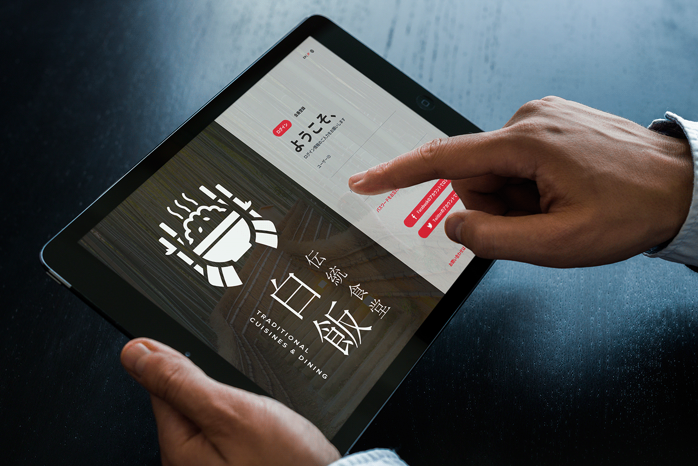
The next step to the project is to design a new website for Hakuhan. With its new identity, Hakuhan requires a website to connect with and to bring the brand closer to customers from around the world, and another website for users to view the information related to its restaurants, make reservations, and order takeouts. As such, in this project, two separate websites were created: one designated as the restaurant's brand website, and the other designated as a customer portal.
For the brand website, the one-page design style along with a dark theme was adopted with an intention to maximize the story-telling elements embedded within the brand's history and to maximize the aesthetic value contained within every dish served at Hakuhan. In addition, this decision also helps to maintain simplicity while creating an elegant feeling, suitable for Hakuhan's new image. Samples and a short preview of the website's motion design can be found below.


Website Design (Service Site)
The last step to the project is to design a service site for Hakuhan. Contrary to the brand website, the service site employed a lighter theme with an intention to create a balance in appearance when combined with the vibrant color of the dishes being served at the restaurant. In addition, an asymmetry grid system was also employed to create more dynamics to the page and to the information being posted. Samples from the developed website can be found below.


This Concludes The Project! Thank You For Your Interest!


