INDYPENDENTLY
You're Independent, But Not Alone
Indypendently is a new publishing platform launched to help solo workers get the advice, information, and inspiration they need to go it alone. Freelancers, solopreneurs, contractors, small business owners, and independent workers: this is for you. In the words of the founders: “Indypendently is dedicated to the hustlers, pioneers, dreamers, and doers. People who mix a dash of What if with a shot of Hell yes I can. People who don’t worry about what’s next because they have what it takes to make their own future. People whose path isn’t always clear or easy, but believe chasing dreams, big or small, is worth it.”
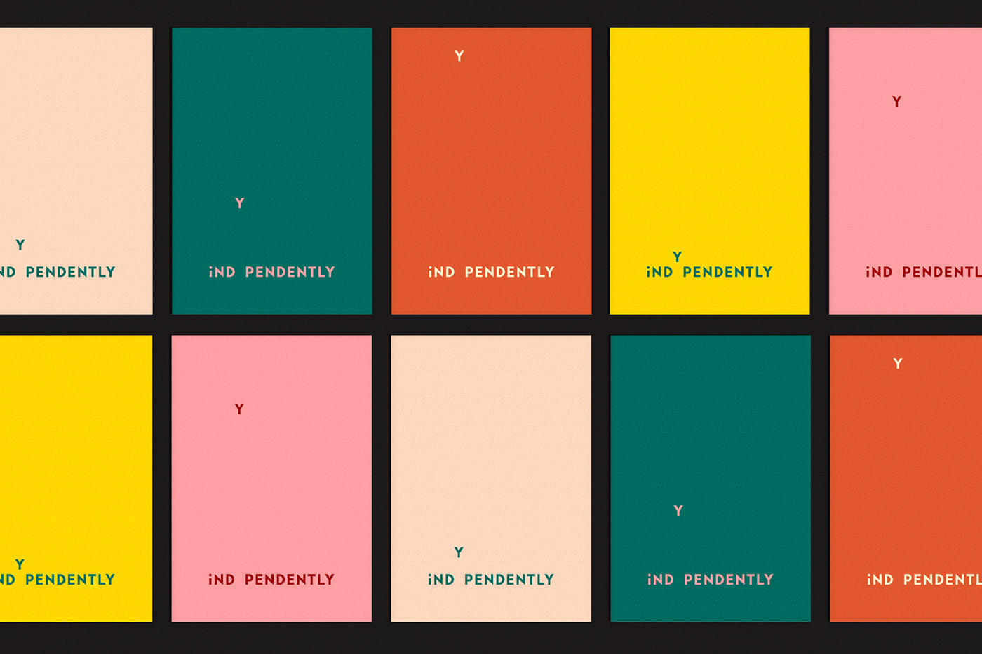
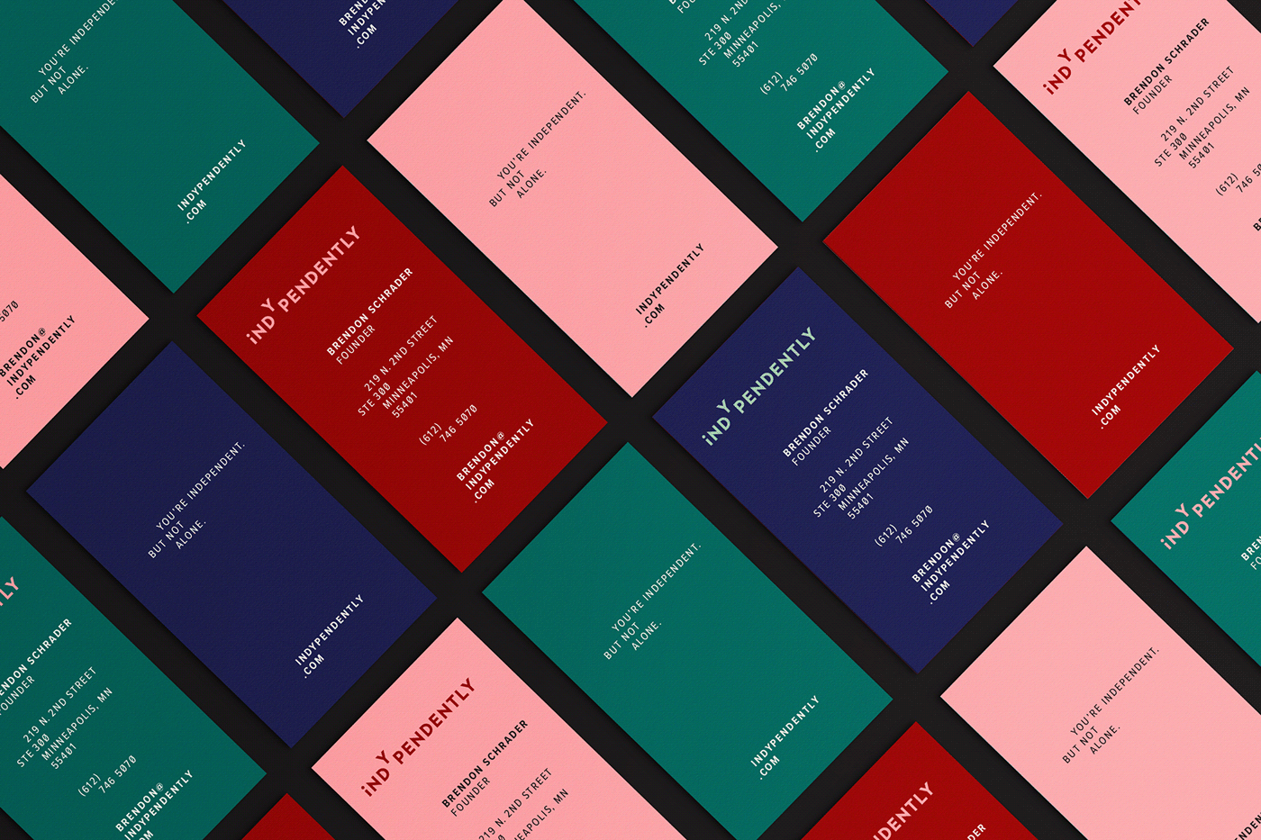
We developed a logo and identity system for Indypendently that visually expresses the concept of “taking the leap” into independent work, with the letter Y launching up and away from the rest of the logo. (Why Y? For “You” of course. Go get ’em, tiger.) We also created a modular visual system for the brand’s editorial team. This system allows Indypendently to create a wide variety of original, on-brand visuals to illustrate their content and create a consistent, proprietary look across their web and social media channels.


EDITORIAL VISUAL SYSTEM: BUILDING BLOCKS
For Indypendently’s editorial visual system, we designed several categories of illustration styles, typographic systems, and photo treatments. The underpinning of the entire system is a library of simple shapes, symbols, and patterns which can combine in endless ways to create minimal abstract illustrations.


STICK FIGURES
Stick figure illustrations take the brand’s building blocks one step further, literally adding life to simple shapes and enabling the team to create emotion, interaction, and personality in an easy-to-execute format.


CONCEPTUAL ILLUSTRATIONS
When time and budget permit, an illustrator can use the brand’s foundational shapes and symbols to create unique conceptual images.


TYPE TREATMENTS
To make sure Indypendently has differentiating typography at its disposal, we took a dual approach. Our first tactic was to take the two font families Indypendently was already using in its website interface and combine them with shapes, symbols, and patterns to create simple typographic illustrations. We also created a custom geometric display font—once again transforming an assortment of simple building blocks into a vehicle for conveying a unique, branded message.


PHOTO TREATMENTS
Last but not least, we developed a variety of photographic treatments for Indypendently. These allow the editorial team to overcome common challenges, such as photography that’s provided in the wrong orientation or which suffers from poor lighting or color. These treatments also allow the team to add a branded element to stock photography, giving Indy’s photos a proprietary look even when commissioning custom photography isn’t an option.


