

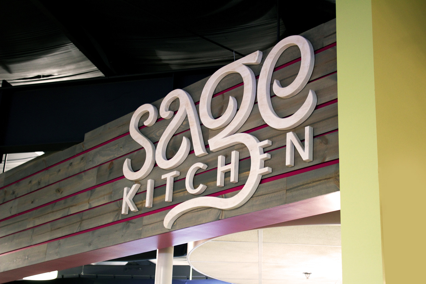
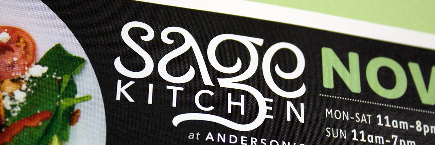
A Hand-Crafted Solution
Like the dishes created at Sage Kitchen, the lettering was created from scratch. Even down to the very end, the curves we adjusted and refined using stacks of tracing paper and tons of erasers. Eventually the process reached a breaking point for detail, and only then was the original lettering scanned and vectorized.
The final logotype for “Sage Kitchen” featured letterforms reminiscent of art nouveau café signage and botanical cues directly from Anderson’s produce. “Kitchen” is nestled and interconnected, almost as if it existed previously and had become over-grown. The Anderson’s brand features a heart-shaped leaf, and Sage Kitchen features a heart-shaped nod of it’s own if you’re looking for it.


For a more in-depth look at the development of Sage Kitchen, head over to MisterMunn.com


