


VISUAL IDENTITY IN WAYFINDING
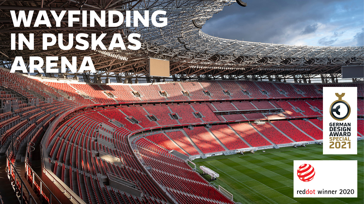
After 50 years, the aging People's Stadium was worthily rebuilt. As part of this large-scale work, Graphasel Design Studio was asked to design the Arena’s visual identity and wayfinding system.
A key issue in the design was the impact of image and national character on the graphic elements of visual control.
A key issue in the design was the impact of image and national character on the graphic elements of visual control.


ACCESSORY DESIGN FEATURE
Stylized lines of force are complementary elements of the identity. Links between printed corporate identity, merchandise products and wayfinding. Helps with representing the national characteristics.


Typography
We chose René Bieder's Gentona font, that is also used in the visual identity. We paid close attention to justify the spaces between the letters and digits, when putting one below the other. The painting of the numbering of the parking lot and garage made it necessary to also design the stencil version of the numbers of the corporate font.


the journey
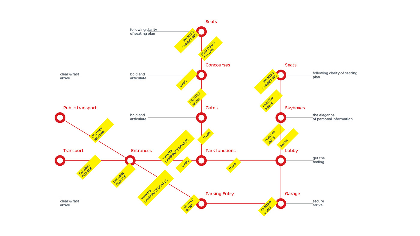
When designing the route, the primary consideration was to get the visitor to their seat as fast as possible, based on the information on the ticket. To this end, we thought it was necessary to put clear, articulated, well-identifiable signages, and we planned several reinforcement points between the “stations”.
Identification
Latin characters were used for identification. For the quick access to the seats and for the orderly departure from the stadium, it is important to display the names according to the ticket allocations in a clear, obvious way.


Orientation
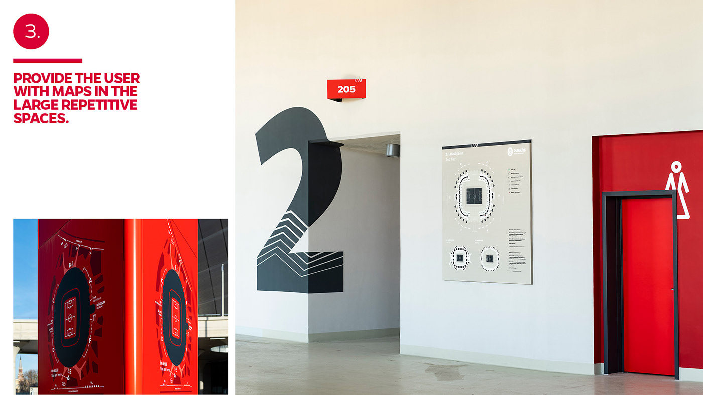
Maps all around the tiers. Due to the repetitive features of the building, the map is the most important aid for getting oriented, and also in the accurate location of one’s current position. Depending on the actual location, the floor plans were processed on different scales. The maps talk in a unified visual language to visitors.


design Principles
We developed six design principles that helped us achieve the design goal during the design process. Which we were constantly able to reach back to control ourselves.

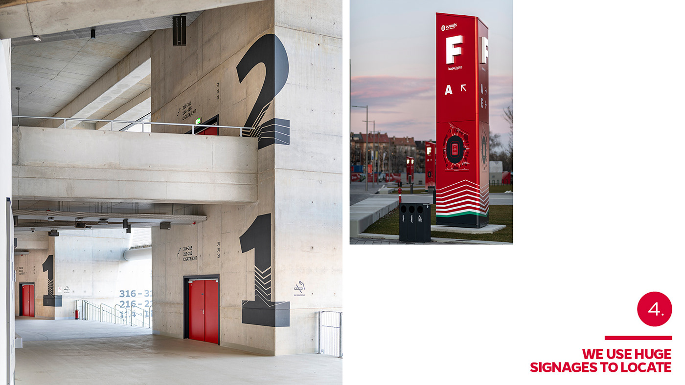


OUtdoors & indoors elements
To conform to the field of view. A special feature of outdoor wayfinding design is that the field of view
is limited only by facades, and natural or craft landmarks. Thus, we have the opportunity to strike the gaze with
an artificial surface, board or totem.
The outdoor boards and surfaces due to their positions and appearance stand out well from their surroundings. They are important elements of the space even during mass events.

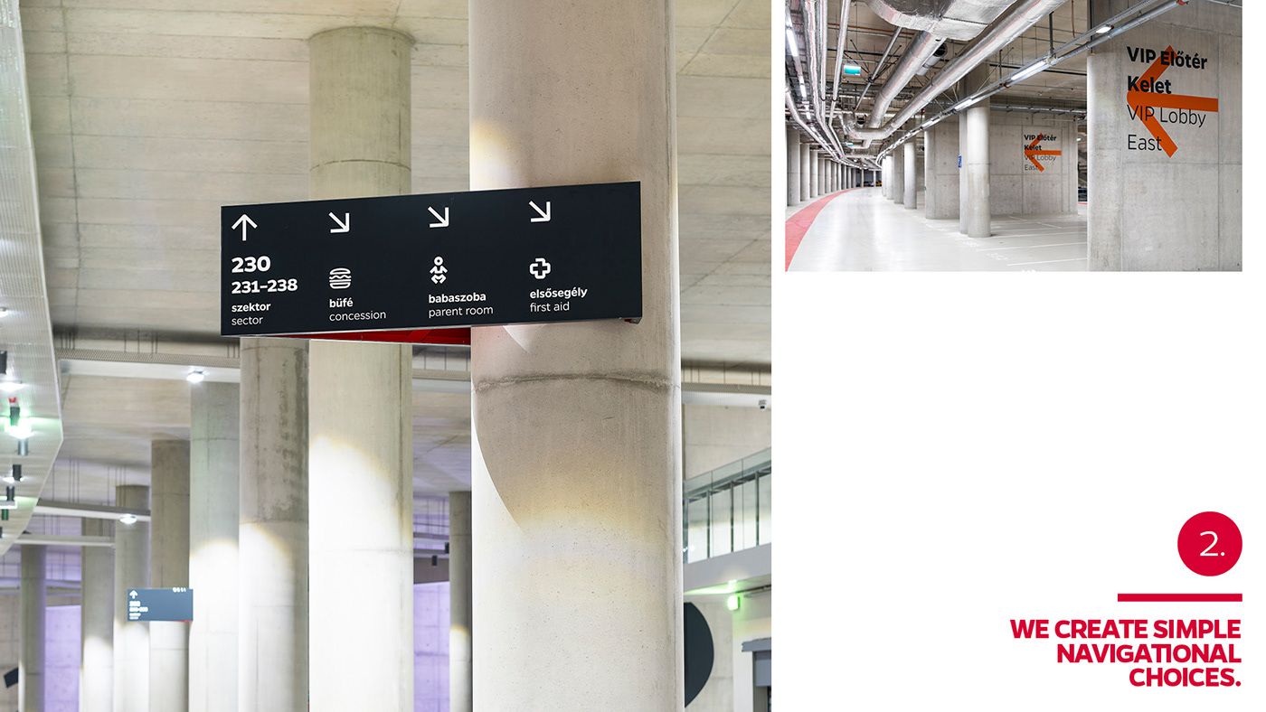
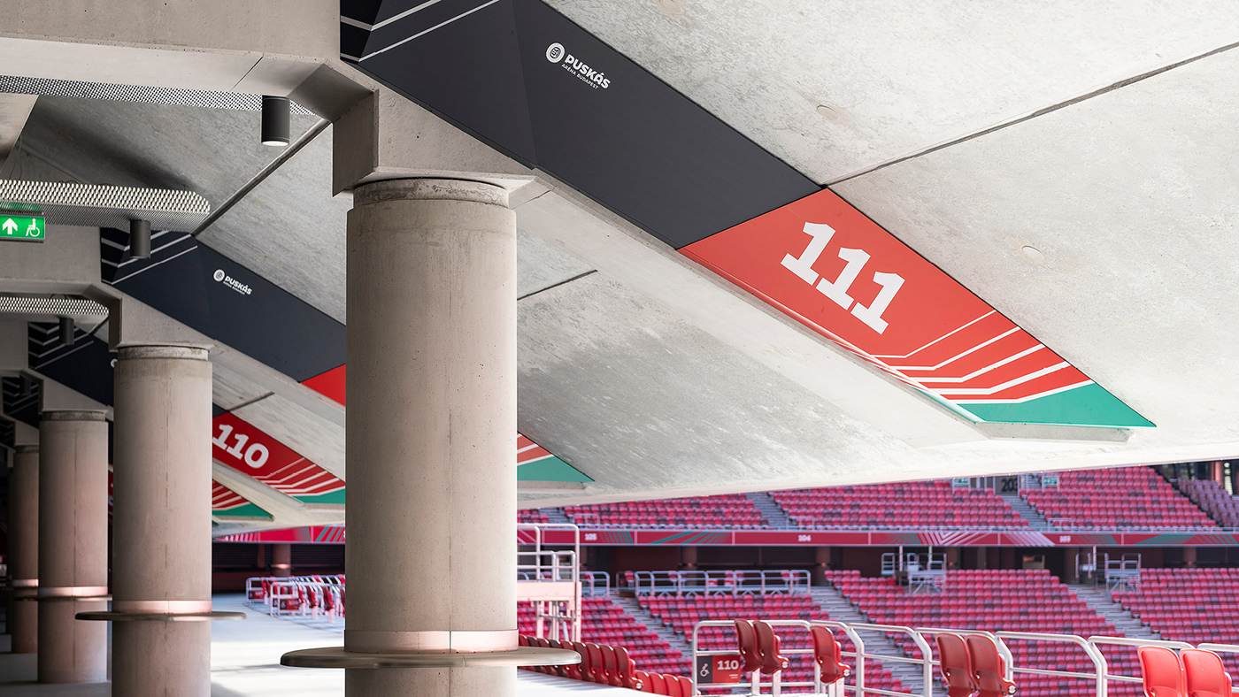
identify repetative situations in spaces
Inside the building, the field of view is delimited by walls and divided in a specific rhythm by staircases and pillars. Boards and sector signages mounted onto the pillars, which are part of the information system, serve to break this rhythm. Approaching the seat, we move from gray to red.


object design & commmunication surfaces
The boards are made of an easy-to-label, clean but replaceable, matte, corrosion-resistant design. The shapes and colors fit into the identity; they evoke the world of lines of force, and they also serve to attract attention.


CLIENT
Budapest Development Centre
Balázs Fürjes
Under Secretary
Art Director, CEO
Dávid Drozsnyik
László Ördögh
Graphic Design
Matyas Beke
Péter Szőke
Kristóf Láng
Csaba Dobos
Photo
Attila Balazs
Visit our website → graphasel.com
Join us on facebook → facebook.com/graphasel
and instagram → @graphaseldesignstudio


