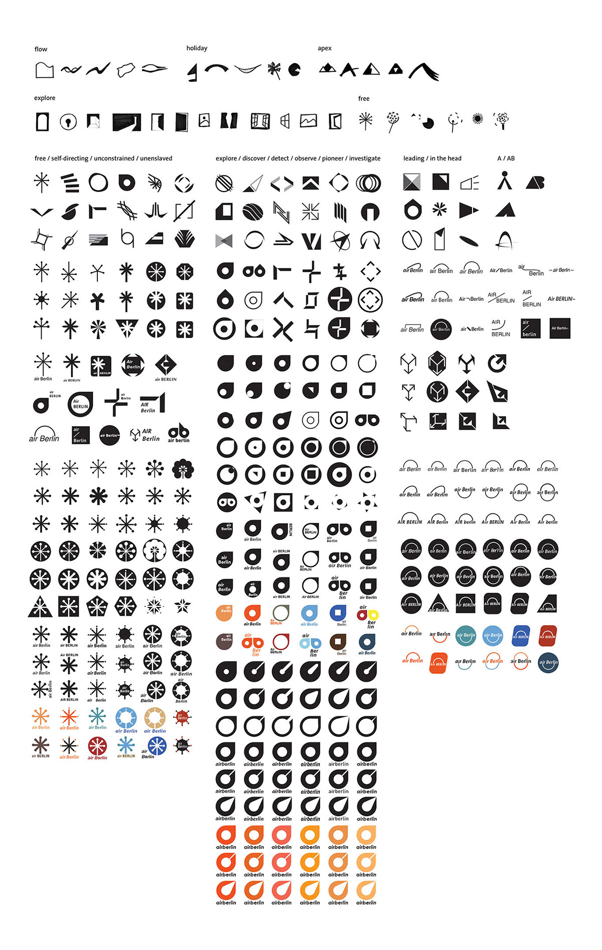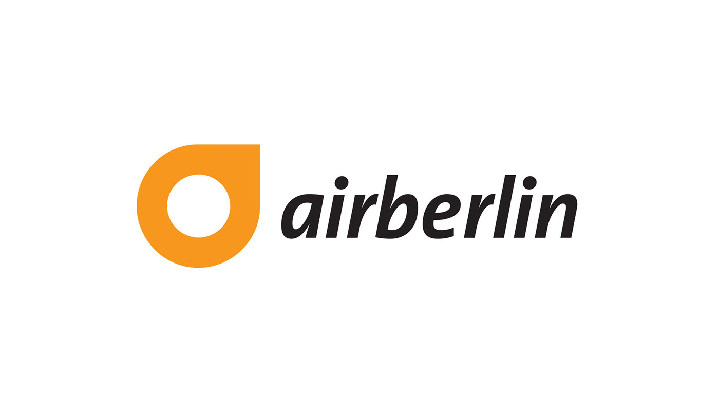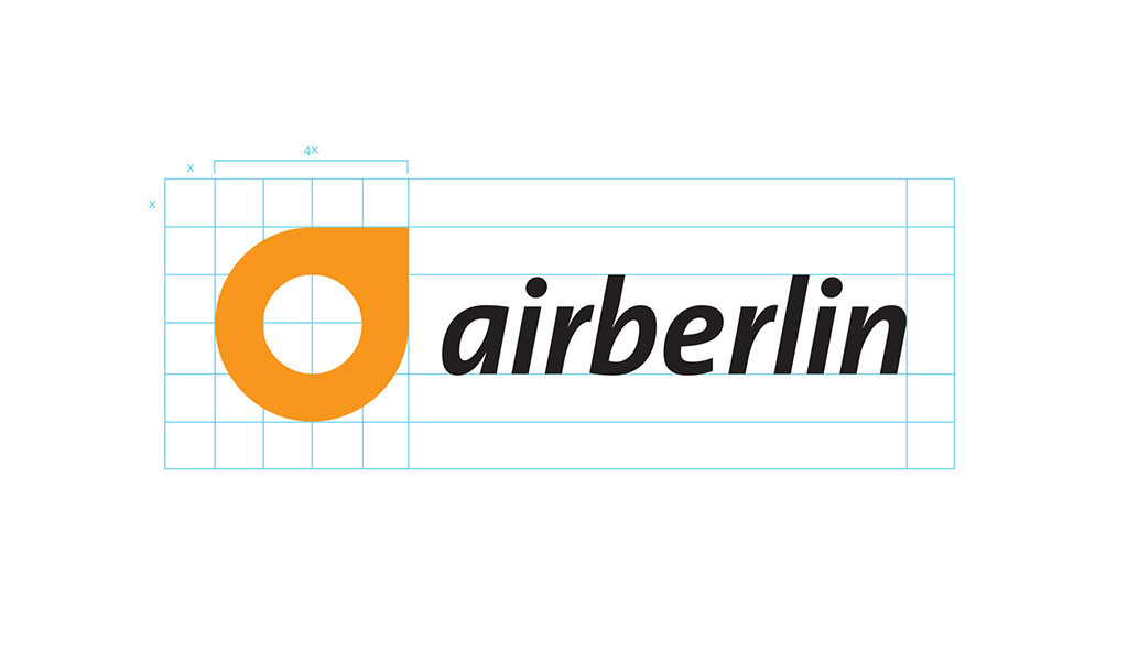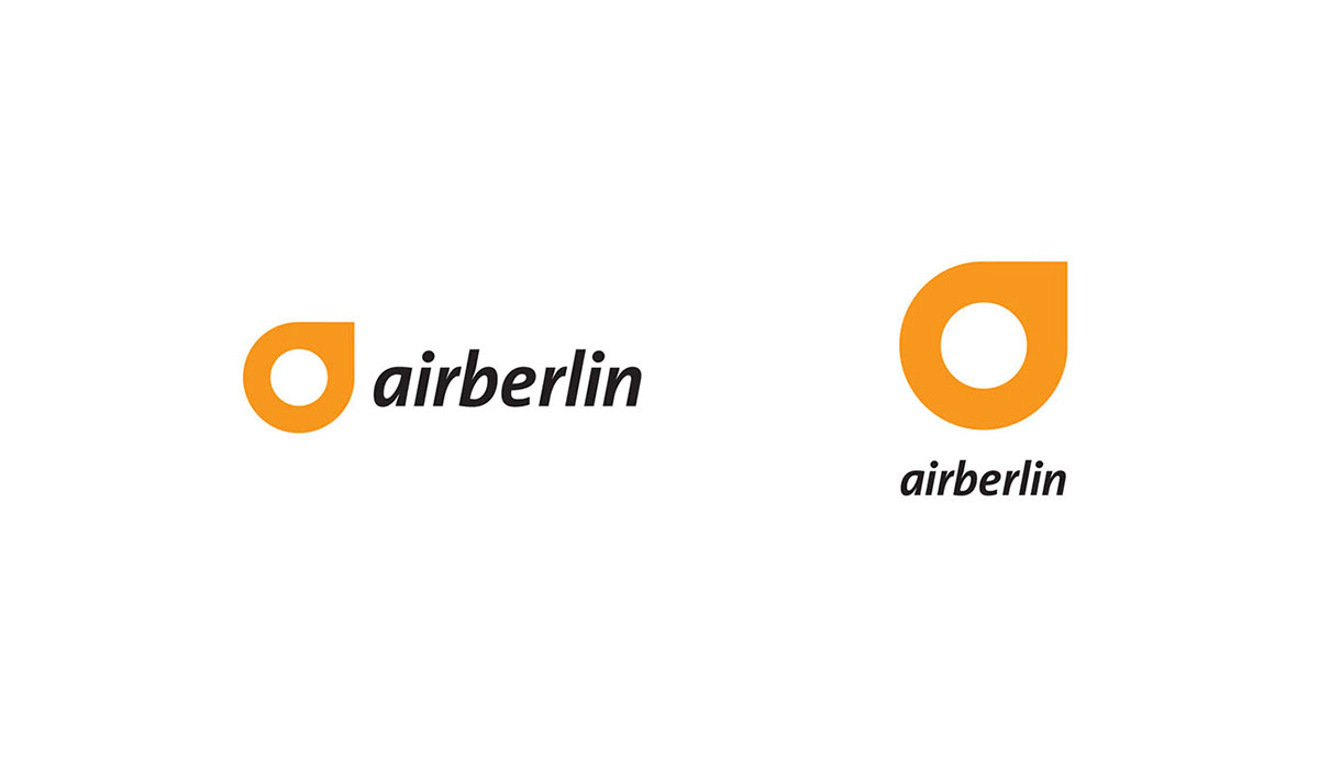
Air Berlin
"We Make You Free to Explore the World”
Title|Air Berlin
Category|Identity
‧
Year|2013
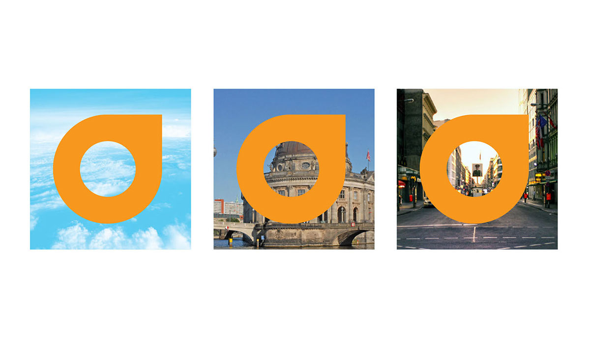
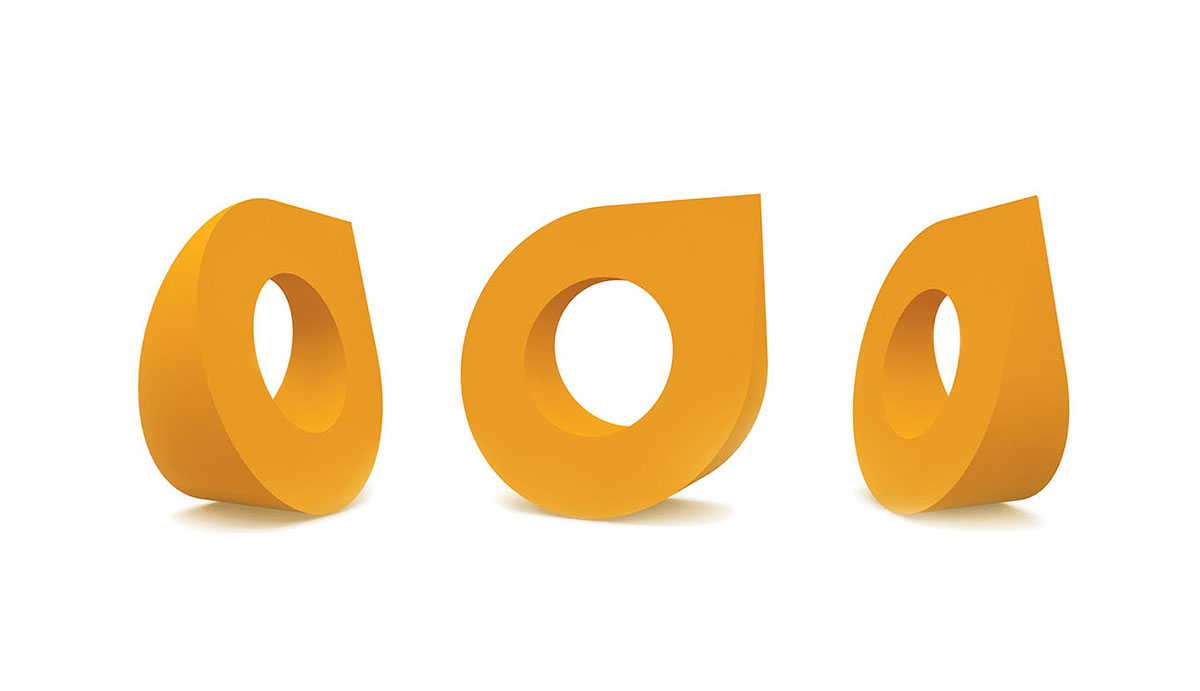
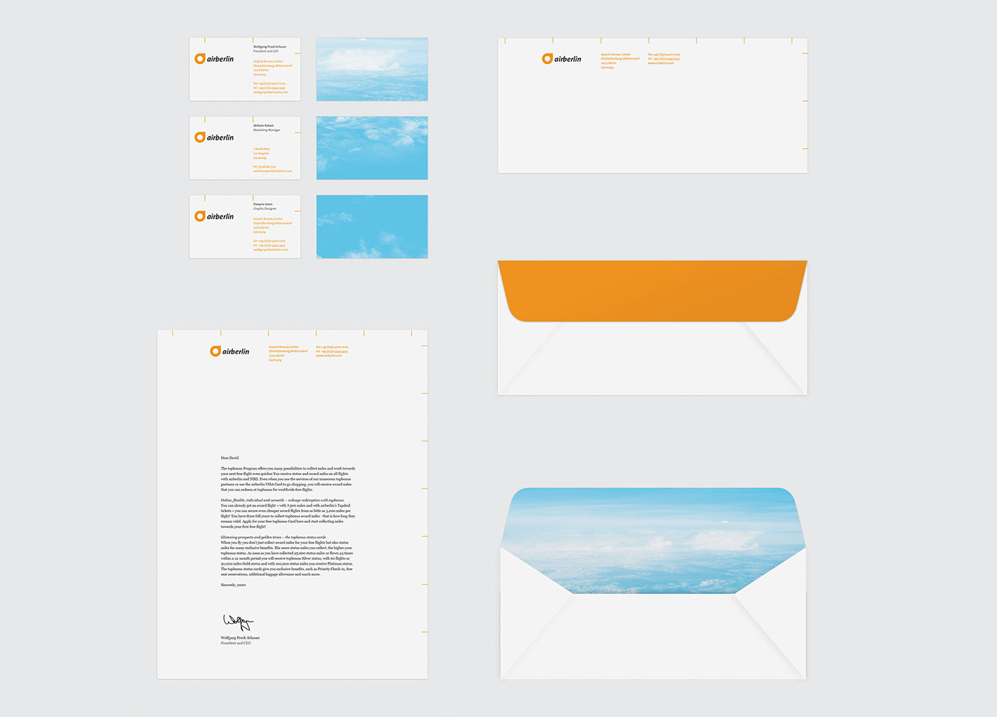
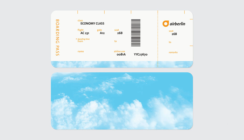
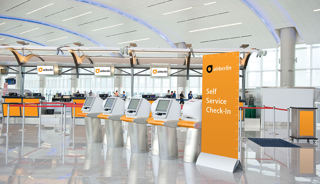
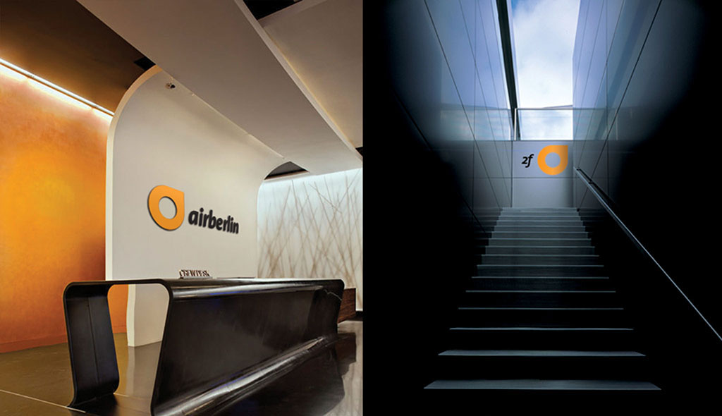
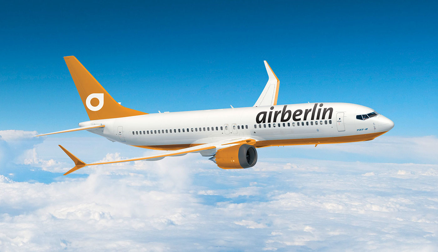
The project is based on rebranding Air Berlin what the airline company exists in Germany. The shape of identity refers alphabet lowercase A of Air Berlin, a pin on a map, a compass toward east north indicating the location of Berlin in Germany. Also, the fresh orange color compares with traditional German black, red and yellow; making the stunning contrast with blue sky.