


____ logo / new - all variants
____ logo / old

TKP is a law firm recommended each year on the biggest law firm rankings - both domestic and foreign.
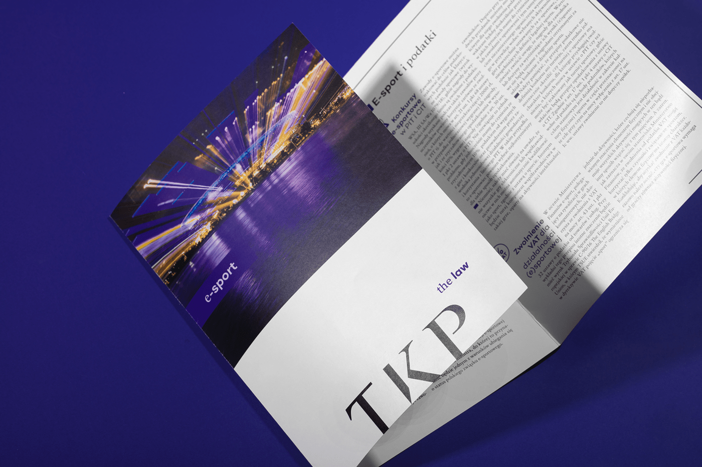
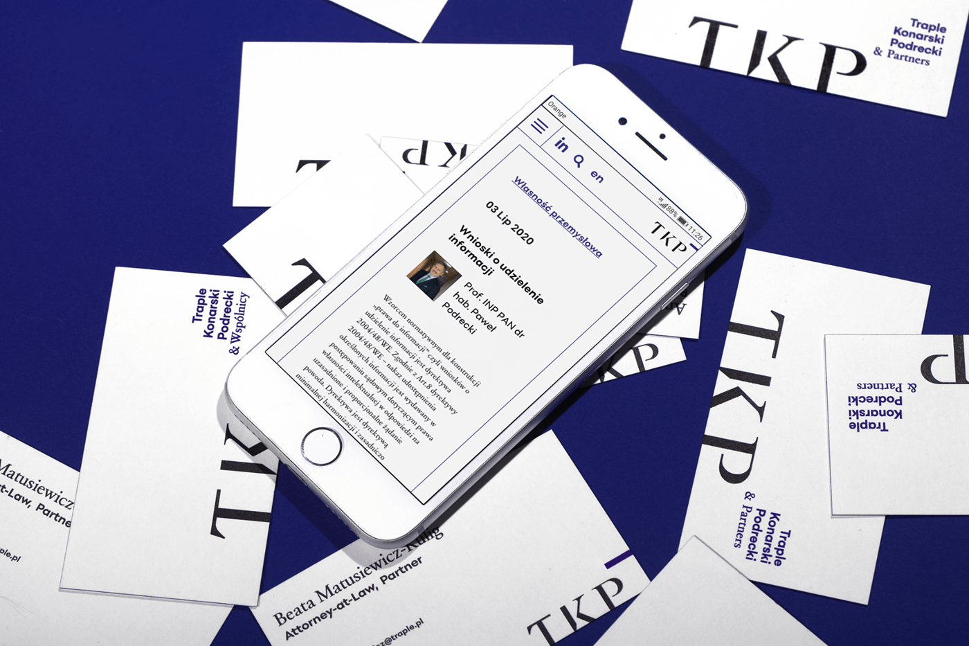
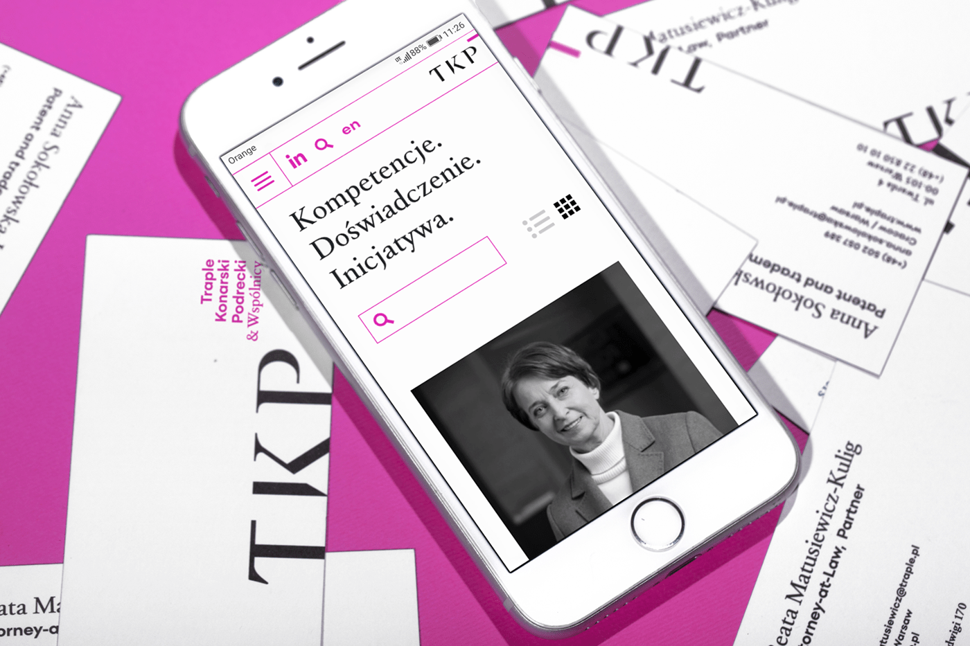
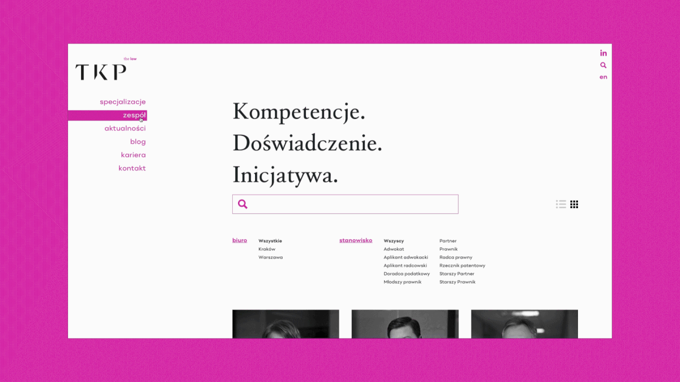
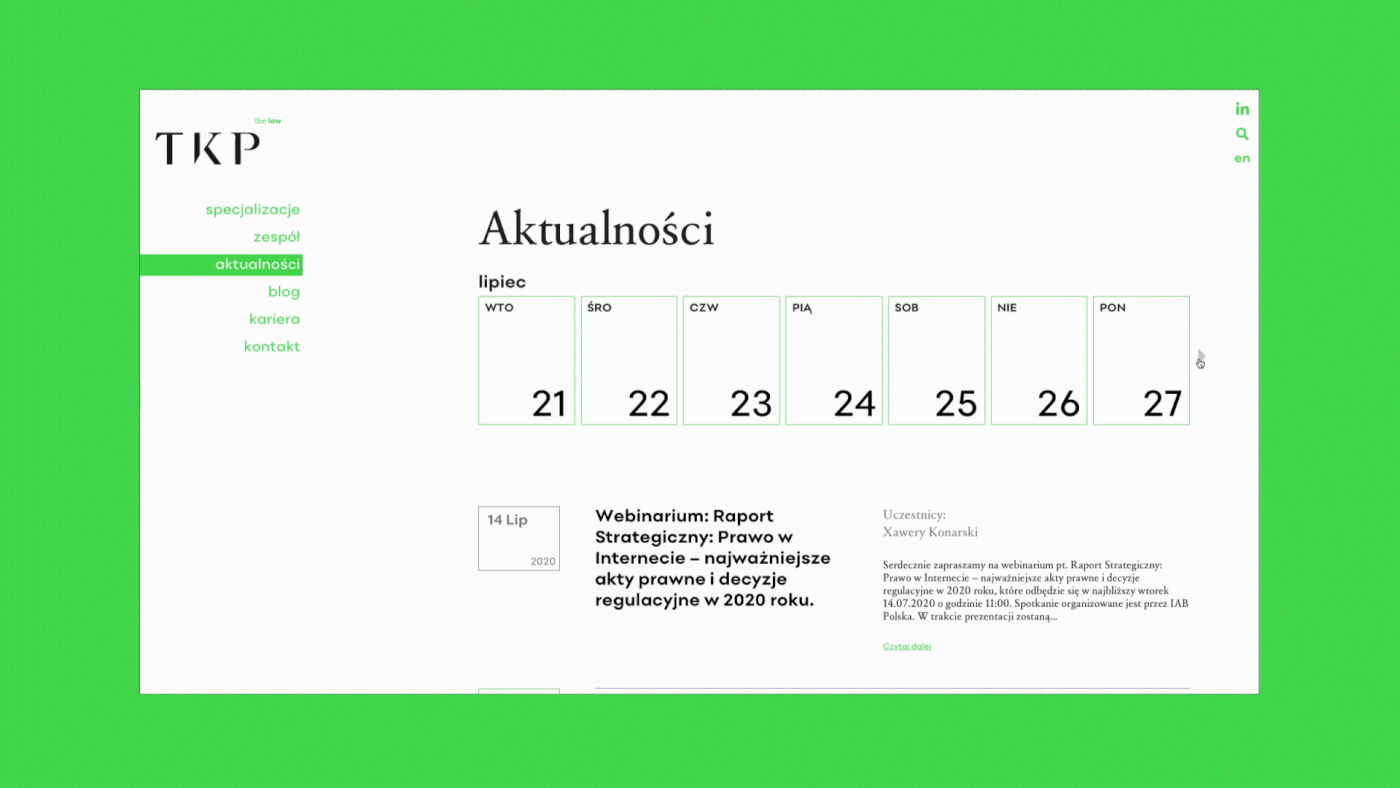
The rebranding's purpose was to create an identity fitting the profile of the company and show its dynamic growth, as well as the main areas of its activity. A fusion of tradition - being the academic roots of the firm - and modernity, which can be seen in the business approach and applying new technologies, was the strategic and innovative identity change of this brand. Rebranding covered the strategy, logo modification, key visual of all promo materials as well as the website.
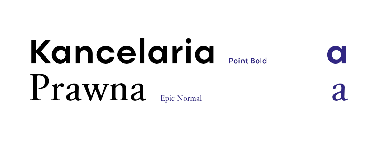
The new identity's purpose was to best the current conventions; be brave, but not break off entirely with it's academic heritage. In each and every element of the identity this merge of both notions can be seen. Starting with a mixture of a classic typography with a modern and dynamic logo, ending with the key element - always present black and white colours peppered with dinstinctive touches. The latter gives the identity character and distinguishes from competitors.

___ key visual


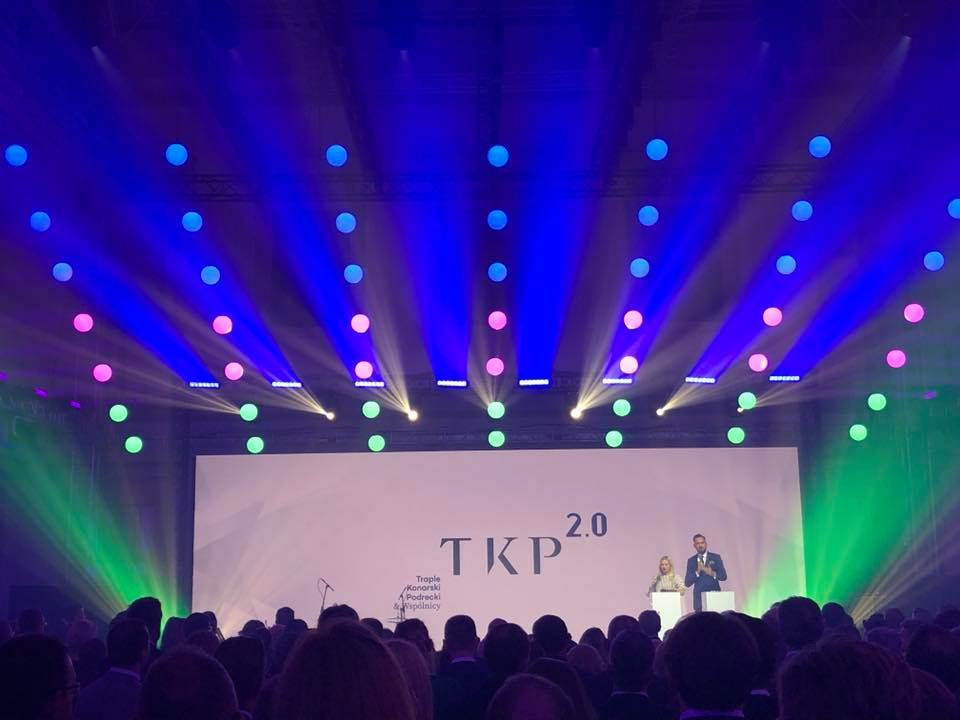
Ujazdowski Castle, 20th anniversary of TKP, the announcement of the rebranding
scope of the project: strategy, logo design, key visual, web design & programming, promotional materials for printing (flyers, folders, bags, business cards, letterhead) and social media, pictograms
Łobzowska Studio
graphic design: Weronika Cyganik, Joanna Wielgosz
photography: Aleksander Karkoszka
movie / video: Michał Braun
strategy: Karolina Reimus


