South Africa's largest independent radio station had an old and stale image which needed re-imagining. The old purple was "naff" and the logo was based on a frequency similar to that of a competing radio station who had won the recognition battle. A change was needed
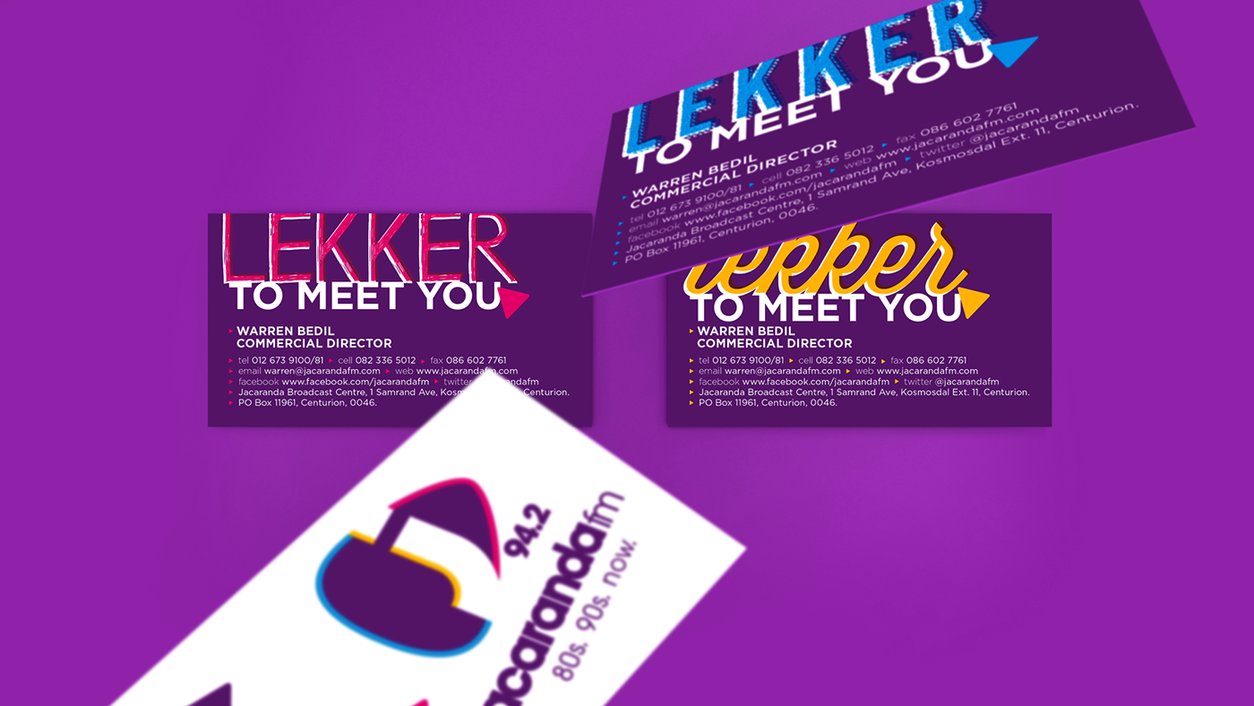
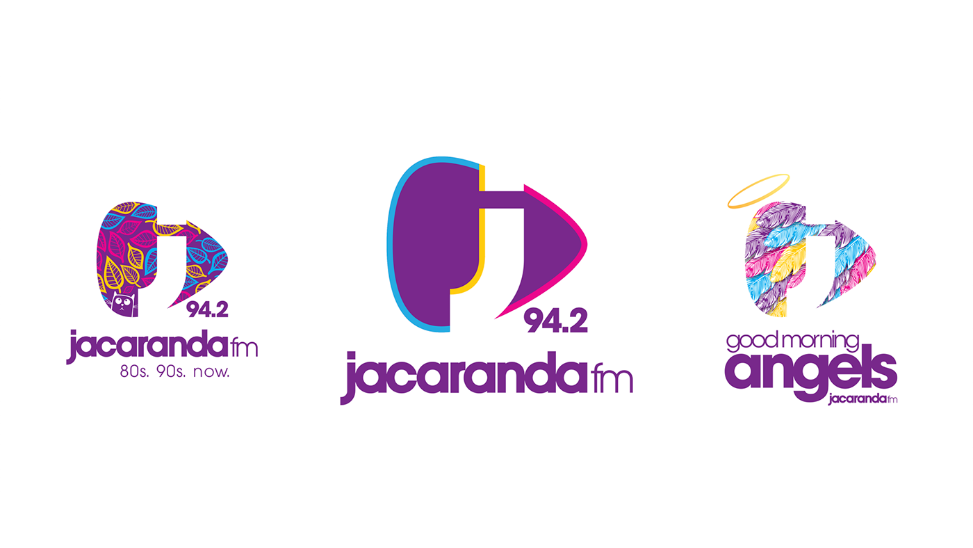
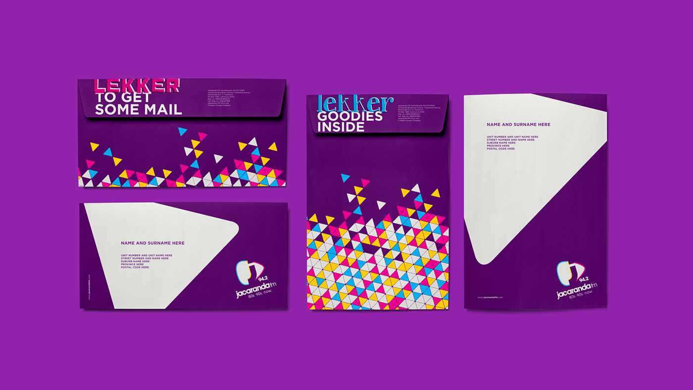
I revamped the old purple and added yellow (for the city of gold) as well as pink and blue (representing the guy/girl next door). The icon is a plectrum, turned on it's side to depict a play button, but also a more playful attitude
As Jacaranda fm participates in many projects and host a variety of events, I made the logo modular. Maintaining the shape of the logo mark, but allowing the background to be changed creates brand recognition across the entire range
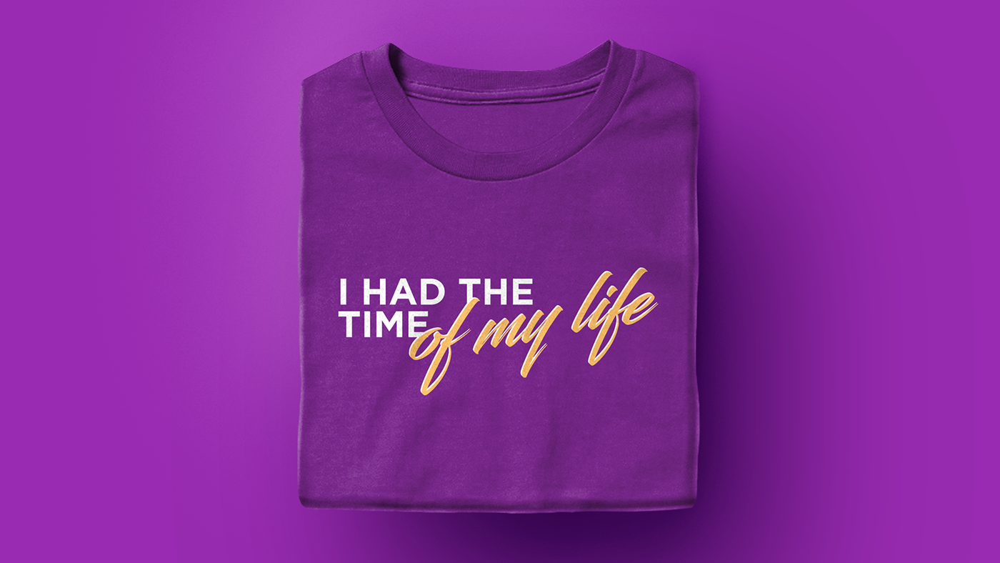
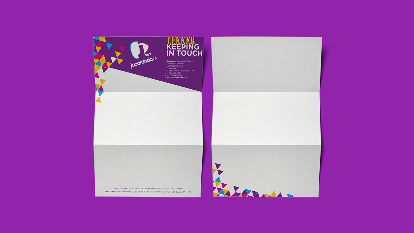
The new identity translated well across a wide platform of elements ranging from station, pull up banners and fence wraps to t-shirts and vehicle wraps like that of the broadcast unit