A new media strategy company that believes in “audience above all” needed a corporate identity to convey their beliefs as well as their services
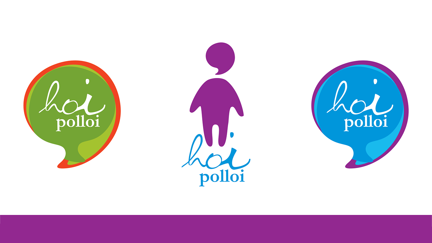
The logotype represents the everyman by using a combination of hand-generated type along with a classic serif font

The logo mark comprises of a man with a speech bubble for a head, clearly depicting Hoi Polloi as a communications company
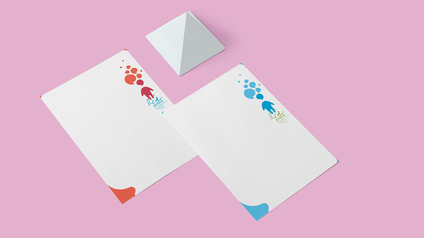
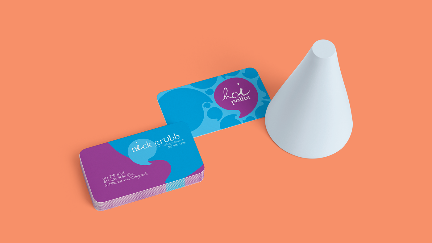
An adaptable pattern coupled with an extensive color palette, ensure there are endless possibilities for every element needed