


Olimpo Empreendimentos
EN
_
_
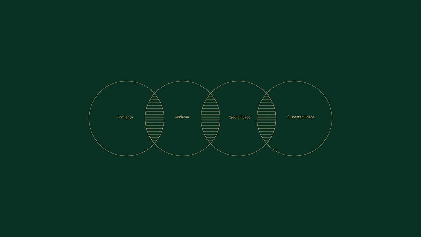
The project had the challenge of rethinking a new brand for one of the largest real estate companies in the region of Campinas -SP. The challenge was to bring up-to-date and modernity as a strong symbol and recognized by its audience, bringing in its essence: Trust, credibility, sustainability and being premium.
PT
_
_
O projeto tinha o desafio de repensar uma mova marca para uma das maiores empresa de Empreendimentos Imobiliários da região de Campinas -SP. O desafio era trazer a atualidade e a modernidade como uma simbologia forte e reconhecida pelo seu público, trazendo em sua essência: Confiança, credibilidade, sustentabilidade e ser premium.


EN
_
_
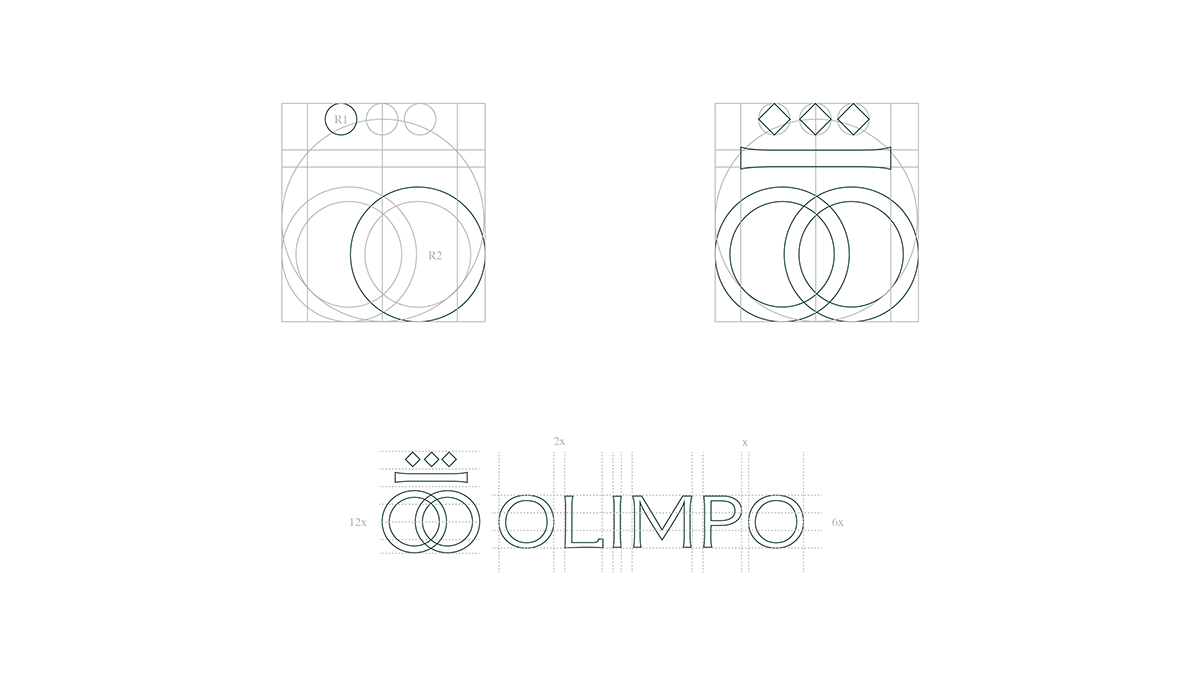
The construction was based on the sizes of the circles formed within the golden ratio. Thus bringing more perfection, symmetry and accuracy to the symbology that refers to a Greek god, and gods are perfect. So does the symbology.
PT
_
_
A construção foi baseada nos tamanhos dos círculos formados dentro da proporção áurea. Trazendo assim mais perfeição, simetria e exatidão para a simbologia que remete a um deus grego, e deuses são perfeitos. Assim a simbologia também.
EN
_
_
With the defined proportion and the keywords chosen together with the client, the grid was created to assist in the construction of the symbolism of the Olimpo brand, thus bringing visual harmonization to the brand.
PT
_
_
Com a proporção definida e as palavras chaves escolhidas juntamente com cliente, o grid foi criado para auxiliar na construção da simbologia da marca Olimpo, trazendo assim a harmonização visual para a marca.


EN
_
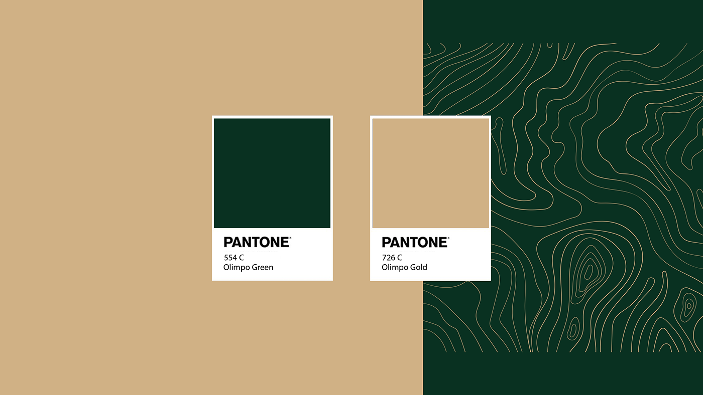
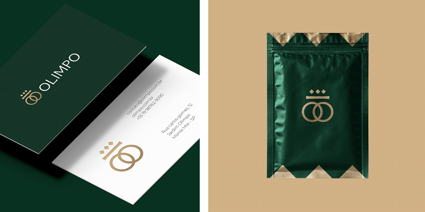
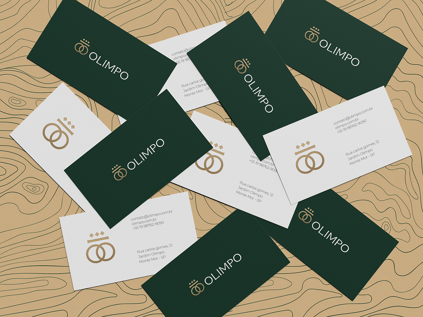
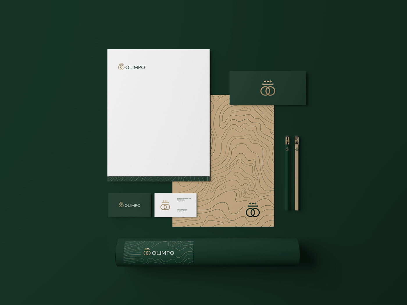
The color green was chosen to maintain the concept of sustainability and also the meaning of growth, trust and stability that the company has as its essence in its nature. Already the gold refers to nobility, high quality products that the construction company delivers to its customers, the gold is as noble as the Gods of Greece, which the brand now brings in its construction.
PT
_
_
A cor verde foi escolhida para manter o conceito de sustentabilidade e também o significado de crescimento, confiança e estabilidade que a empresa tem como essência em sua natureza. Já o dourado remete a nobreza, produtos de alta qualidade que a construtora entrega para seus clientes, o dourado é tão nobre quanto os Deuses da Grécia, que a agora a marca traz em sua construção.
EN
_
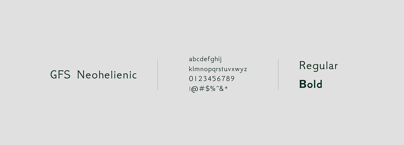
The typeface chosen was the "GFS Neohelienic", a serif typeface that resembles the lines of an Ionic column, bringing the reference of the brand concept to the typography that, in addition to being used for the logo, was used as a source of support for the materials.
PT
_
_
A família tipográfica escolhida foi a "GFS Neohelienic" uma tipografia serifada que lembra bem as linhas de uma coluna jônica, trazendo a referência do conceito da marca para a tipografia que além de utilizada para o logotipo, foi utilizada para fonte de apoio dos materiais.


Agência Sinais Publicidade
Diretor executivo: Primo Júnior
Diretor executivo: Primo Júnior
Diretor de Marketing: Primo Júnior
Diretor de Criação: Murillo Lima
Designer: Murillo Lima
Proposta: Branding e Identidade Visual
Proposta: Branding e Identidade Visual
Obrigado!


