Design Team
STUCK Principals: Donn Koh, Lee Tze Ming, Yong Jieyu
Design Team: Cheng Siewming
Design Support: George Goh, Mervy Quek, Kiera Lin
Zensorium Team: Visit Thaveeprungsriporn, Juliana Chua, Cheah Xinying, Kumar Senthil
Development Team: Dominic Ee, Kuan Chih Yuan
Designed and developed in Nov 2011 - Sep 2012. Launched in Oct 2012.
Please do not reproduce in any form or post on blogs without the expressed written consent from STUCK.
Please do not reproduce in any form or post on blogs without the expressed written consent from STUCK.
MOBILE FITNESS APP
Science Made Friendly, for Zensorium 2011
Mobile App UI/UX Design and Development / Infographics
Overview
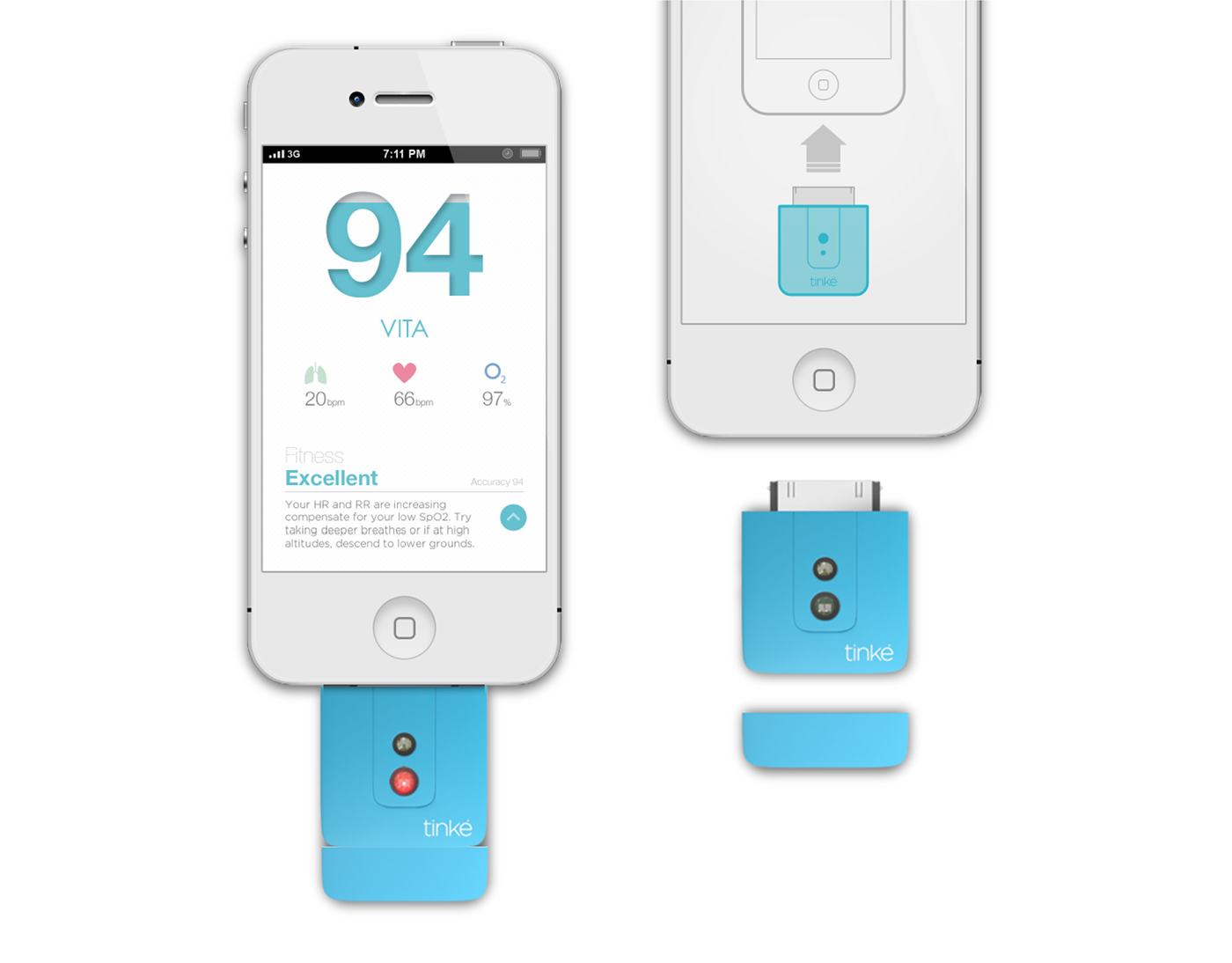
Nitto Denko had developed a new technology, using optics to non-invasively measure parameters in our blood. These comprise the Oxygen Saturation, Respiration Rate, Heart Rate, and Heart Rate Variability. These measurements enable a snapshot approximate of a person’s overall fitness and wellness at any point in time.
STUCK was engaged to investigate the hardware configuration for such a technology to become usable, convenient and delightful for consumers, resulting in the preliminary hardware configuration and general usage form factor. As a second part of the project, STUCK was to design and build the entire Tinke App from the ground-up. This included designing the whole software usage flow, its interaction model and interactive elements, the data representation and the aesthetics of the mobile app.
The final result is an App which achieves beauty and function by breaking out of the typical ‘safe’ ways to design mobile interfaces. Through this, STUCK created an innovative menu navigation typology which is both fun and blazing fast, as well as friendly and clear aesthetics throughout the app - representing scientific data in ways that are comfortable, positive and acceptable to the user - steering away from the typical information overload.
With the App, STUCK has effectively transformed something quite technical to a format which is lively, motivating and assuring. Enjoy the UI design overview video below:
Problem-Solving: Structuring the App Workflow
As a relatively complex App, one of the biggest challenges was to sort out all the functionality and features into an easily navigable, logical and comprehensible flow for the user. This formed a key challenge, but was ultimately resolved with a logical workflow that is easy to understand and organized to work with one’s intuition.
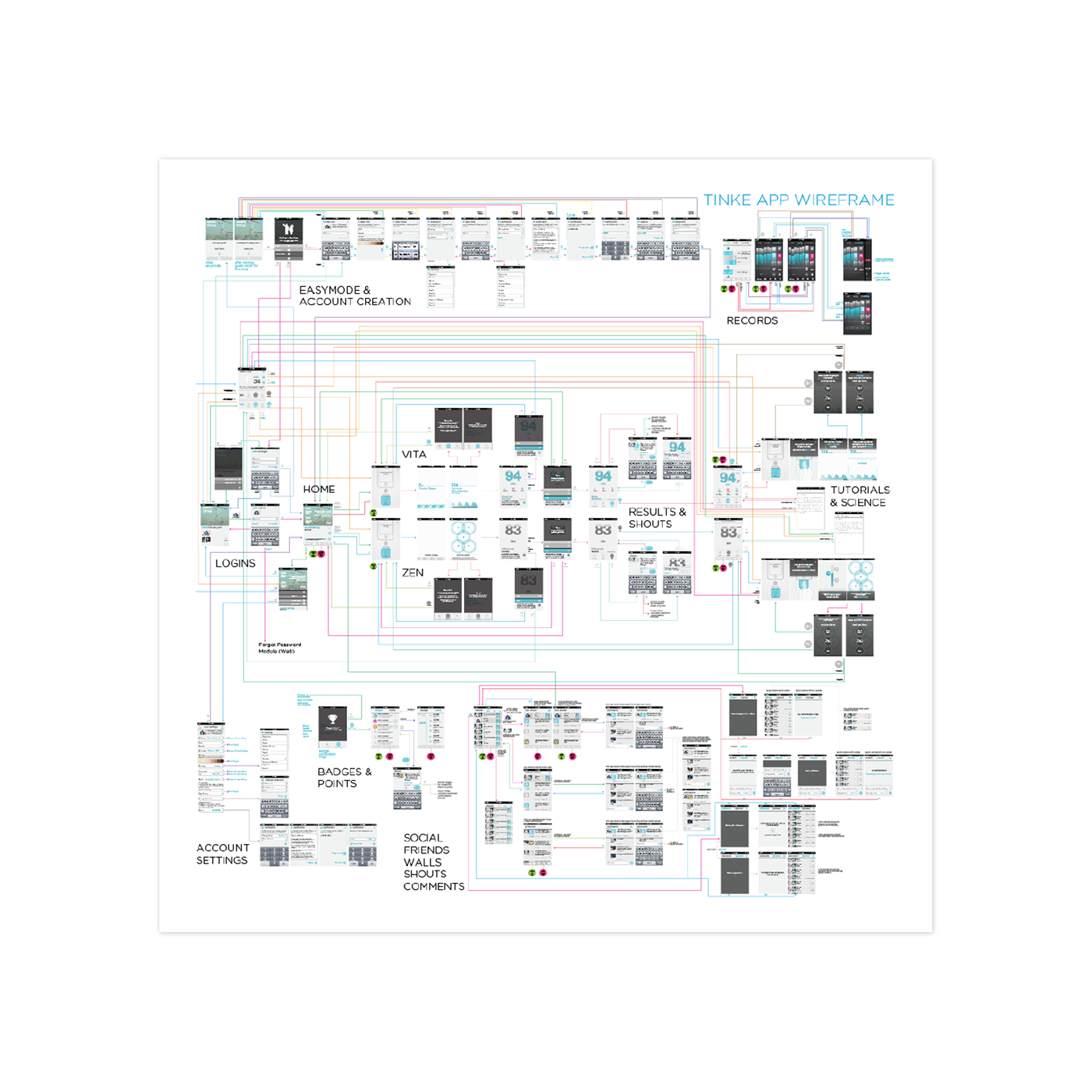
The wireframe diagram above (after numerous iterations) was a tool to help us work out and communicate the intended flow of the app, for ourselves to evaluate and tweak, as well as for communicating with programmers. It’s inclusion here serves the purpose of providing a sense of the App’s scale and complexity.
App Positioning
The strategy was to create an App that feels like ‘lifestyle-oriented’ health-consciousness. We made it highly approachable, and reminiscient of a lifestyle magazine, or brochure, rather than what would remind one of ‘computer software’.
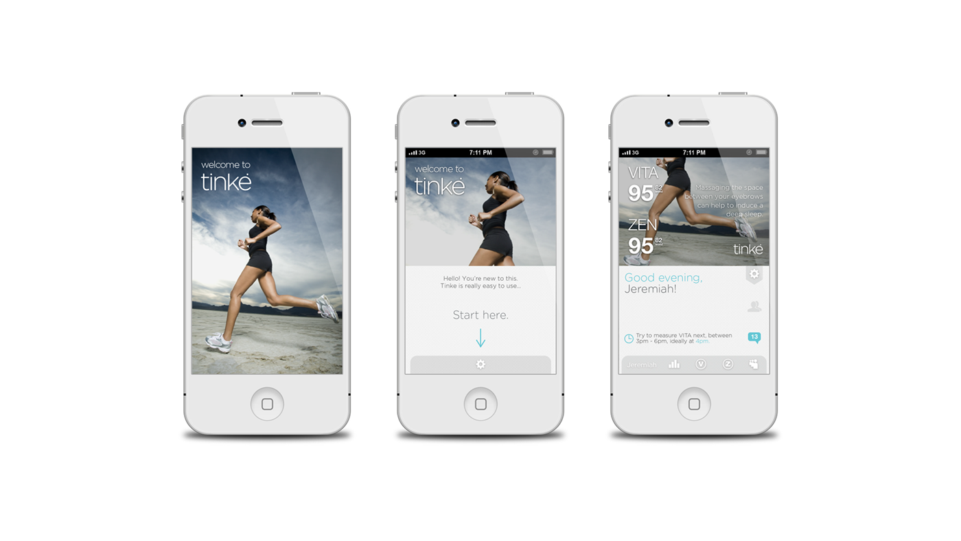
Like a well-designed unboxing process when one buys a nice gadget, the App takes a first time user through a progressive unveiling of functions, and helps introduce the new interaction paradigms to the user as he/she experiments with using it.
The third screen shows the home base for the user. Periodically, new health tips and images are revealed to give a feel of a ‘live’ magazine.
Friendly Science
These VITA measuring pages demonstrate one of our key focus in developing the Tinke App: We were determined to find alternative ways to represent medical / ‘science-ish’ graphs and data, so that we could break out of the whole ‘analysis / technical / statistical’ image of medical monitoring tools, and instead, become more like an everyday lifestyle companion: positive, light-hearted, optimistic, breathable, and casual, but nonetheless credible, and of substance.

Integrating a meter gauge within the shape of the digits of the score creates a less technical feel than having a separate meter display, at the same time it creates a fun, game-like feeling, and also reduces clutter!
The ‘Friendly Science’ feel was critical so as to achieve the right positioning and feel for the whole usage and value proposition of Tinke - an everyday lifestyle health awareness companion product. These screens are some of the ones involved in taking a ZEN (Stress) measurement, continue to demonstrate this approach we have taken - transforming
technical data into approachable, light-hearted graphics.
technical data into approachable, light-hearted graphics.
‘Gamification’ of the graphics was one of the ingredients we’ve employed to generate the approachability and feeling of simplicity.
Clutter-Free Records Pages
Besides technical-looking aesthetics, another source of usage stress for the user is visual clutter. With the amount of variables and data components to be displayed, one of the key challenges of designing the Tinke App is to find smart ways to represent and organize data clearly and systematically, so that it becomes information that can be easily absorbed.

While doing this, we sought ways to make data appear ‘happy’ too, so as to make Tinke a health-tracking device that is endearing to use, instead of a technical drudgery.
Fastest Navigation Ever
Tinke is an app with many pages. One challenge was to find ways that would help the app feel snappy, quick, and intuitive to navigate, and help the user easily form a mental map of the whole app structure.

Inspired by the observation that sliding one’s thumb over capacitive interfaces is more addictive and more natural than tapping on it, we achieved this with a ‘single-swipe’ fanning menu system: Wherever a user initiates a finger swipe, that determines the submenu that opens; and without lifting his finger, he swipes to his choice and releases to make the choice. This menu system enables every key page of the App (10 of them in fact) to be directly accessible from any other page with a single swipe. Users never need to ‘tap-here-then-tap-there’, or return to a home menu just to go to another page.

Such is the success of this menu system that we have multiplied it across various points in the App where there are multiple paths of action to take.
The system not only gives speedy navigation - but because of its ‘fanning-out’ mechanism, all options stay hidden until you are making a decision - effectively reducing visual clutter, and the number of ‘buttons’ at any one point on the screen. This is possibly the fastest navigation menu ever made. And not only that, the interaction is proving to be extremely satisfying, fun and highly addictive.
Behind the Scenes: Design Development
While most of the development process and alternative options are bound by non-disclosure agreements, Zensorium / Nitto Denko has graciously allowed the detailed showcase of the process behind developing a few areas of Tinke. This provides a us chance to reveal some behind-the-scenes work, as a representation of the methods and rigor put into the design of the App.
Design the Records Pages: It Started with Playful Doodles
We started with loose, playful doodles as a search for new ways to represent information, finding interesting visual analogies, envisioning new effects, and trying to work out the functionality and hiearchy.
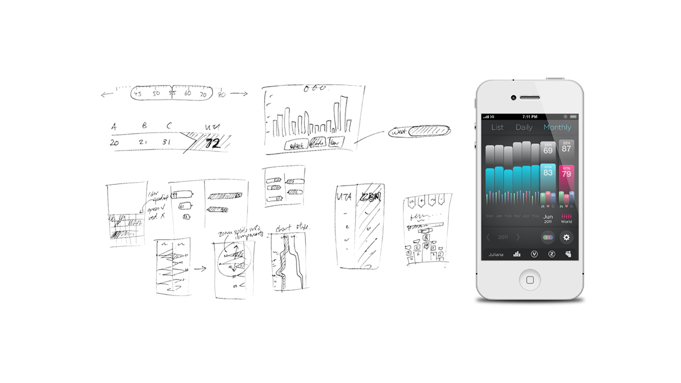
At this stage, some sketches may be more inclined to solving ‘function’, whilst others may be about a cool new aesthetic.
Records Pages Process Snapshot #1: Quick and Varied
Working on a digital project allows us to move quickly into ‘scale one’ high fidelity sketch prototypes. The emphasis here has still been about finding new and fresh ways to break out of the box of statistics display. The aim is to find interesting starting points so that we are not just stuck with convention.
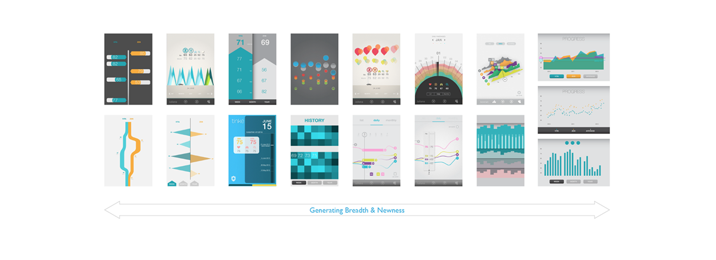
Working in scale allows us to better examine how the realities of the screen size constraints the design, and also helps us evaluate the usability.
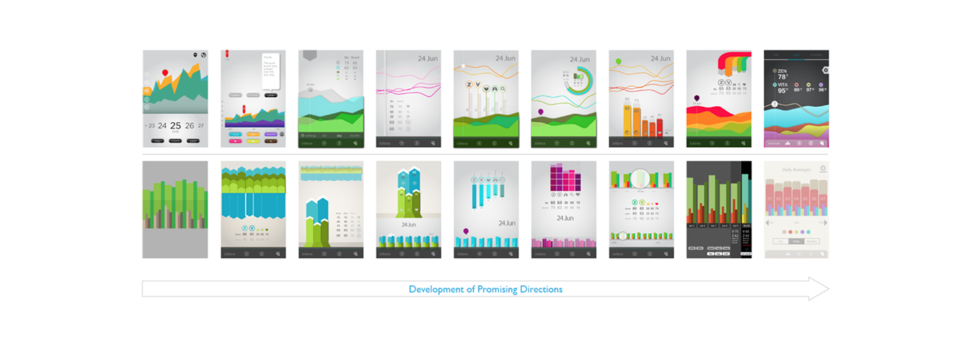
Records Pages Process Snapshot #2: Developing the Promising Directions
Directions which show promise functionally, and/or aesthetically, are further worked on to test the plausibility of the direction. As we do this, we experiment with variants that modify the usability, to better understand the layout challenge we are facing; at the same time, we play with different visual treatments to try to arrive at different aesthetic impressions.
Below are snapshots of two of the directions that we have more intensively explored in parallel.
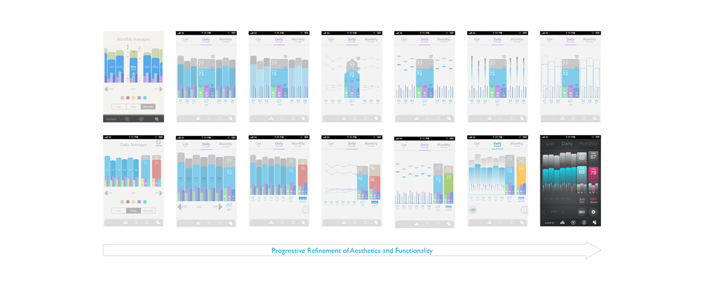
Records Pages Process Snapshot #3: Refinement
Sometimes we take a direction with a promising aesthetic, and try to wrestle the maximum functionality from it; at other times we focus on a layout with great usability, and we try to make it as visually comfortable as possible. The ideal would be a synergy of the two.
Over here, as a charts page, the functionality was the main driver, thus once we arrived at this highly usable and compact layout, the task was to stay with it and work on maximizing its aesthetic quality. The above snapshot shows the progressive refinement towards a clear, comforting, and interesting visual. Different visual tricks were experimented with to create an overall feeling of simplicity, consistency, spaciousness, and friendly approachability - while making sure it still feels credible and substantial.
The Result: Records Pages
By careful control of the visual hierarchy, hues and gradated translucency, the Records Pages exude an easily readable, organized, and uncluttered feel - despite the large amount of information compactly represented.

A side panel can be revealed underneath to adjust the age and gender settings of the World values used for comparison. For even more clarity, each variable can be individually toggled on/off to select what is displayed or hidden.
Designing VITA Measuring: Friendly Science
The task of designing for the measuring page of VITA index faced the main challenge of trying to make the blood signal waveforms look friendly and less technical. However, at the same time it should not become too playful such that it loses its ‘healthcare credibility’.

In our explorations, some options tended more towards the technical, and some more towards the playful. While the snapshots of the options we had explored for this are confidential, the gist of the main trick we have adopted is to make the waveform into a solid graphic rather than a graph line aesthetic - this way we it helped us move it away from the 'science-y' association of a line-based technical graph - and instead hints more at mountain ridges, melting snow caps, water waves etc.
This approach it however, when taken too literally, tended towards a childish feel, and would not fit well with a medical device needing some level of soberness. The final design was a precisely-balanced version between the ‘literal childishness’ of the mountain ridges analogy and something that feels more controlled and rational.
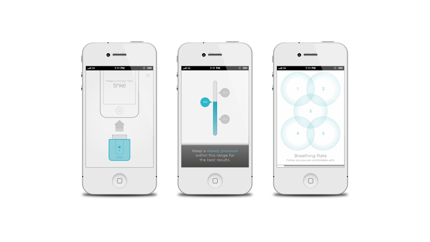
Designing ZEN Measuring: The Problem of Conventional Visual Gauges
For the development of ZEN measurement, we needed to create visual breathing guides for users so that they can follow along in their inhalation and exhalation. The typical solutions involves having clear start and end boundaries, like a meter, so that the user can visually track and anticipate when to switch between inhaling and exhaling.
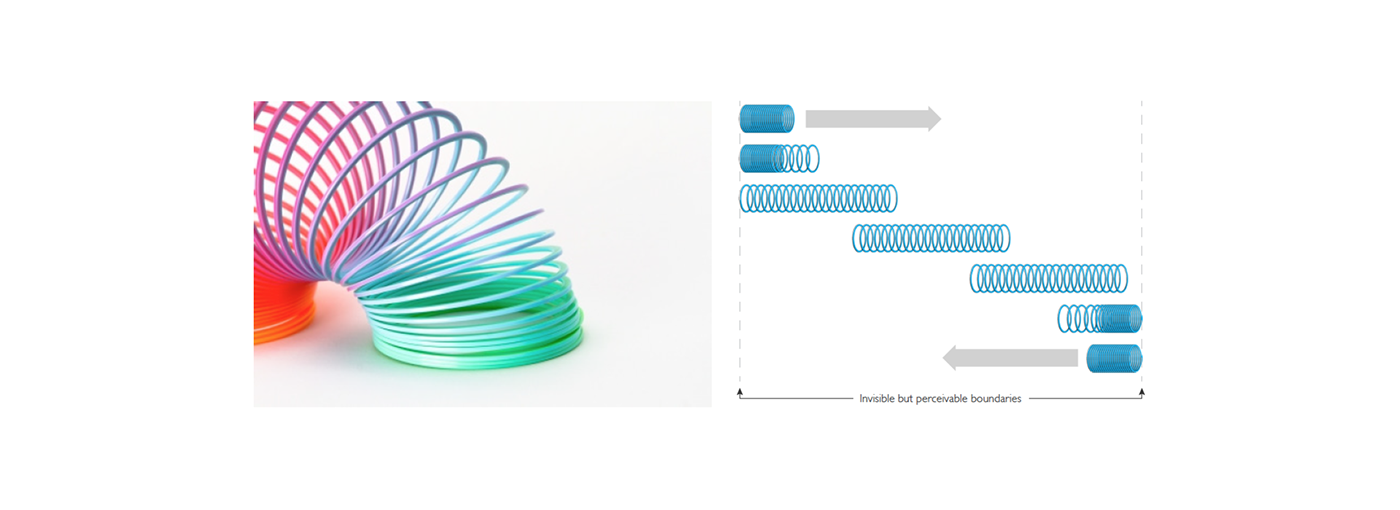
However, as illustrated by the attempts shown above, these ‘visible boundaries’ tend to create an aesthetic like technical meters, and also clutter the interface - especially because we need five different breathing speeds to be displayed at the same time.Therefore we needed to find an alternative solution.

The resultant design typologies remind too much of technical meters. Also it seems that the boundaries which are always visible are an unneccessary clutter on the screen.
Designing ZEN Measuring: Slinky Coil Inspiration to Overcome Conventional Visual Gauges
Inspired by the way slinky coils move, we created a graphic that did not need to have permanent fixed boundary to indicate to the user the end of the movement.
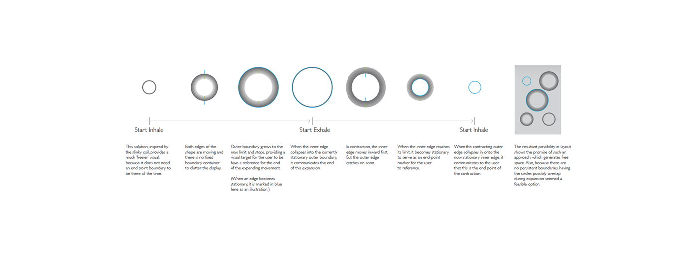
Designing ZEN Measuring: Problems as Opportunities
Another problem became apparent - To create a sufficiently big range of movement, the circles had to be somewhat big, and thus created the problem of overlapping. However, what was initially deemed to be a problem - the overlapping - was used as an opportunity when we decided to adopt the concentric rings ripple patterns. The overlapping produced a beautiful moire effect rather than being a problem.

Designing the Results Display
With the same vision in mind, this final example shows the similar rigor with which we have explored and developed the Results Page, so that the display achieves a high level of functional usability, as well as an aesthetic that marries friendly approachability and credible soberness.


