koko&clay is a cosmetic brand based in Germany and it is all about conscious, natural, mindful beauty. The products are made out of unique formulas created by the founder, inspired by ancient beauty and traditions from all around the world, and are made with all natural ingredients, giving back the power to the nature.

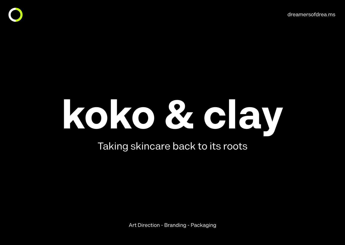
For the rebrand the goal was to express the simplicity and honesty behind the brand and highlight the natural aspect. Therefor I played with the typography of the logo, making the "k" have the shape of a plant.
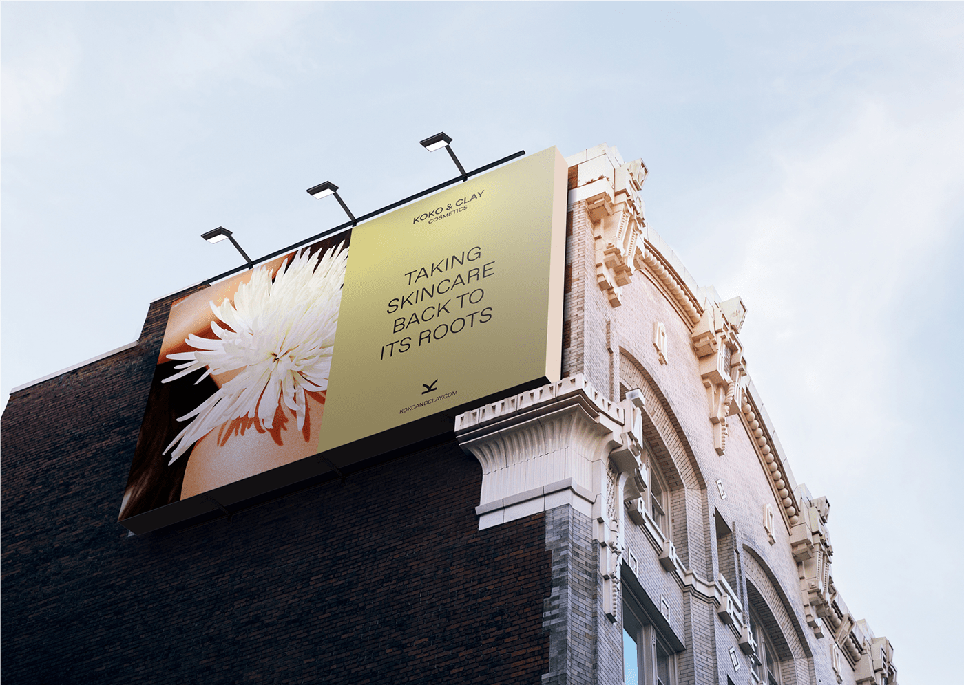
koko&clay wants to bring back skincare to its roots, and the logo wants to be a visual expressions of it.
koko&clay wants to bring back skincare to its roots, and the logo wants to be a visual expressions of it.


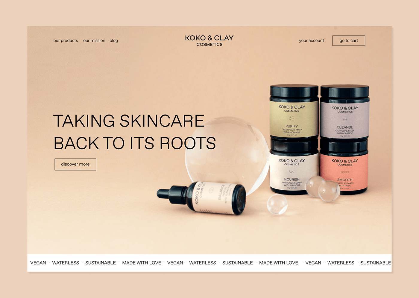
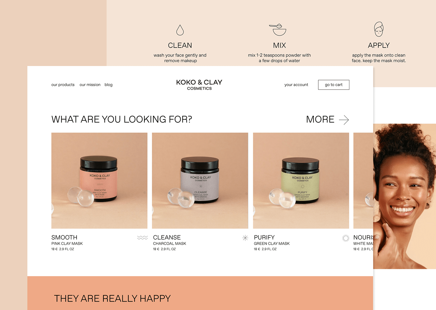
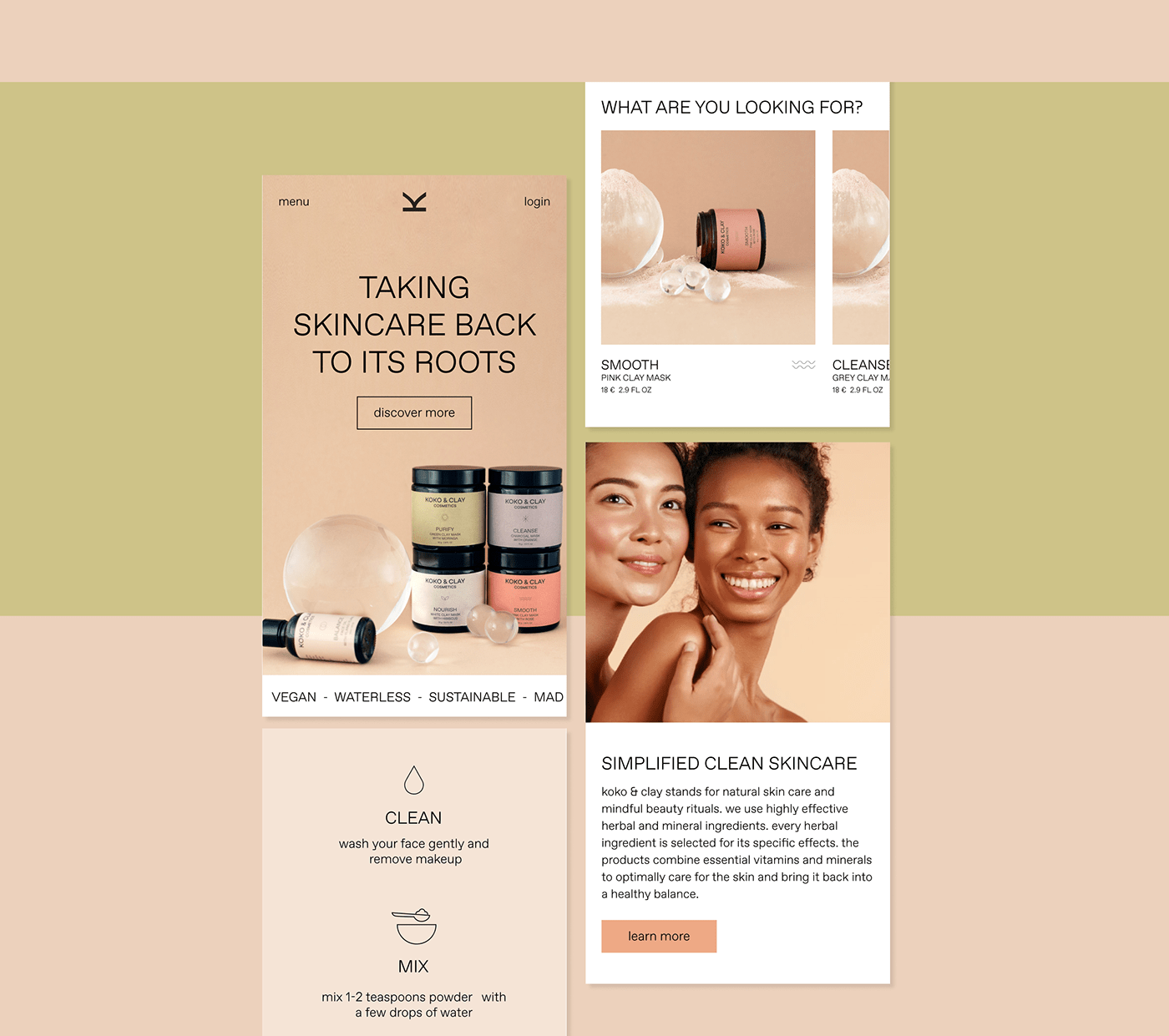
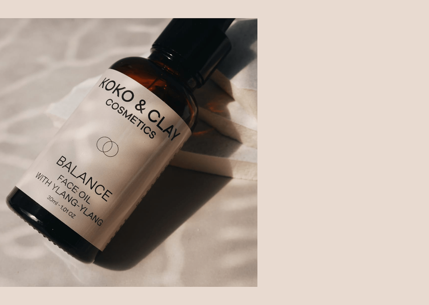
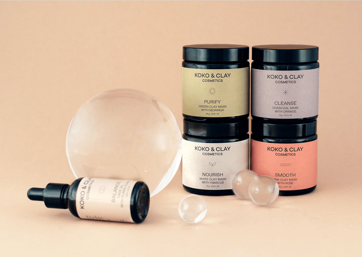
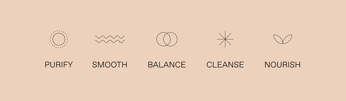
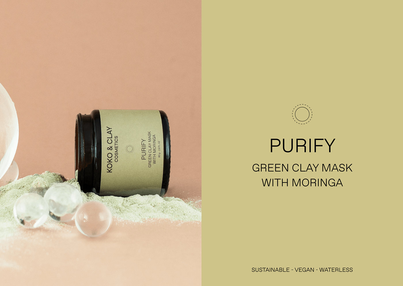
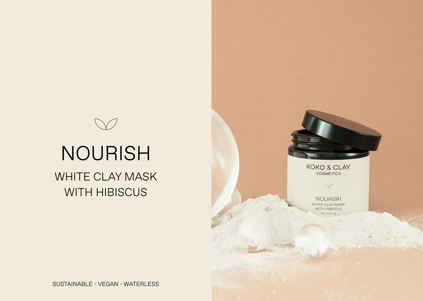
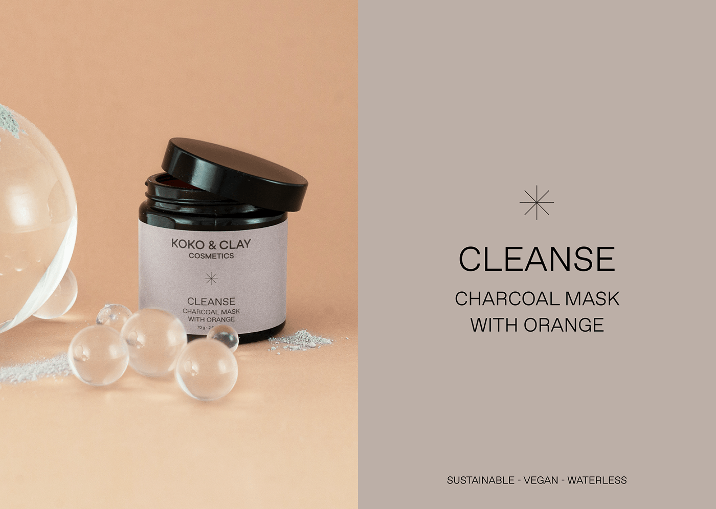
The packaging wants to highlight the specific benefit of each product as well as the natural ingredients. Therefor the color of each label is a reflection of the main ingredient used and has a link to the color of the product itself. The icons play an important role highlighting each specific benefit.

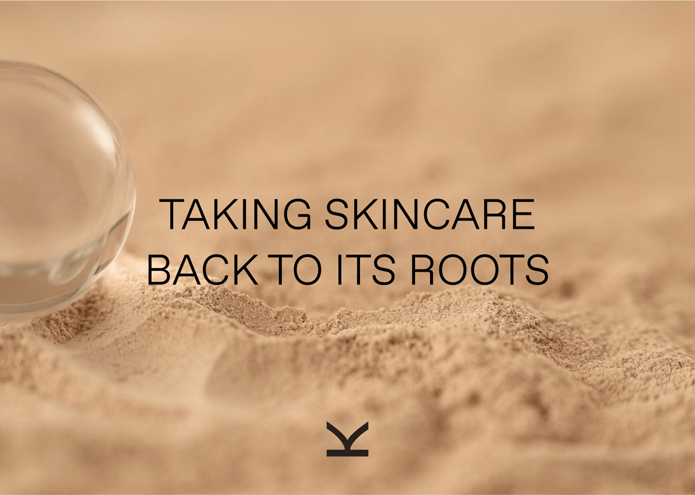
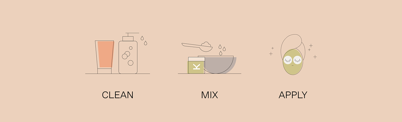
Illustrations are used on web and print materials to express how to better use the products
The website is clean and plays around the use of typography and photography in order to be first of all easy to navigate and have a strong focus on the products and the benefits of each of them.