
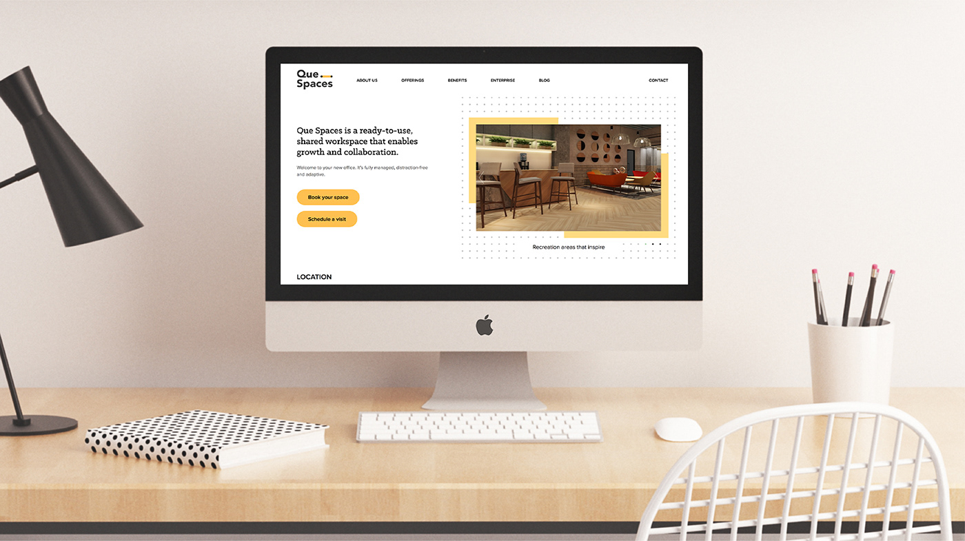
Que Spaces - Enabling Possibilities for a new-age co-working space.
Launching a new age co-working & shared office space by the Magarpatta Group in Pune.
Deep rooted in the idea of a fresh start daily the name revolves around the metaphor of a “cue” - how everyday is new, filled with opportunities and provides a reason to come into work.
Deep rooted in the idea of a fresh start daily the name revolves around the metaphor of a “cue” - how everyday is new, filled with opportunities and provides a reason to come into work.
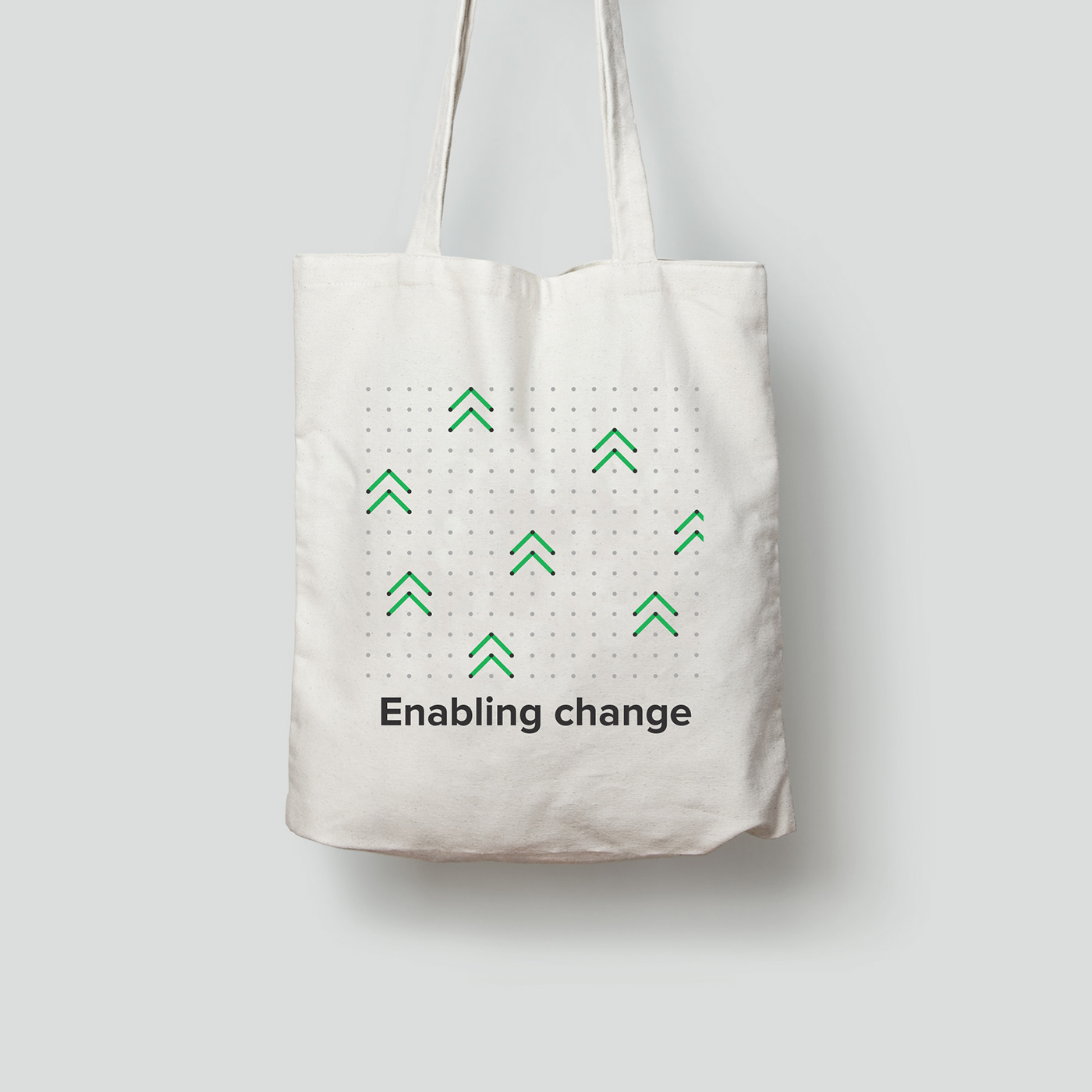
The brand essence “Enabling Possibilities” positioned Que as an enabler, facilitator, support for teams big or small from across industries staying true to the shared economy space.
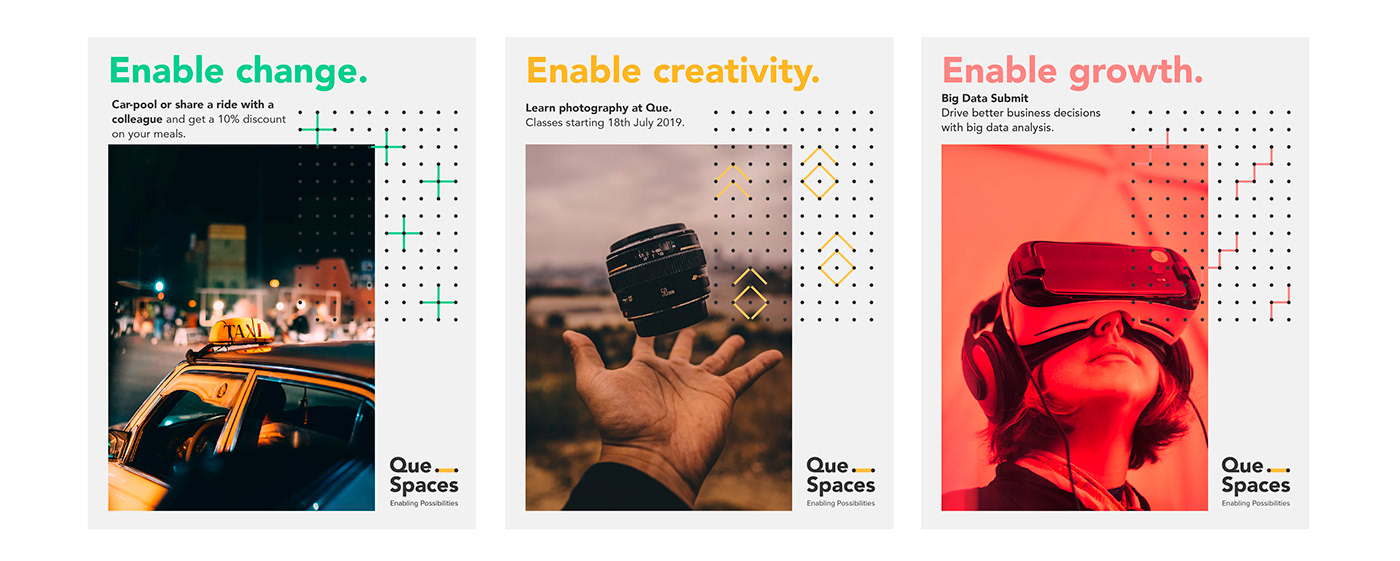
The identity explores the use of a simple dot, which is the starting point of anything one wants to create.

Establishing the idea that Que is a space for possibilities, the concept projects Que as an enabler and facilitator for its customers. The first dot represents Que, while the second represents the customer. The line is symbolic of the fact that Que bridges all the gaps by providing customer excellence.


The visual language is built on dots that form a unique grid that can be used in a dynamic and fluid manner to communicate any aspect of the business. The dot is not just limited to lines but adapts to various forms, shapes and patterns. With the play of the grid, we enabled the brand to tell different stories that could be made visually ownable.


Environmental Graphics


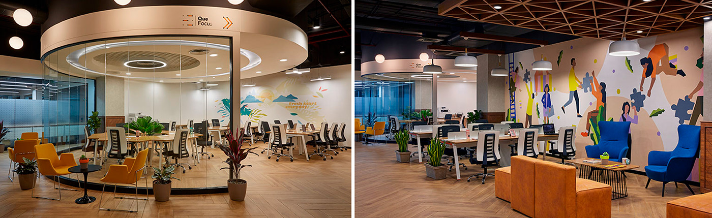

Client: Quespaces (Magarpatta group)
Location: Magarpatta, Pune
Space graphics in collaboration with:
Typestripe - Enabling possibilities wall
Manosij - A fresh start everyday, endless possibilities
Aravani Art Project - Hot desk Workspace


