

Zagreb University Fair 2012
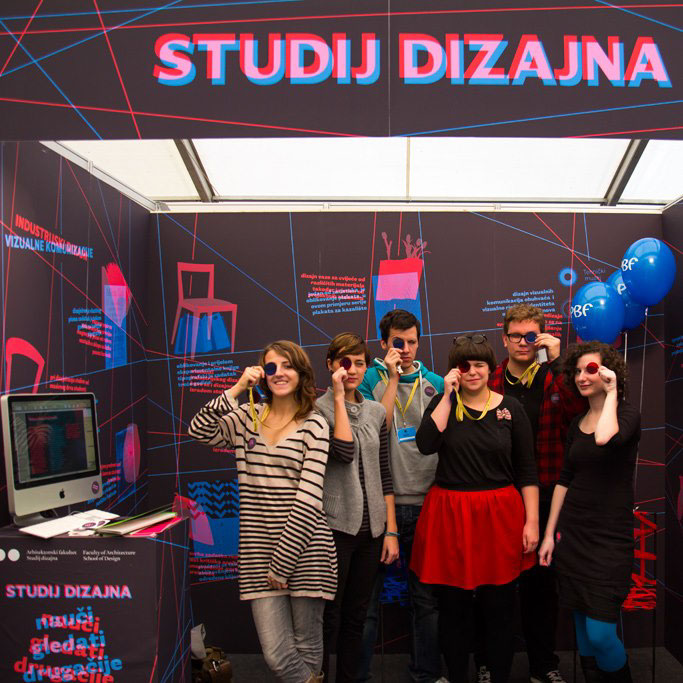
Every year the University of Zagreb organizes an event where different schools promote their programme, courses and student work — each in their own promotional booth. We had to find a way to promote two completely different courses our school has to offer — Visual communications and Industrial design, all in one small space while finding a common visual language between the two at the same time. We chose a slogan "Learn to see differently" which best represented the way we think as designers, and the approach of our schools programme.
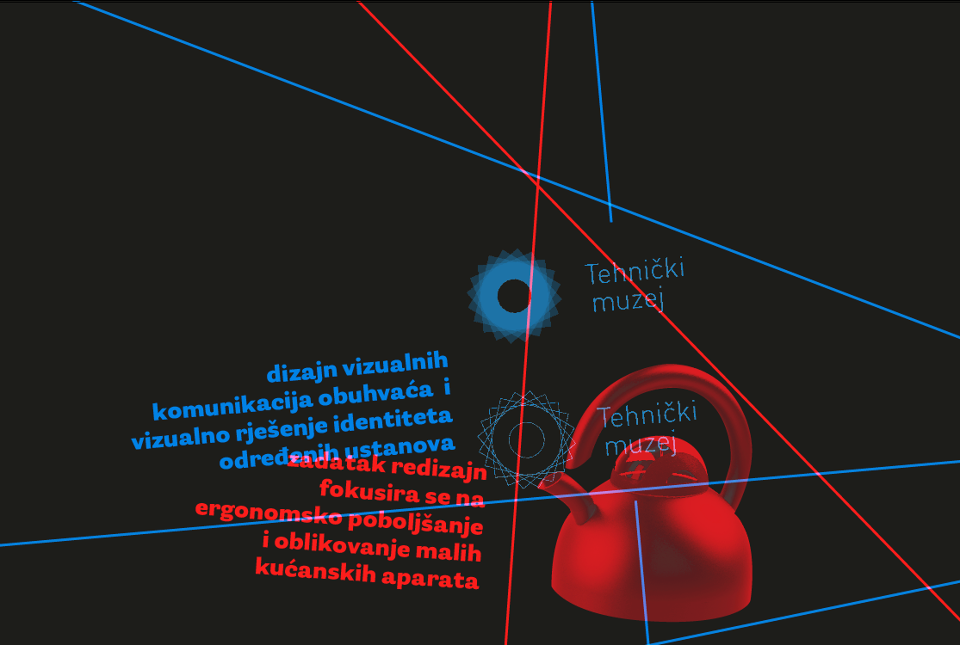
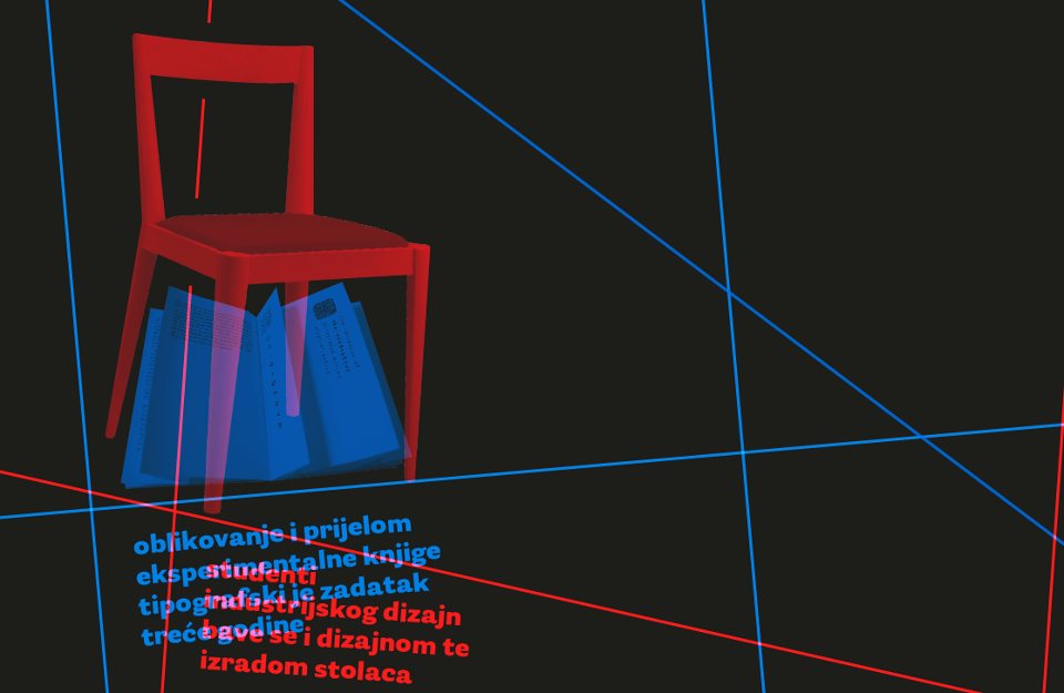
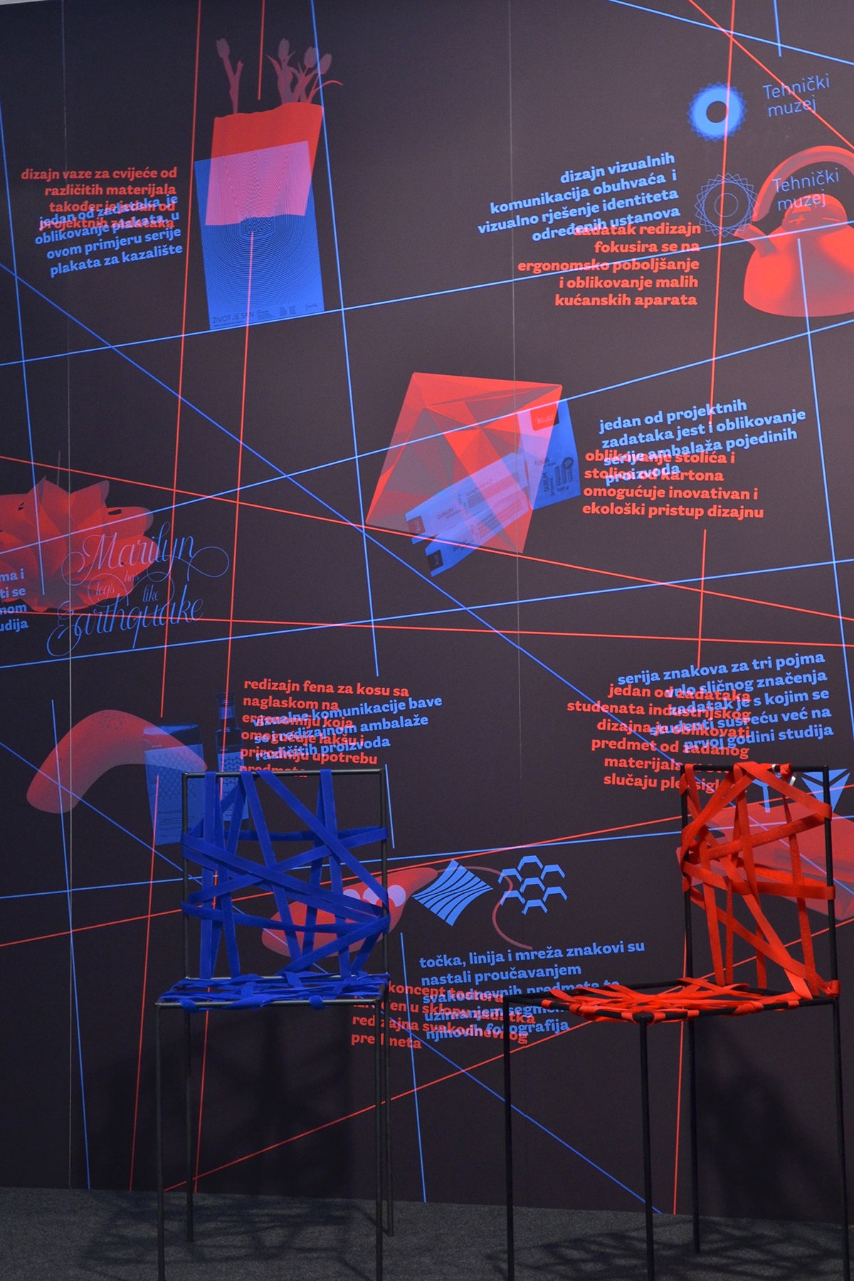
Unfiltered graphics, visual communications and industrial design overlapping
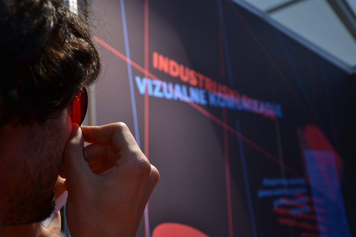
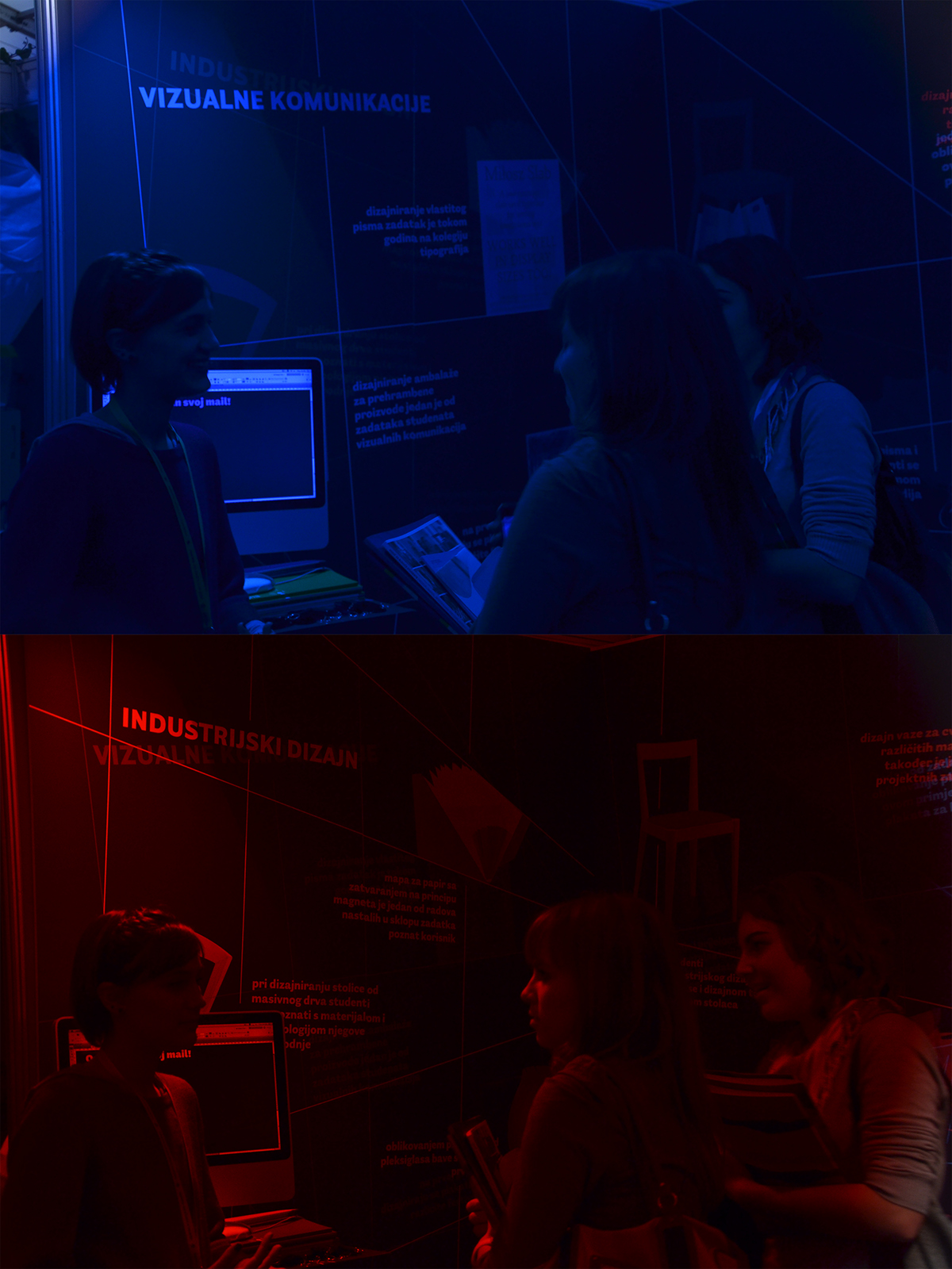
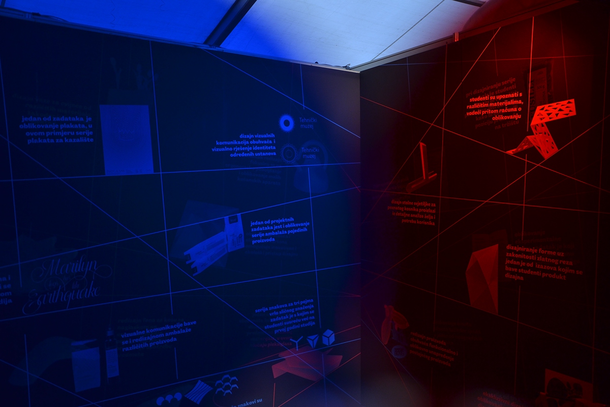
Through the optic illusion of selective color filtering a different booth was created for each of the courses. The red one for industrial design, and the blue one for visual communications.
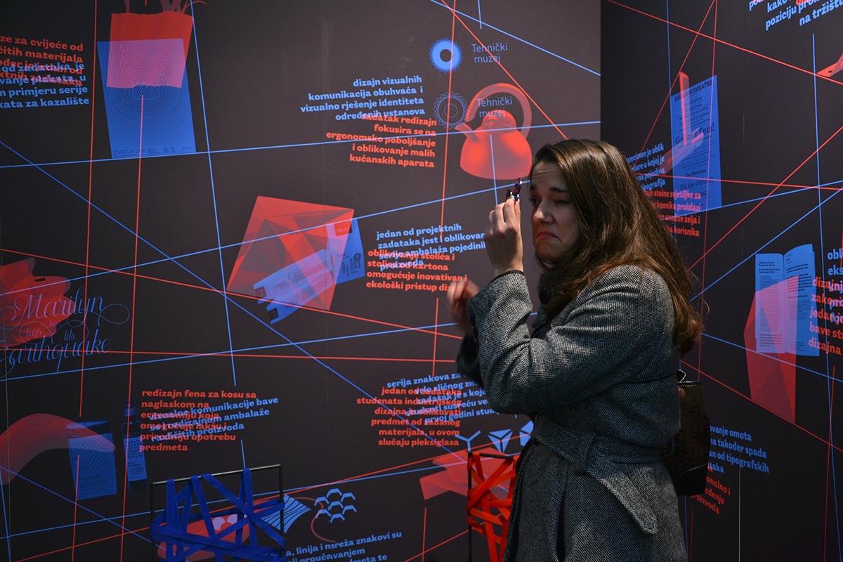
Using small acrylic monocles given to each visitor (most of which were future students) and depending on the colour of the monocle the visitors decided to look trough, they were able to see one of the courses graphics and text fully visible, while the other one became more translucent and less visible. In such way we provied a promotional booth for both of the courses at once, giving our visitors a possibility to "choose a path" they would like to take, being able to focus on the projects and information within the selected course.
Using small acrylic monocles given to each visitor (most of which were future students) and depending on the colour of the monocle the visitors decided to look trough, they were able to see one of the courses graphics and text fully visible, while the other one became more translucent and less visible. In such way we provied a promotional booth for both of the courses at once, giving our visitors a possibility to "choose a path" they would like to take, being able to focus on the projects and information within the selected course.
During the years of study in our school, we were taugh to look at the world around us and try to see things in as many ways as we can, so we could broaden our possibilities and imagination.
We wanted to share a little piece of us and our work as well as school spirit with prospective students, hence the idea and realization of the "Learn to see differently" University fair promotional booth 2012.
We wanted to share a little piece of us and our work as well as school spirit with prospective students, hence the idea and realization of the "Learn to see differently" University fair promotional booth 2012.
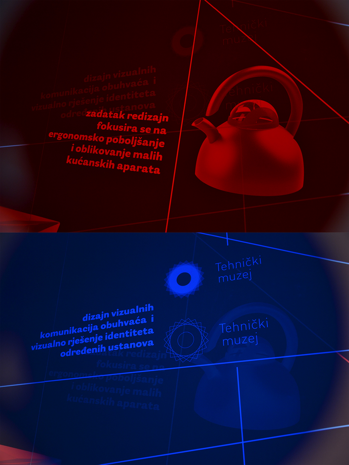
The same part of the graphics seen through the red and blue monocle.
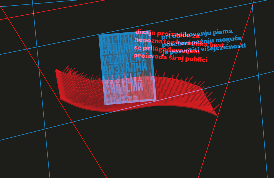
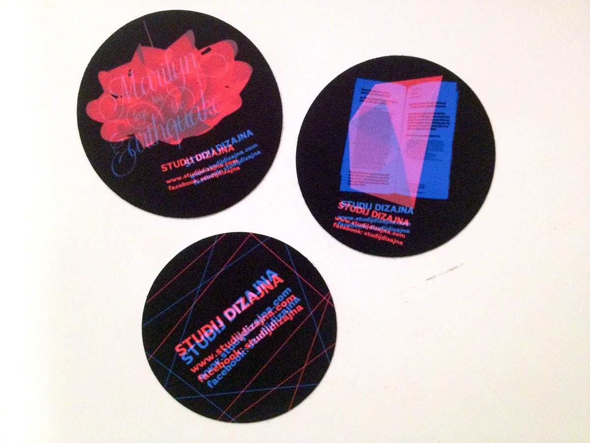
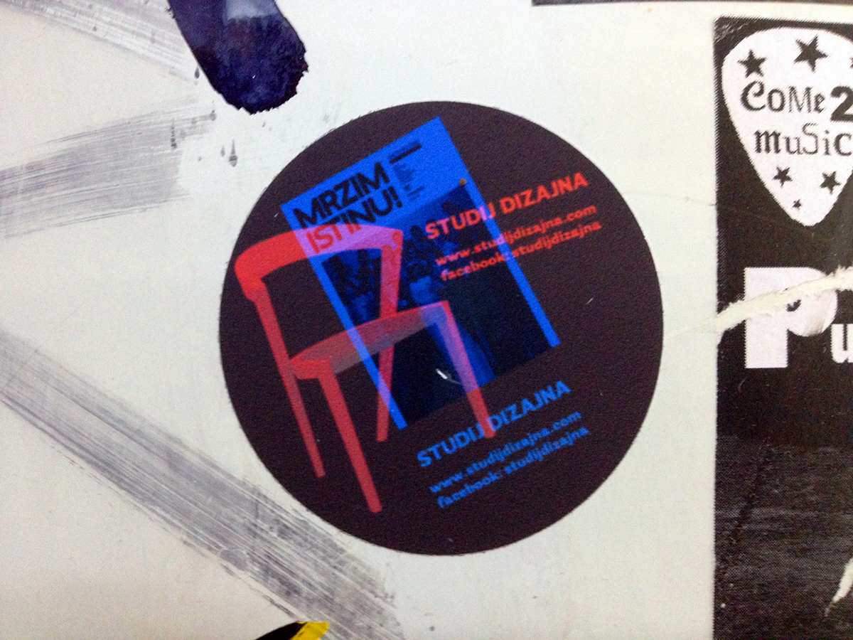
The graphics on the walls featured a selection of student projects from each semester of each course ranging from chairs, lamps, vases and re-designed furniture, as well as books, posters, visual identity and typography. The graphics also contained a description of the programme for each year and information on admssions. Other advertising material, such as stickers, worked in the same way.

The booth seen with the blue and red monocle

We tried to incorporate the colour-coded system into all objects within the booth,
as well as other advertising material such as stickers.
as well as other advertising material such as stickers.
Design Team from left to right: Anta Bučević, Petra Vrdoljak, Stanislav Kostić, Lana Grahek, Niko Crnčević, Alma Šavar
This project was made as a part of the Zagreb University fair in 2012.
Visual communications — Anta Bučević, Lana Grahek, Alma Šavar
Industrial design — Niko Crnčević, Stanislav Kostić, Petra Vrdoljak


