
Typographic Poster on Gill Sans Typeface
Gill Sans: The British Helvetica
Challenge: To design a design
a type-only poster on the Gill Sans typeface.
Research on Type
Abstract
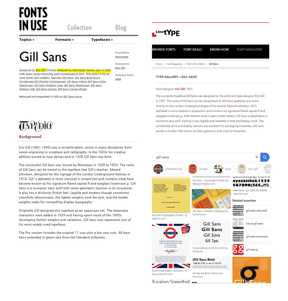
Gill Sans was designed by Eric Gill. It was released by Monotype in 1928. The typeface was inspired by Edward Johnston’s Underground Alphabet. Eric Gill was developing the typeface with his friend Stanely Morison, an influential Monotype executive. It was developed to compete for the success of German sans-serif families like Futura, Kabel and Erbar. It was intended to use as a display text, headings and text for documents. It was digitally released around 2005. The typeface was used by the London North Eastern Railway (LNER), London Transport System, BBC, Tommy Hilfiger and Wikimedia Foundation.
The uppercase of Gill Sans is based on monumentalRoman capitals and the lowercase is based on traditional old-style serifs. It is a humanist sans-serif typeface. It has around 15 individual styles. (light, italic, extra bold, condensed, shadowed, etc). It has a vertical axis, unmodulated strokes and almost circular ‘o’. Gill Sans displays a modern and takes a very ‘asystematic’ approach to type due to its clear, generous and original characters.
Inspiration


*All images are copyright to their respective owners.


Mockup from Graphic Shelter. Download the mockup from here.

Mockup from Graphic Shelter. Download the mockup from here.
If you liked it, please Appreciate!


