SoZen is a hybrid brand involving yoga, personal training and nutrition. The client wanted the brand to have a similar feel to other personal trainer brands but with a delicate feminine touch similar to yoga/holistic brands. Our client has Korean heritage and wanted to also include this in the branding.
Upon doing research for the SoZen brand, we were inspired by Korean signage which is ofter written downwards instead of across. The bold text is reflective of other PT influencers and their branding. The type is strong and assertive yet the feminine colours ad some delicacy. The thin lines of the Korean calligraphy also ad femininity.

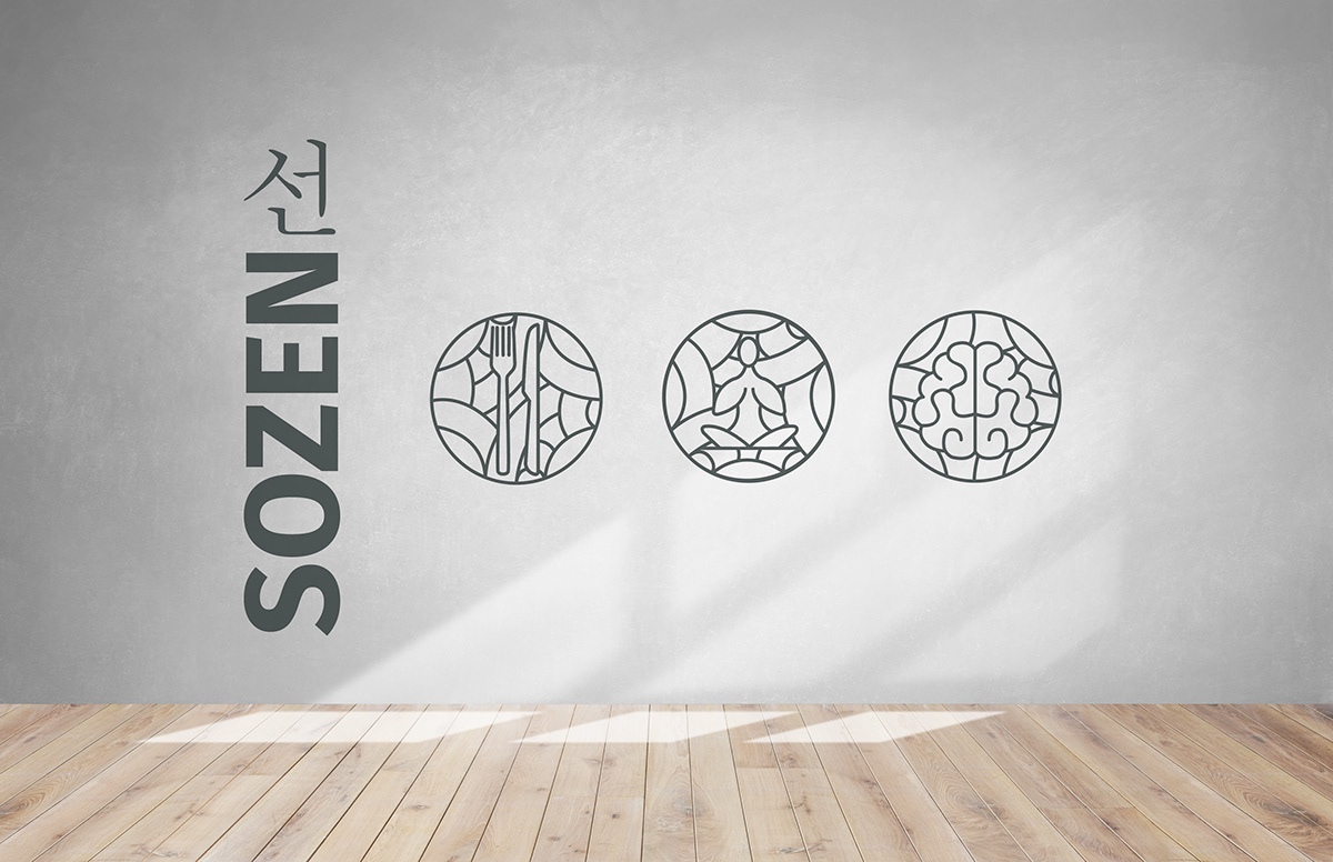
I created a series of icons to reflect the core teaching principles of SoZen - Nutrition, Body and Mind. These icons can be used across the branding in various ways, for example, in online videos and promotion for the brand. The icons can also be used alongside the logo when printed and can be used to decorate the space used for yoga.
The pattern in the background of the icons was inspired by Korean design patterns. From my research, a lot of Korean branding has the curved, flowing lines to reflect the Korean characters. These lines tie in beautifully with the character at the top of the logo.